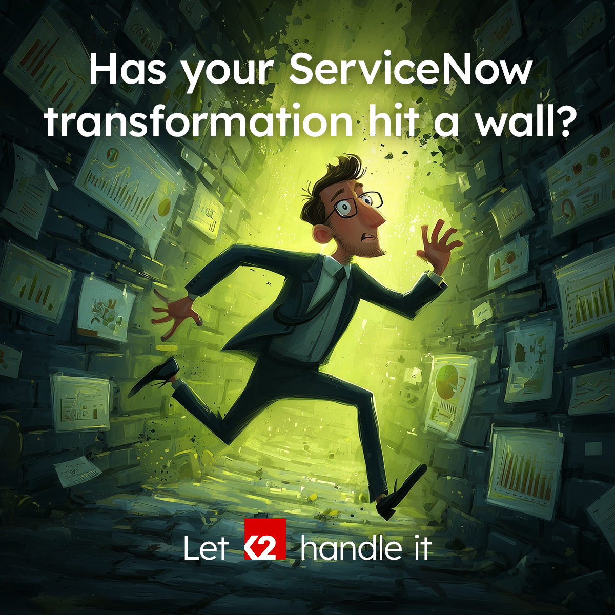
1. Identifying design challenges
The situation:
The market had known K2 Partnering Solutions as a specialist IT recruiter for over 25 years. This reputation was seen as a barrier to it securing the larger, more complex digital transformation projects it wanted.Its brand identity had evolved from its recruitment beginnings and did not now reflect the new broader service offering. By pitching itself as a recruiter and a consultancy, its messaging lacked clarity and made SEO and ad targeting difficult.
The brand would need internal buy-in and its workforce would need onboarding and educating.
Collaboration with newly hired practice leaders would be required to curate the consulting marketing.
The marketing team would need to increase in size to be able to execute the transformation while ensuring business as usual.
2. My role in the project
As the group's design manager, my hands-on role required me to work closely with senior leadership, the people office and the newly-hired practice area heads over a period of 24 months.
I identified where the existing brand fell short, and with my international team of designers and the support of the in-house marketing team, implemented a comprehensive transformation of the brand, its digital and event marketing, sales enablement and internal communications.
3. Helping to shape the early brand
The situation:
The brand transformation would be a long and complex process involving every department across every channel. It would need creativity, industry insights, a critical eye and most of all, momentum.
The strategy:
An inter-department working group was set up with several senior figures across the company, with elements of the brief coming directly from the CEO. I made sure to get to the bottom of any nuances and to discover the bigger picture— very important at this early stage.
I listened to the businesses needs, its challenges and goals but also provided creative insights, critical observations and fresh ideas.
Digital Project Management: The working group involved the CEO, the marketing director and several other senior figures from across the business. I presented research findings as well as concepts and initial designs.
4. Reviewing brand architecture
The situation:
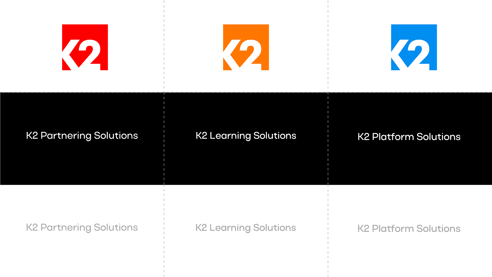
There were three brands with a "K2" prefix in the group already. K2 Partnering Solutions, K2 University and K2 Konnect.
How would the consultancy offering be branded, and how would this brand sit within the existing brand architecture?
Introducing a new brand would be a very different proposition to repositioning an existing one, with its own pros and cons.
The strategy:
Brand architecture diagrams, colour design systems and proofs of concept were explored with the working group. I recommended approaches and made sure alternatives were clearly presented and discussed.
It was agreed that consultancy services would go to market using the K2 Partnering Solutions brand, but that it would be thoroughly audited and updated to more effectively communicate the business' new offerings.
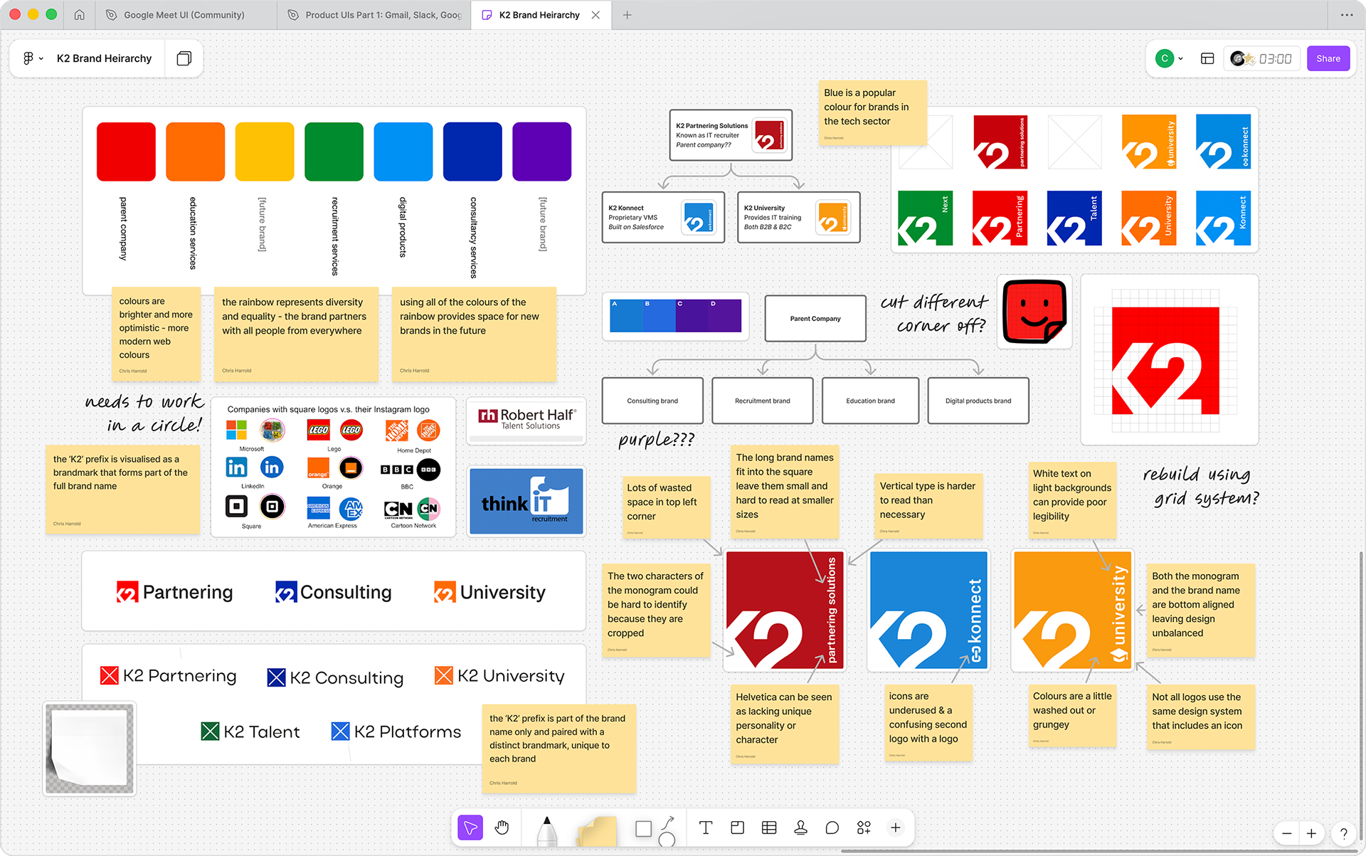
Brand Audit: Before any brand design could begin, it was important to fully understand the existing brand architecture, any design systems already in place, and our options to expand or evolve it.
5. Understanding the competition
The situation:
Who would be the brand's main competitors after the transformation? How would the updated brand differentiate itself in the market?
Consultancies tend to look and feel very different to recruitment firms. How would the brand identity need to change to reflect the new offering?
The strategy:
I worked with business analysts and UX researchers to help identify the brand's direct competitors and the brands that it aspired to. K2 already partnered with many of the big IT consultancies and valuable inside knowledge was shared with my team.
I also looked at the design landscape to ensure the new brand looked like what it was, and that it was effective in our largest markets (such as the US, Brazil, Europe and Japan).
Findings were shared with the working group, allowing us to agree the brand's position in the market, its USPs and its core values.
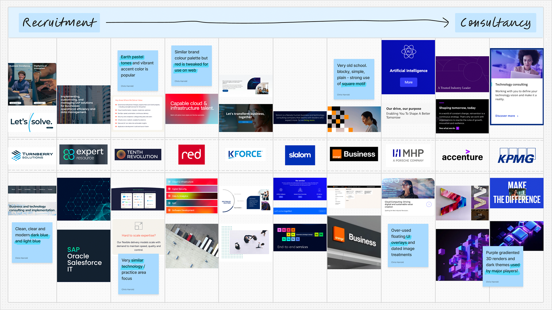
Competitor Analysis: Competitors' were categorised as specialist or generalist, recruiter or consultancy. Their art direction, messaging and colour palettes were analysed to discover commonalities and gaps in the market.
6. Gathering local market intelligence
The situation:
K2 Partnering Solutions had expanded into many new global markets since its founding.
How could we ensure the new brand would be effective in these new markets with their unique languages, cultures and customs?
The strategy:
I interviewed key associates in each region and recorded their insights and understanding of the brand's position in the market. I discovered the regional or cultural considerations as well as any challenges they saw in the brand's future.
"In Japan, formal dress including suits and ties are common and expected in business photography."
Yang Zhang, Digital Product Specialist, Japan
"Make sure to position 'sales' jobs as 'technical recruiter' jobs where possible, as Germans can sometimes look down on sales as a career and feel it is beneath them."
Saskia-Felicitas Böhning, Senior Recruiter, Germany
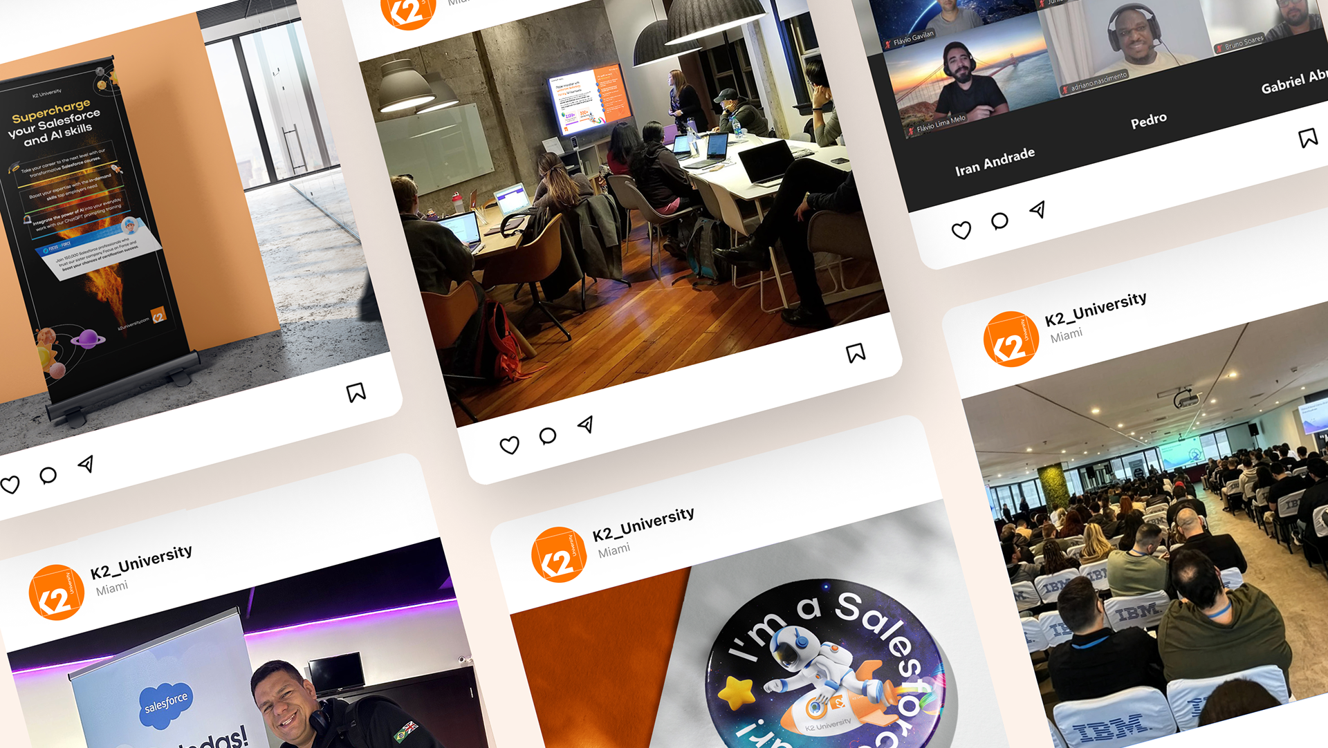
Market research: Example insights like these from K2's talent teams in the APAC and DACH regions helped us tailor the brand to local markets, with insights informing photography art direction and messaging.
7. Modernising and optimising the logo
The situation:
The logo was unclear at small sizes with a lot of wasted space in the top left.
Further analysis showed the logo's typefaces dated the marketing and conveyed little personality.
The strategy:
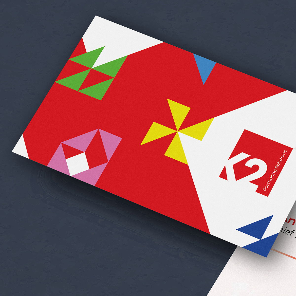
Using a grid system, the square logo and 'K2' monogram element was enlarged, emboldened and clarified.
A versatile chevron motif was introduced to provide a strong core visual hook. The chevron is both a 'less than' seen in programming languages and an arrow representing movement or transformation.
I also suggested the creation of an additional logotype variant, to allow the full brand name to be read at small sizes and when space is at a premium.
New brand fonts were proposed, providing more personality in the headings and clarity in the body copy. Display typography contained geometric flourishes that matched the angles seen in the monogram.
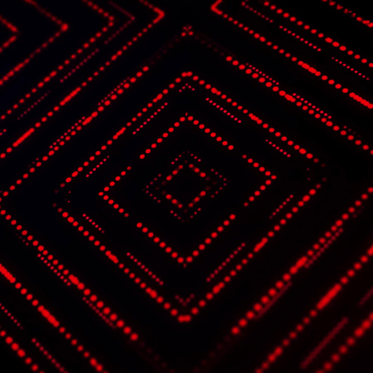


Logomark design: The arm and leg of the 'K' form the "<" / "less than" sign used in programming languages, an arrow representing movement and transformation, and a strong, geometric, technical pattern.
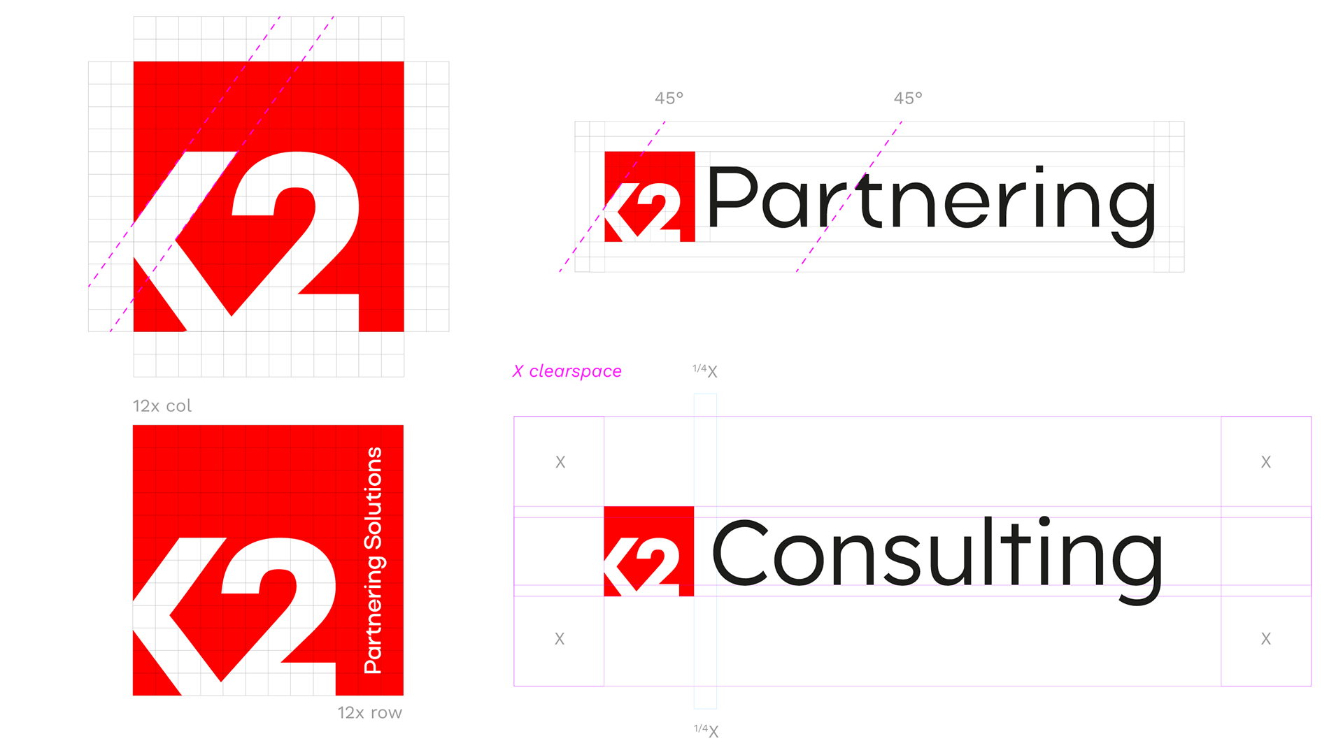
Logo refresh: The board were keen to retain as much of the brand's heritage as possible. A conservative redesign was undertaken, looking at the group's suite of logos holistically, while focusing on legibility and modernity.
8. Building out a new colour palette
The situation:
The brand's red looked washed out and old-fashioned when compared to newer tech brands and modern web trends. More vintage car than Virgin Media.
Marketing and designs frequently switched between red and navy blue as the brand primary colour. The palette needed simplifying to improve brand recognition.
The strategy:
Using a grid system, I redesigned the logo with a new, more modern-feeling brand red.
We knew the more vibrant, warmer red would play a large part in the brand's perception. it needed to appear full of life and passion, while remaining recognisable and retaining its reputation.
A full colour palette was developed, ensuring versatility, legibility, personality, professionalism and easy recognition. I presented the new palette to the working group and explained its virtues.
I asked the group's UI/UX designers to introduce a new pale pastel tone— a subtler brand colour for use on web, applications and interfaces.
Moodboards: We investigated the pros and cons of changing K2 Partnering Solutions' brand colour(s). Mood boards were created, inspired by modern tech brands and award winning designs.
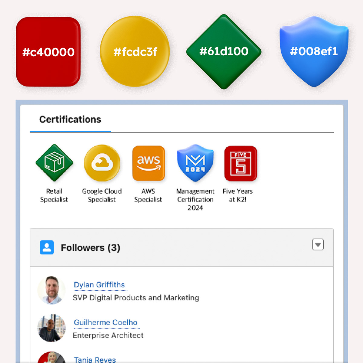
Colour system design: The brand frequently communicates large amounts of data and complex concepts. A new palette of vibrant accent colours was designed to provide greater informational hierarchy.
9. Defining the photography guidelines
The situation:
Legacy brand photography was dull, used dated image treatments and scenes seemed overly staged. This aesthetic did not reflect the increasingly young, nomadic and casually-dressed modern tech professional.
K2's marketing had traditionally relied on static stock images— an increasingly un-engaging and unsuitable medium for many popular advertising platforms and social media.
There is a compelling business case for utilising AI in content generation. How do we ensure AI generated media consistently meets the brand guidelines?
The strategy:
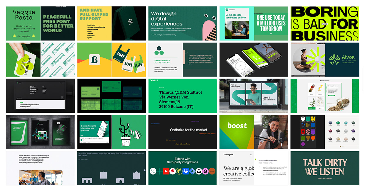
I designed and rolled out a new more authentic and natural art direction. I wanted our audiences to recognise and empathise with the realistic environments.
New photography should have depth and be rich in colour and diversity. Photographers should avoid messy backgrounds and use large strong blocks of colour to complement brand colours.
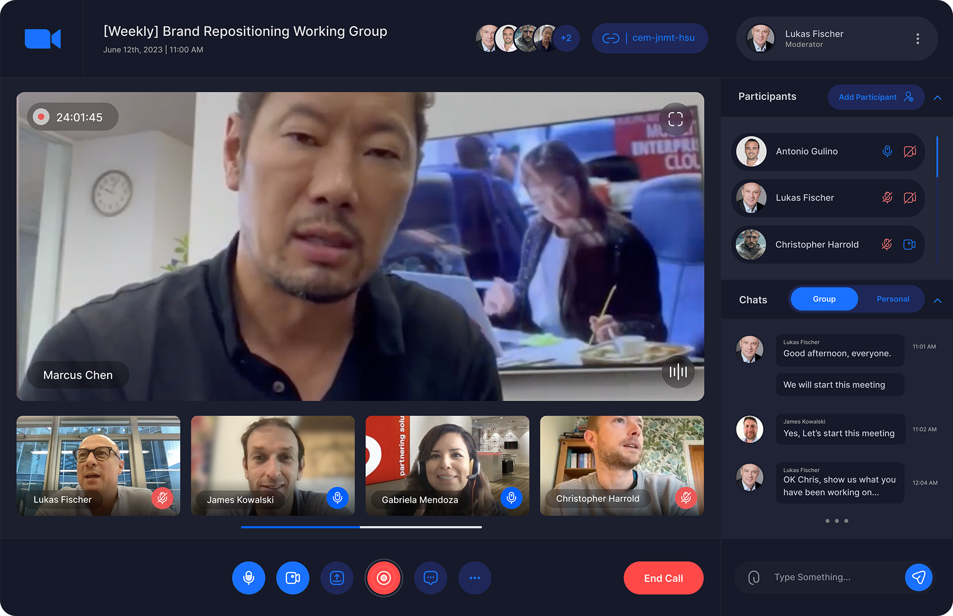
I trained marketing team members on brand videography guidelines and created new Canva workflows. A curated library of approved brand video is shared with relevant associates.
I worked with the group's head of AI to develop a series of prompts and an internal AI agent that could be used to generate on-brand imagery for blog articles, case studies and social media.
Hero background video: This hero video montage demonstrates the new photography art direction. Note the authentic, fly-on-the-wall style footage and how the camera focuses on the subjects' facial expressions.
Prompt guidelines: Authentic, realistic and branded imagery could be generated reliably using GenAI image and video tools such as Midjourney and Gemini.
10. Illustrating technical concepts
The situation:
The shift to consultancy created a need for visual tools that could clearly support complex technical concepts.
Larger amounts of detailed text would need breaking up and additional web content would need enhanced user interfaces.
The strategy:
A new bespoke icon library and design system was designed, created with a square grid system based on the angles formed by the arm and leg of the 'K" in the monogram and the block serifs of the brand's typeface.
These versatile, geometric monotone icons provided visual shortcuts, anchored text and strengthened comprehension— all while ensuring the new marketing reflects the more confident, professional consulting brand.
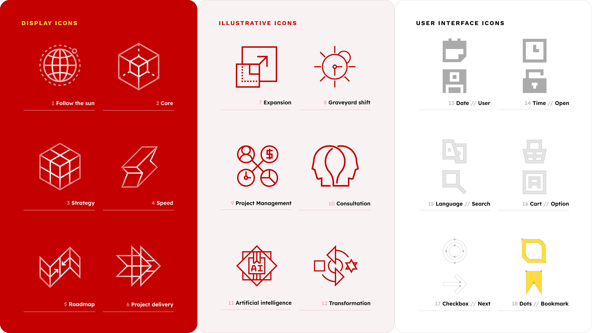
Iconography design: The bespoke brand iconography is minimalist, pictographic and geometric. Large icons were designed to accompany messaging and illustrate complex concepts. Extra small icons are for user interfaces.
11. Clarifying the messaging
The situation:
Sales and marketing copy was confusing, hard to read and full of jargon.
Positioning the new consulting services alongside existing recruitment services confused audiences and weakened both messages.
Positioning the new consulting services alongside existing recruitment services confused audiences and weakened both messages.
The strategy:
Together with the content team, we pinned down a new shorter and easier-reading brand voice and writing style guide. The new copy allowed us to be bolder in our designs and engage with our audience more quickly on complex topics.
A clear focus on consulting was introduced across all channels. This new focus was reflected in everything from ad copy to website UI to pitch decks.
Messaging and tone of voice: Shorter, simpler messaging was found to be effective on social media. Vibrant, colour-themed imagery exaggerated real world scenarios to reinforce businesses' pain points.
AI-powered workflows: As a technology consultancy, K2 Partnering Solutions works with cutting edge technologies such as artificial intelligence. It was important for AI images or videos to feel premium and human,
Video generation: "AI is everywhere you look. Let's bring it into focus." Gemini and Midjourney were used to produce the footage for a moving-image style ad campaign to promote SAP consulting services.
12. Making the change online
The situation:
Introducing additional consulting services to an already unintuitive recruitment website could confuse users and weaken SEO.
The creation of new webpages was resource intensive and did not always follow best practices.
The increased use of AI in lieu of traditional web searches was leading to fewer organic website visitors.
K2's corporate website needed an update to improve aesthetics, usability and accessibility.
The strategy:
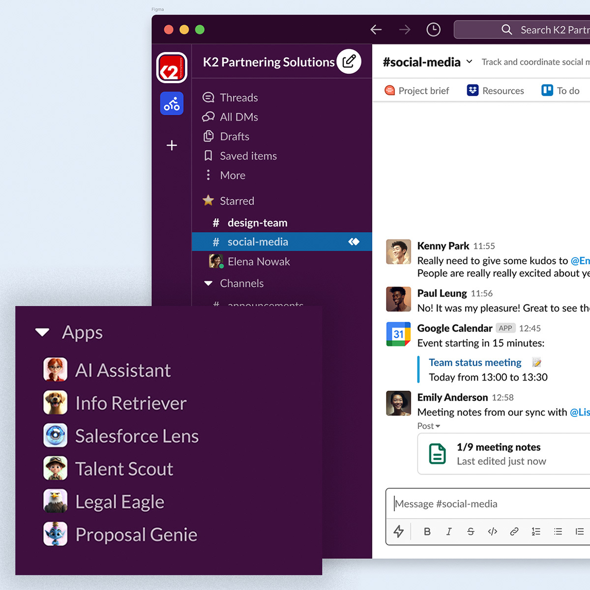
Analytics, reporting and heatmapping tools were implemented to better understand how users engaged with our site. A new top level navigation was introduced, providing clarity and ensuring consultancy services were see as the primary offering.
A new bespoke template library was created in the CMS, allowing efficient creation of additional pages as required. Training was provided to ensure best practice file handling and metadata and tagging.
Dedicated SEO and GEO projects were undertaken to radically improve search performance and references in ChatGPT and Google's AI Overview.
A resent acquisition brought an additional UI/UX designer into the company. I brought him into the marketing team to help with the reskinning and UI/UX improvements to K2 Partnering Solutions' website.
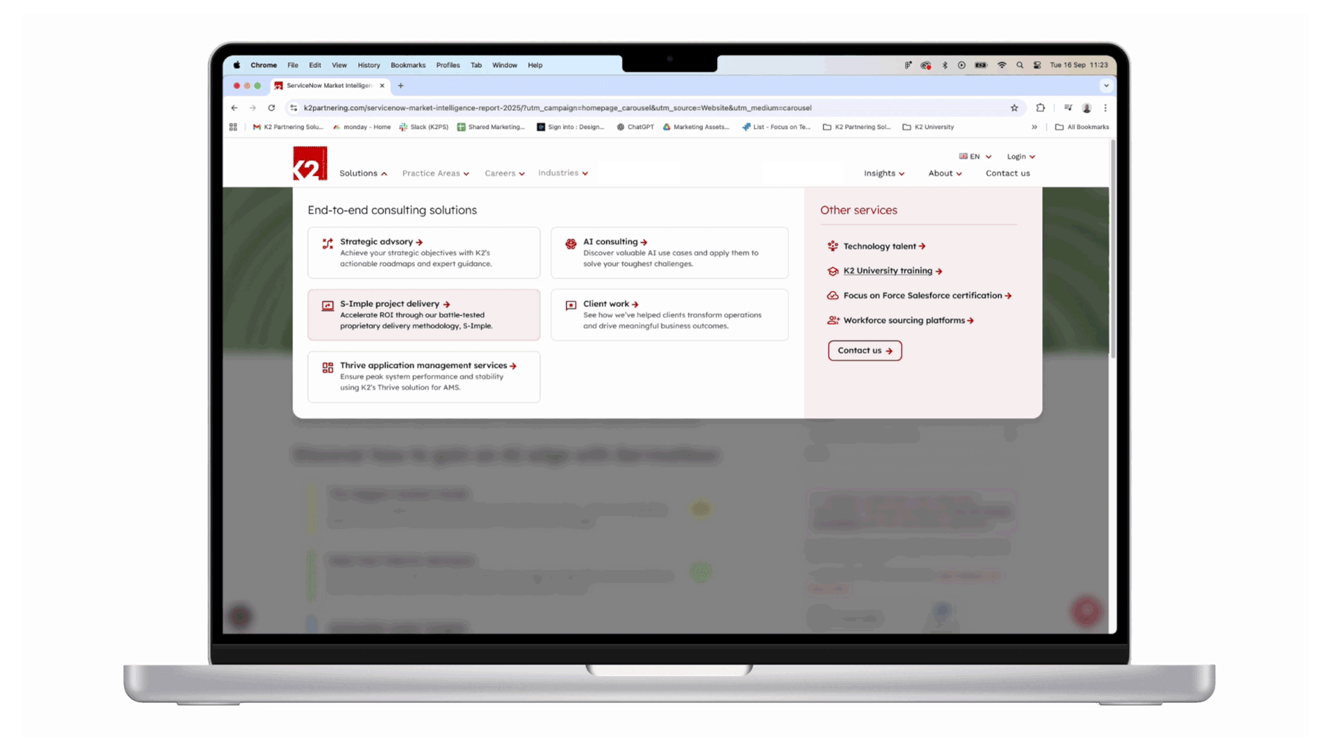
UI/UX design: A new navigation and user interface was designed and implemented. Users no longer have a confusing mix of recruitment and consultancy messaging and can browse service offerings by solution, technology or industry.
13. Positioning the brand as a thought leader
The situation:
A lack of thought leadership content would make it hard to cement the brand's new reputation as a consulting partner. It needed to clearly demonstrate its knowledge and experience though content marketing and regular publishing.
The strategy:
A new series of whitepapers were written, designed and marketed as gated content available to download via bespoke lead generating landing pages.
High profile booths and sponsorship of some of the tech world's biggest events made sure those in the industry got the message. Stand design and messaging was now focussed on end-to-end IT consulting and managed services.
A first for the company, K2 put on an AI-themed conference roadshow that ran in cities across South America. I led the design of a unique brand identity for the tour and a huge range of event collateral was produced. The company was pleased with the pipeline generated from the tour.
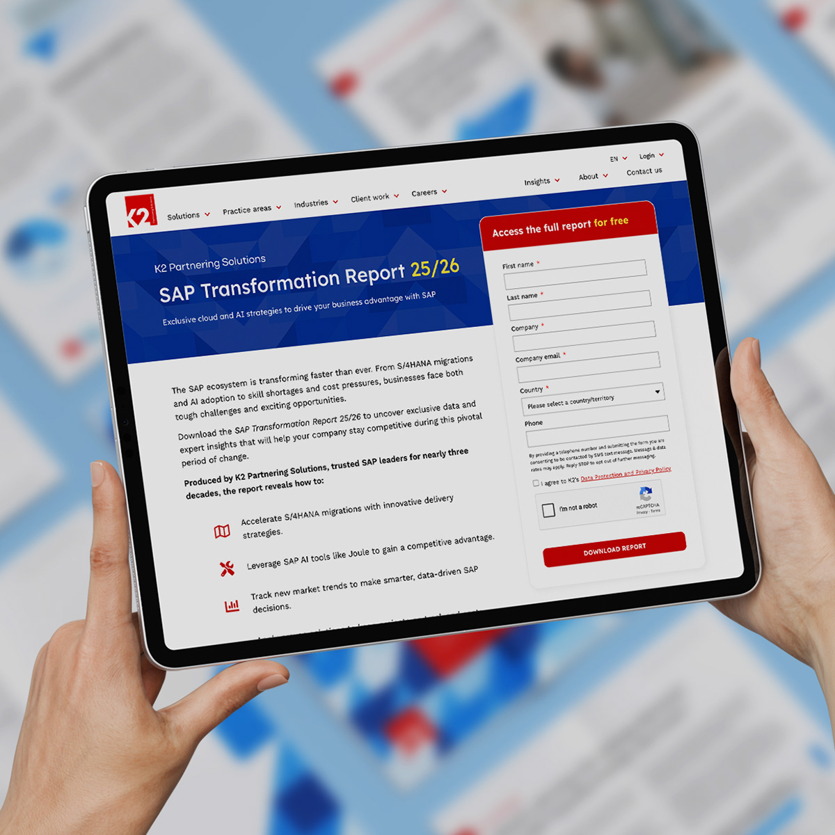
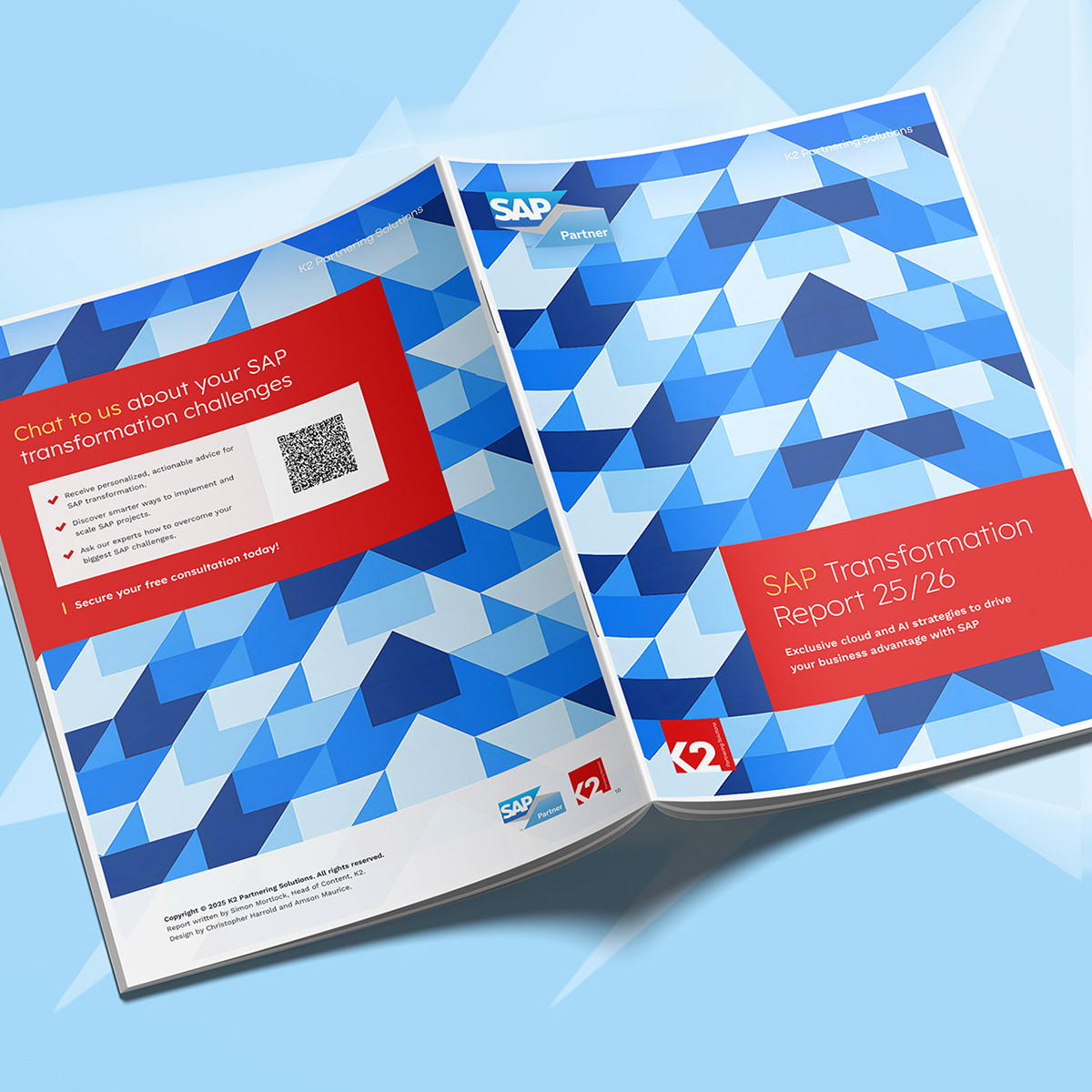
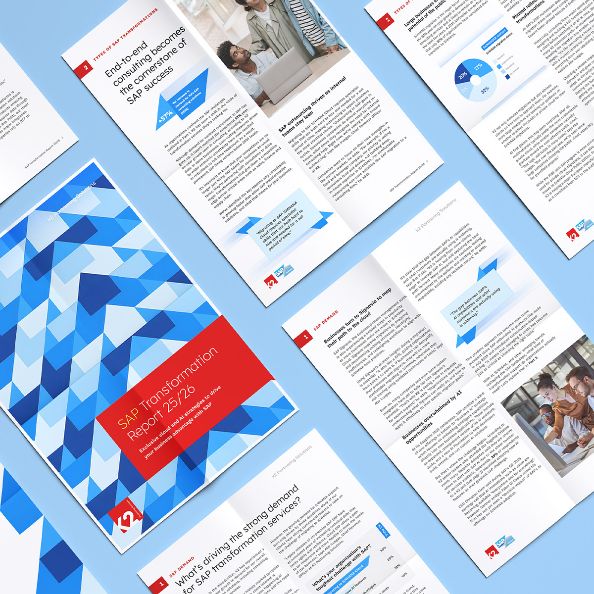
Thought leadership: Content for a series of thought leadership whitepapers was drafted in collaboration with newly hired practice leaders. We marketed these designed and typeset digital documents as gated content.
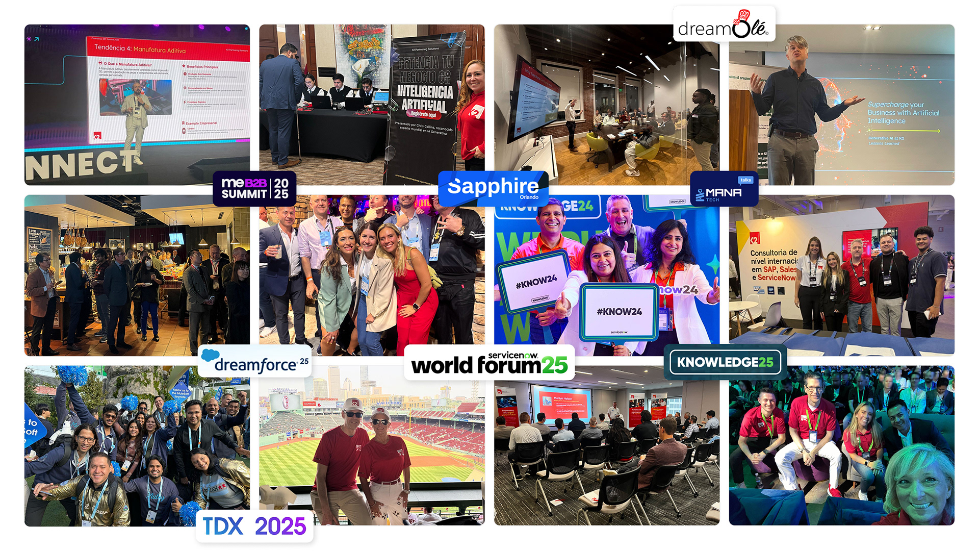
Event marketing: The new consulting messaging was applied to event collateral, allowing K2 to promote its transformation to those closest to the industry. Stands, merchandise, invites and videos were created to support attending associates.
14. Enabling the sales teams
The situation:
A lack of approved and branded sales enablement materials made it hard for sales teams to talk the talk and prove past consulting successes.
What was available was not easily findable or customisable. Poor version control and lack of a single source of truth risked data being out of date.
A huge amount of resources were required. Some just needed rebranding, others needed creating from scratch.
The strategy:
Working with the content team, practice leaders and sales teams, we created a large cloud library of fact sheets, case studies and pitch decks.
A new company intranet was set up. I worked closely with the People Office to designed and skin the platform, allowing us to roll out a new employer brand and make our new branded resources easily available to associates around the world.
I brought a freelance graphic designer in to help with the internal roll out. After a thorough briefing on the new brand, they proved invaluable in setting up many of the brand first templates.
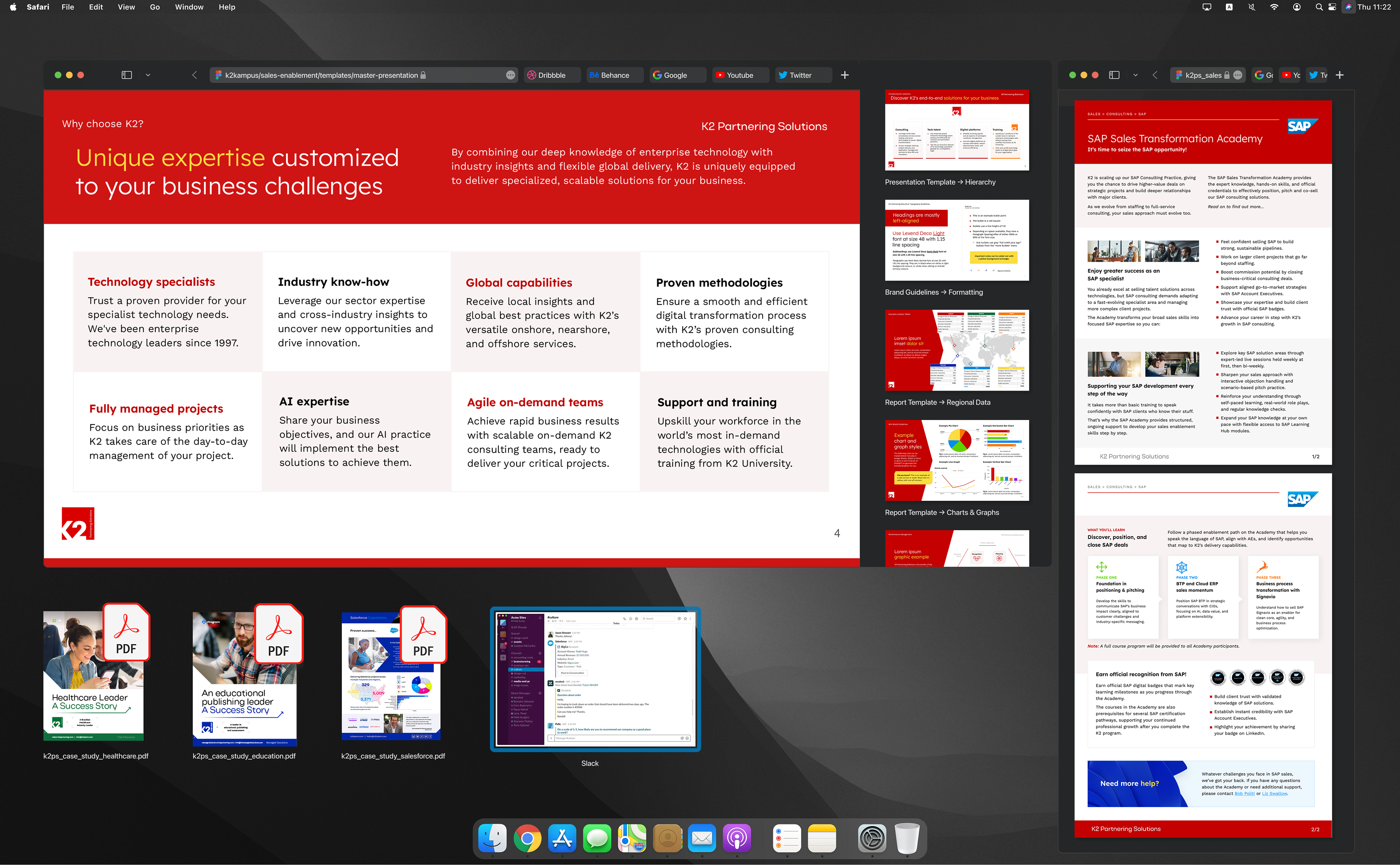
Sales enablement: Self-serve sales enablement materials were designed and made available on the new company intranet. Cloud documents allowed a single source of truth and easy collaboration and branding.
15. Rolling out the brand internally
The situation:
Associates lacked easy access to broader consulting-focused training materials. Compiling RFPs and pitch decks from scratch for consulting projects was labour intensive.
The branding of internal materials was inconsistent or sub par (i.e. no employer brand existed) and there was a lack of clarity and understanding of company structure and brand hierarchy.
Sales associates' pitches and RPFs were not on brand or otherwise unprofessional or buggy. They lacked advanced training in the digital tools they were expected to use day to day.
The strategy:
Working with the learning & performance team and the people office, I skinned and branded a new learning management system (LMS).
I provided design, branding and generative AI training to key teams across the business and ran pilot programs of the emerging digital tools associates would need to propagate the new brand.
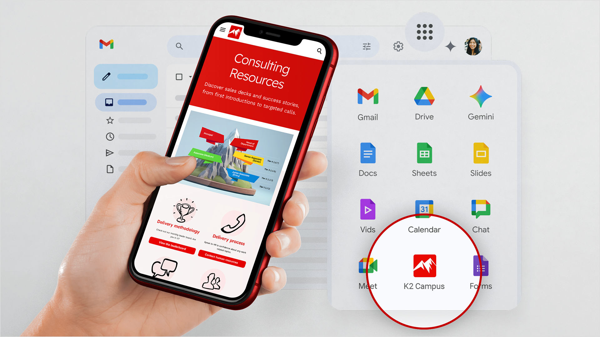
Employer branding: I designed a new employer brand for internal comms and training. With a friendlier and more organic brand than its parent, the new employee hub was integrated into the company's digital tools.
16. A design system for internal tools
The situation:
Sales teams are often the first point of contact with the brand for many clients. It was important that they presented accurate, professional and on-brand content.
With the huge amount of information stored within Salesforce, our sales enablement folders and our cloud storage, how would sales teams efficiently collate the information they need into the pitch decks and RFP responses they need to deliver?
Solutions:
A new suite of bespoke AI agents was created by the internal AI team— designed to speed up daily tasks such as pitching, responding to RFPs and exporting data from Salesforce.
A practical, branded design system was required to help associates easily identify which agent to use for what task when integrated into the company's digital tools.
Integrated into workplace tools, these tools quickly proved to be invaluable and to provide some impressive success stories.
"What would normally have been a stressful, time-consuming scramble turned into one of the easiest wins of the week. Huge shout-out to the team behind Proposal Genie for building something that really makes our lives easier. Proof that having the right AI tools available can turn days of chasing into minutes of doing!"
Caitlin Gentry, Vice President of Recruiting
User Experience Design: Feedback from a grateful managed services sales team member in LATAM after the internal rollout of our proprietary, branded AI agents.
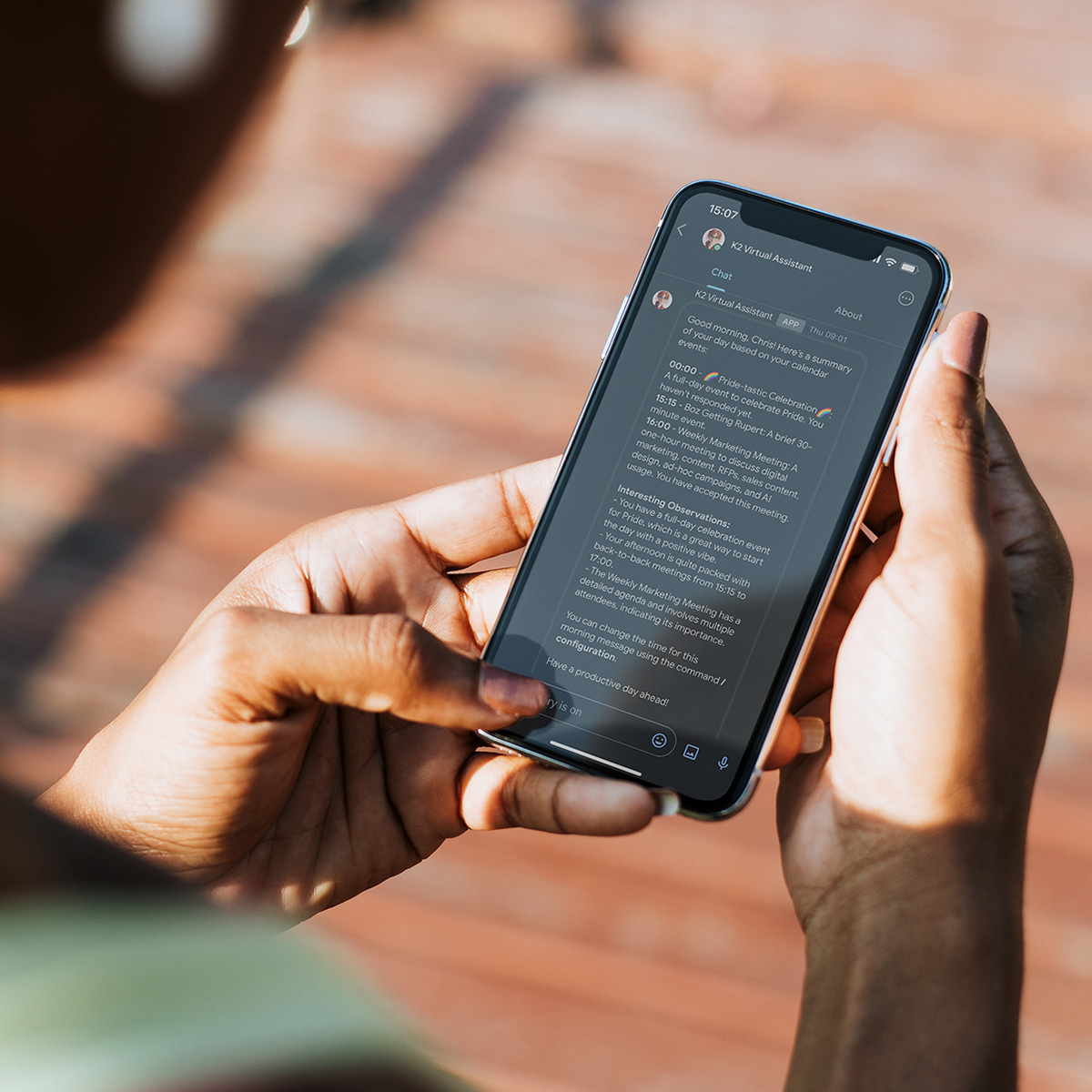


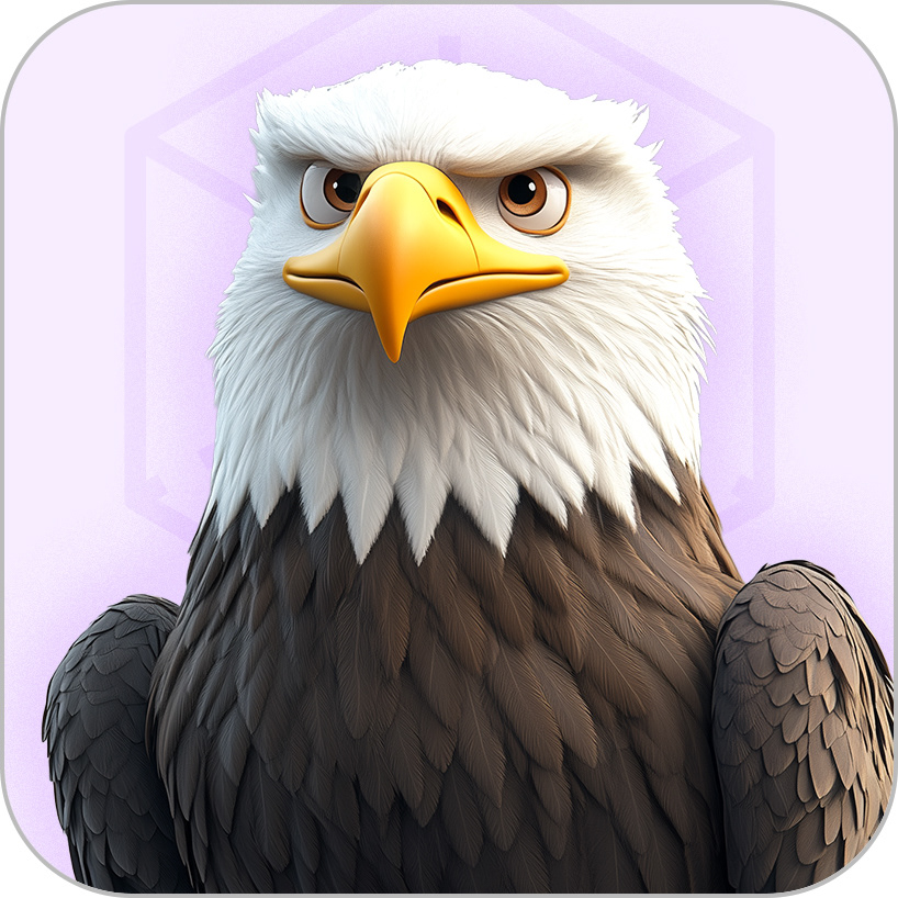
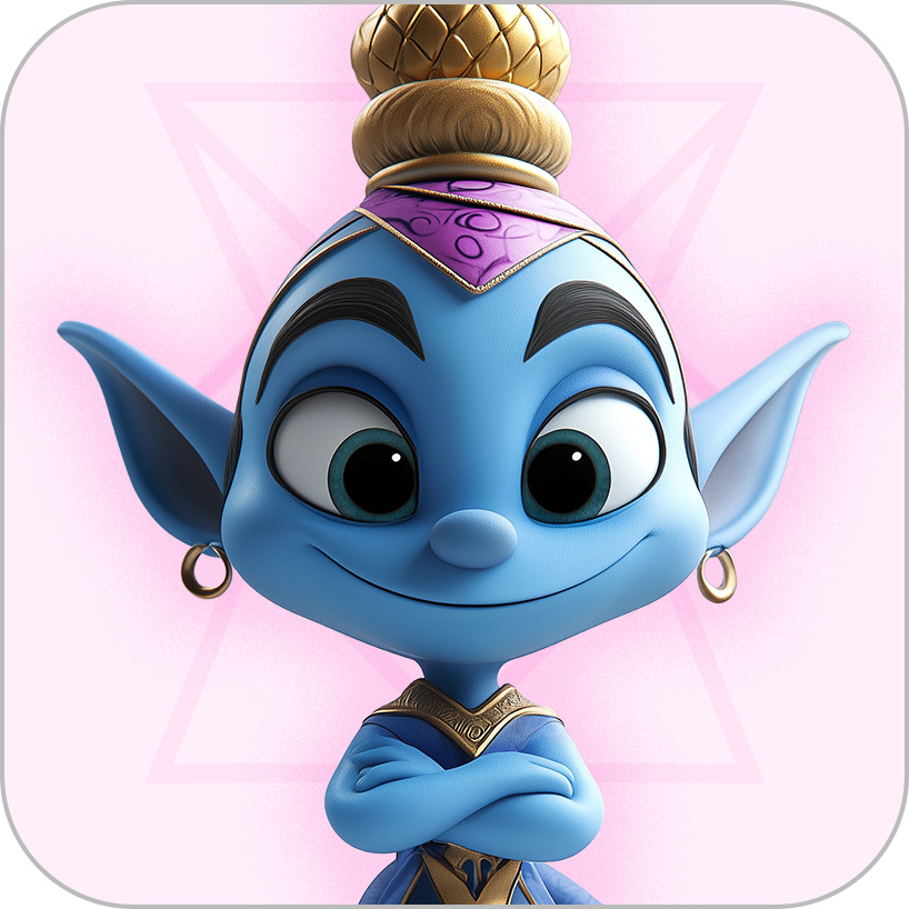
Design system: Six avatars were created for the six new AI agents. Each agent has its own colour-coded persona and specialises in helping with different requests.
17. The brand's impact
534%
increase in conversion rate for core consultancy web pages
$38.7m
pipeline value generated from consulting events marketing
100+
consulting opportunities generated through events marketing
3x
faster RFP responses on average for consulting projects
K2 Partnering Solutions is now generating more large-scale consulting project leads through organic SEO, GEO, industry events, thought leadership content, paid advertising, sales outreach, networking and new conversations with its existing clients.
Sales and teams are winning valuable consulting project deals with some of the biggest names in tech through their compelling, accurate and branded RFPs, pitch decks and sales sheets.
Sales enablement materials are more efficient to produce, are of a higher quality and better represent the brand thanks to new cloud document management, templating and artificial intelligence.
Employees experience K2 Partnering Solutions as a coherent and trusted brand thanks to a more engaging and believable employee value proposition and professional internal communications.
Associates are empowered to help themselves with easy access to clear, usable training materials, branded templates and tools, boilerplate copy, sales enablement materials and regular workshops and webinars.
"I had the pleasure of working with Chris during his time as our Head of Design, and I can’t recommend him highly enough. Chris brings a rare blend of creative vision, strategic thinking, and hands-on execution that consistently elevates the quality of our brand experiences. He collaborates effortlessly across teams and has a brilliant ability to translate complex ideas into beautiful creative work."
Dylan Griffiths, Vice President of Marketing, K2 Partnering Solutions
Going through a similar transformation and in need of a new brand strategy?