Building a technology hub

How my design leadership enabled the successful evolution of a Salesforce training store into a sophisticated multi-technology media hub.

1. Establishing the project foundations
The situation:
Recently acquired Salesforce training provider Focus on Force needed to make some major changes to its brand after the decision was made to broaden its scope and focus on other popular cloud enterprise softwares and methodologies as well.
The new platform would need to accommodate multiple content types including digital products, certification guides, technology news and events, community forums, jobs boards, and B2B training solutions—all under one cohesive branded platform, all without compromising its strong SEO and customer loyalty.
The new brand would be called Focus on Tech. The board wished to preserve brand heritage and maintain brand equity. Keeping the same naming convention (and two-thirds of the name the same!) ensured continuity.
The strategy:
Key stakeholders, project timeline and meeting cadence were established.
Senior stakeholders presented their vision for a hub/portal theme, showing inspiring websites and brand references. This approach was debated and refined to allow for a more commercial and less resource intensive approach.
An external agency was brought in to advise on the technically complex site migration, ensuring the hard-won SEO value of the existing website, store and blog pages store would be preserved.
Project Management: Clear governance and regular touchpoints ensured alignment across this fast-moving, international project. The clear segmentation and colour-coding of this site by LVMH inspired our initial designs.
2. My role
I was brought in to lead on every aspect of design in the four-part project.
My brief was to 1) Design an effective new brand. 2) Deliver a clear and detailed prototype of the new site 3) Enable and shape the web development. 4) Hand over the brand to the relevant teams.
Each stage would need final sign off by senior stakeholders.
I would have a small, agile international design team to help me including a UX researcher, two UI/UX designers and a junior designer. The wider project team would include a marketing manager, a project manager, a scrum master and a development team in based in Australia and the Philippines.
3. Auditing the existing brand
The situation:
While Focus on Force was doing well commercially, its brand execution told a different story. Its visual identity, web marketing and digital products appeared messy, dated, and provided a poor user experience.
The brand lacked consistency across touchpoints, with terminology and navigation changing throughout the site. This confusion was creating friction for users trying to navigate the purchase path.
The strategy:
Together with our two UI/UX designers, I conducted a comprehensive brand audit examining every customer touchpoint—from marketing, to the website, to training materials, to the checkout process.
To validate our findings, research was commissioned from specialist agency Conversion Rate Experts. Their carefully selected testers provided an important and comprehensive external perspective.
Some of their feedback, summarised below, confirmed our concerns:
 "The purchase path is not very clear. Terminology and navigation change throughout the site. Most pages are very long. Drop down menus are too busy. I feel overwhelmed by content."
Tester, Conversion Rate Experts
These insights gave us the evidence we needed to make the case for comprehensive improvements across the entire platform, while identifying the specific pain points that needed addressing.

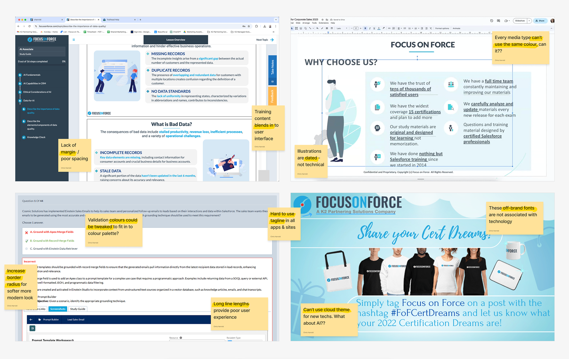
Brand Audit : Myself, my colleagues and an external agency audited the brand and its marketing materials. We identified strengths and weaknesses.

4. Understanding the competitive landscape
The situation:
The new multi-technology media hub would be competing with many different websites. It would need to be able to compete with training providers (like Udemy and Coursera), job boards (like Indeed and Hired), but also with media platforms (like HubSpot and Salesforce Ben).
But more than that, what design language was the tech industry as a whole using? What gaps could we exploit?
Our brand needed to embody multiple technologies and prove itself as a trusted voice.
The strategy:
I led comprehensive competitor research, analyzing both direct competitors in the technology training space and adjacent players in the broader learning and certification market.
I also investigated industry design trends to ensure the new brand would feel contemporary and credible while standing out from the crowd.
This research informed everything from our approach to the site’s navigation, to our color palette and aesthetic. It helped us identify opportunities to differentiate while meeting audience expectations.

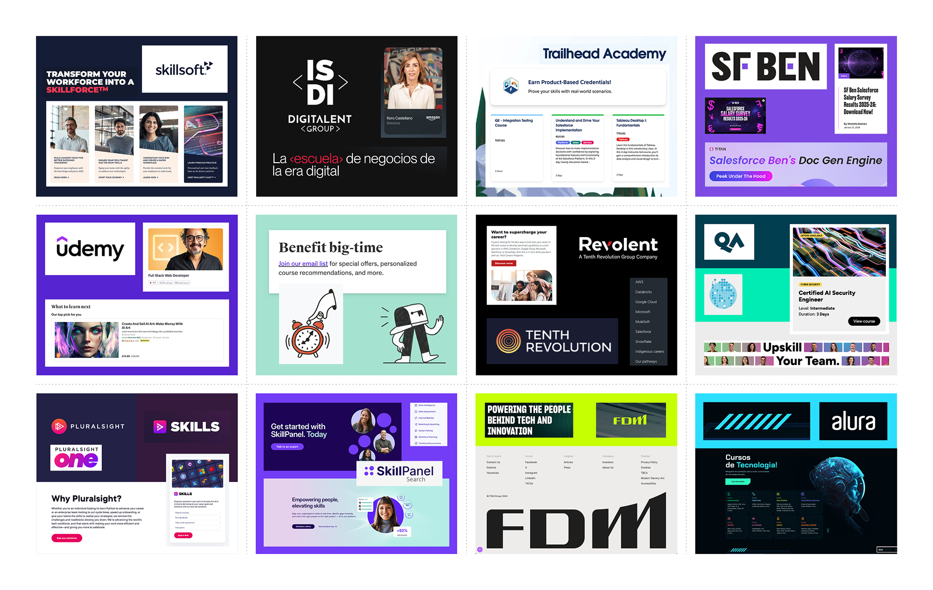
Competitor Analysis: I looked at how the brand's competitors presented themselves online. Vibrant, neon colours and bold stylised typography were prevalent.

5. Defining the audience
The situation:
The platform would serve multiple distinct audiences— from students beginning their tech careers to experienced professionals seeking advanced certifications, as well as businesses looking to train and upskill their teams.
Each audience had different needs, motivations, and levels of familiarity with the subject matter. The brand needed to speak to all of them without alienating any.
The strategy:
I worked with our UX researcher and head of content to pin down and flesh out detailed audience personas.
These demographics, behaviours, pain points and goals were presented clearly and visually to the entire team, discussed and tweaked so everyone was aligned.
These personas, along with the brand’s mission statement, tagline and tone of voice, helped us make consistent decisions about everything from boilerplate copy to menu structure.

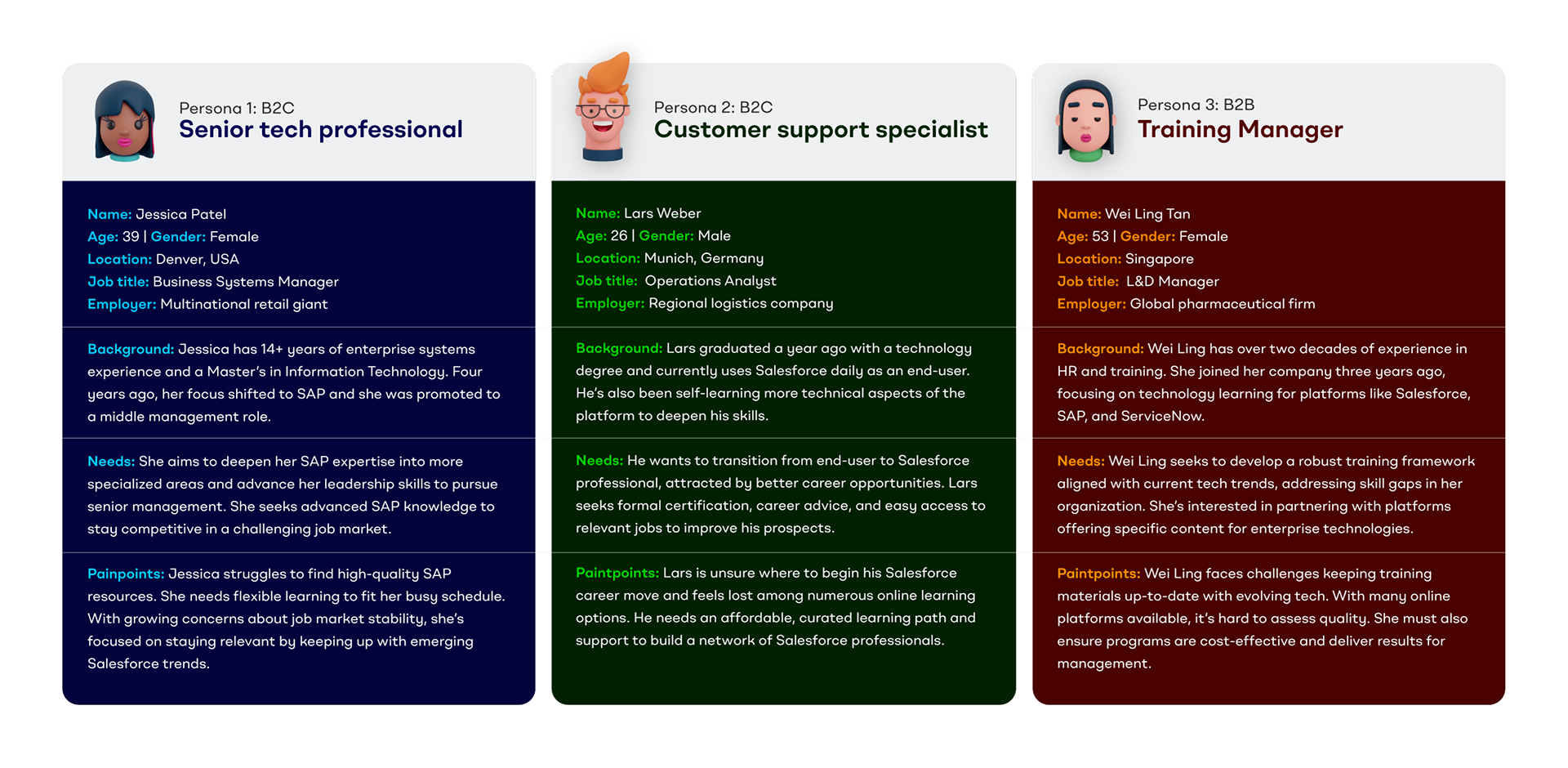
Audience Personas: Focus on Tech's language, UX and visual identity  will be designed to empower at least one of these three core audience personas.

6. Designing the logo
The situation:
As well as the technical considerations of a cross-platform digital product, it was my view that the logo needed to communicate several other core themes and ensure audiences are not alienated by a radically different logo format.
It needed to clearly represent the concept of "focus"— a key word in both the new and old company name and an obvious indicator of the company's commitment to the tech industry.
"Transparency" should represent the brand's commitment to showing what is inside. This could be the contents of certification exams, the truth behind industry news stories or the day-to-day responsible of exciting new job vacancies.
Lastly, the board felt it was important for the brand to reference its parent company. The red, orange and blue represent the three existing brands in the family, in their order of establishment.
The strategy:
I designed the brandmark around a semi-ambiguous crosshair motif, crop marks or camera shutter. These symbols all represent "focus" in their own unique ways.
Not only was the liquid glass aesthetic being popularised by Sky and Apple, this render also symbolised the brand's promise of transparency and inside knowledge.
This powerful brandmark reinforced the ultra-clear logotype, designed to reflect the brand's core vision— providing clear guidance and support for those navigating complex technology careers.
Logo Concepts: Design inspiration and trends (left) and early monotone logo concepts (right) were presented to the working group and discussed. 
Logo Design: The logo presented to and approved by the stakeholders balances an ultra-clear logotype with a unique and colourful cross-hair brand mark perfect for the mobile app coming later.
7. Building a color-coded design system
The situation:
The hub would contain six distinct content types, each requiring clear visual differentiation so users could quickly identify where they were and what they had selected.
The color system needed to be versatile enough to work across ecommerce, editorial content, forums, job boards, and more—all while maintaining brand cohesion and reducing visual stress.
The colours would need to be easily useable and editable by the designers, developers and web content team after launch. They should be saved as swatches, tokens and variants.
The strategy:
I designed a sophisticated color system with six primary colour palettes, each with dark, medium, light, and pastel variants. I was careful to ensure that the dark and medium swatches met WCAG AA  standards and therefore can be used for text in the brand's digital products.
These palettes, coupled with a comprehensive suite of versatile modern greys would provide us with the tools needed to style varied user interfaces and large amounts of technical information.
This color-coding became crucial for wayfinding, helping users navigate between different sections of the website and quickly identify what they had in their shopping cart.
The palette was designed to be friendly, bold and energetic— reflecting the dynamic nature of the technology industry while remaining professional enough for B2B audiences.

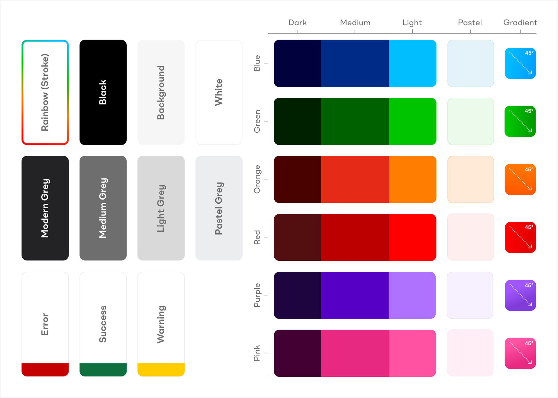
Colour Design System: A large, harmonious colour palette was essential to colour-code the site's numerous content types. It would remind users where they are in the site and what they have in their cart.

8. Creating a bespoke icon library
The situation:
Icons would play a crucial role in the interface, helping users navigate the complex hub and to quickly identify different content types and features.
The digital products and resources hosted by the website would likely not have any product photography or hero images. Icons could also be used to help illustrate the often complex or abstract concepts referred to in the literature. 
The icons needed to feel distinctive and on-brand while aiding comprehension. Content creators and trainers would need easy access to the icon library when the brand was live.
The strategy:
I wanted our strong visual identity to show through in the brand's iconography as well as in messaging and colors.
I designed a set of decorative brand icons using overlaid, gradiented, rounded-corner, folded rectangles—echoing the shapes and effects seen in the logo.
However, testing proved that these were too unusual and complex for navigation or user interfaces. While bespoke and matching the brand's visual identity, they wouldn't provide the instant recognition required. I would recommend that this library be saved for more illustrative media such as advertisements and social media.
For UI icons, I sourced a pre-made library from Streamline that contained the same open, friendly feeling through wide strokes, rounded corners, and off-perfect angles.
I created detailed usage instructions to ensure these stock icons were implemented consistently, making them look like a natural and bespoke part of the brand rather than generic off-the-shelf assets.

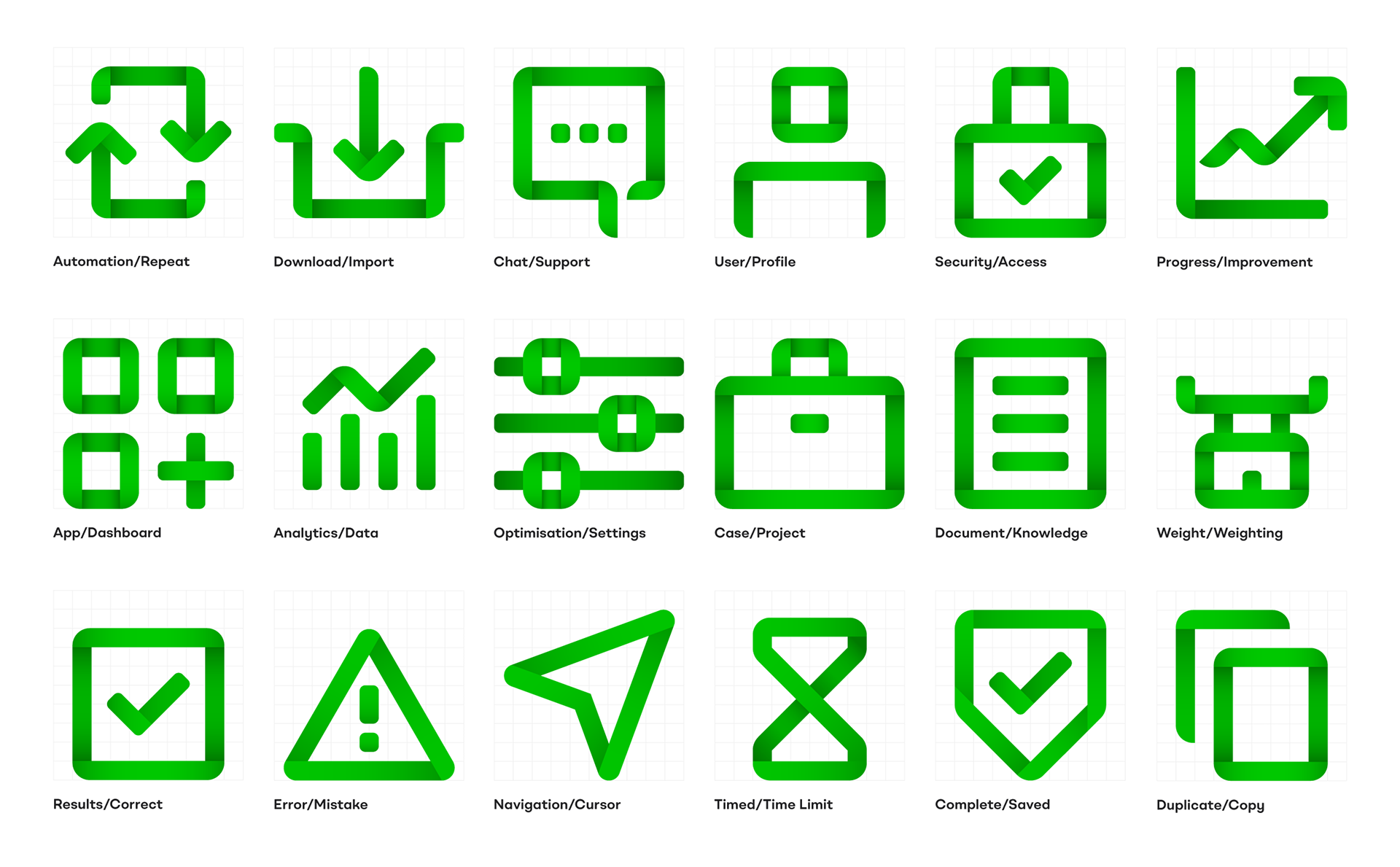
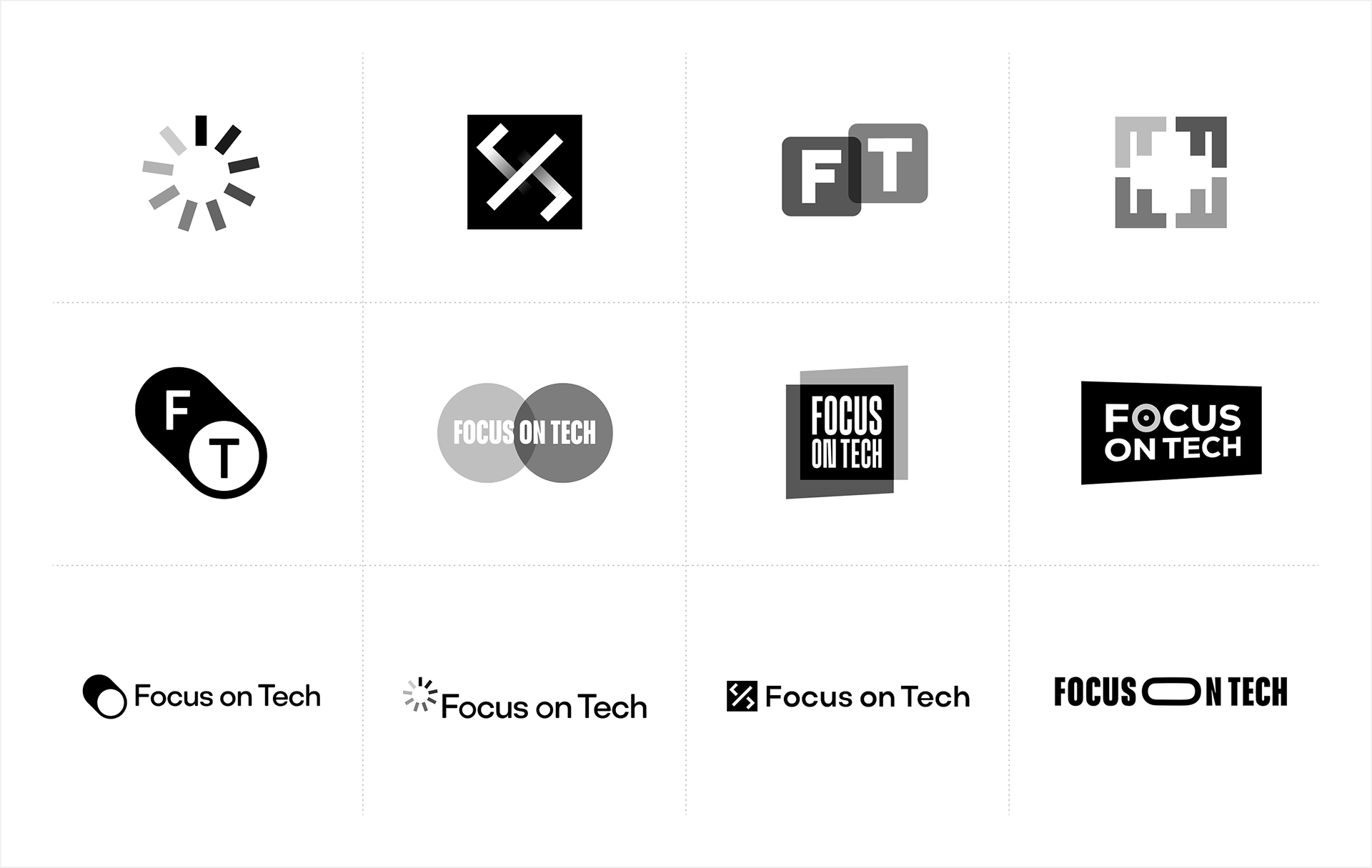
Icon Design: I designed this bespoke icon library POC to further propagate the brand's clear and approachable personality. Upon testing however, the icons were found to be hard to decipher and too ambiguous.

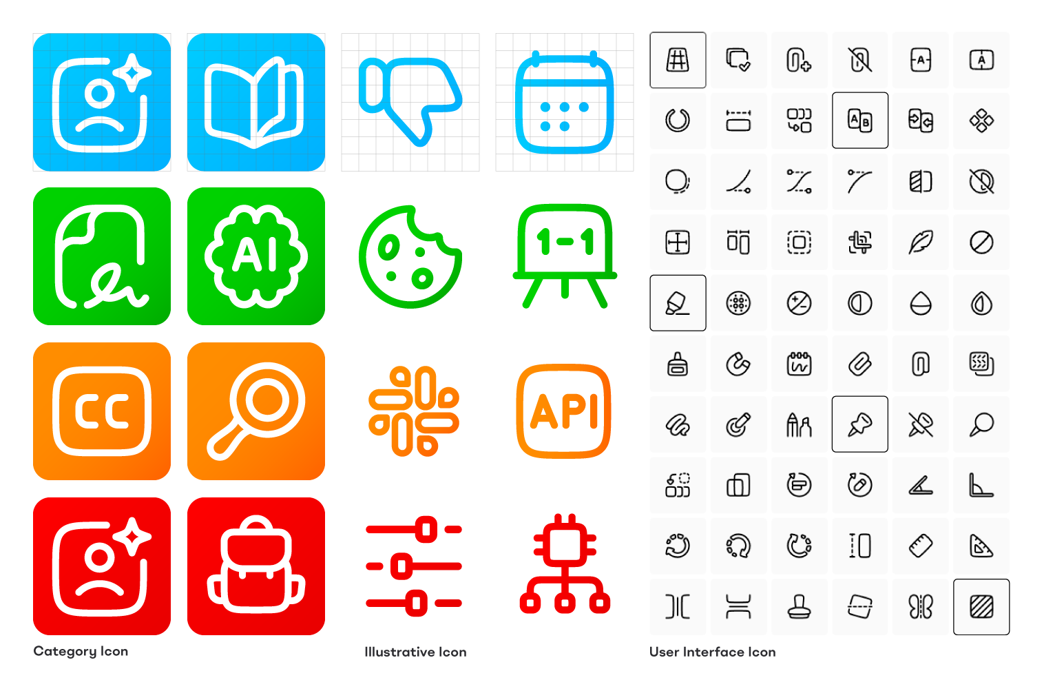
Iconography design: The final library was based on an existing library called Plump Line from Streamline. By customising these simple, rounded-cornered icons, I created an extremely versatile and intuitive visual language.

9. Developing the illustration style
The situation:
One of the biggest creative challenges was illustrating non-physical products. How would we differentiate between different training courses, certifications, and career paths?
I decided to use high quality aspirational photography to illustrate the individual courses themselves. Each product would feature a different lifestyle photograph showing a student or students learning, working or liaising as its thumbnail and featured image.
But a brand as bold and coloruful as Focus on Tech needed something more unique. The illustrations needed to complement the vibrant color palette, break up text-heavy pages, and lighten the brand without appearing cheap or amateurish.
The strategy:
Initially, I proposed bold, bright, 3D-render styled illustrations set against dark backgrounds. Emoji-esque spot illustrations that would pop against the brand's dark colours and inject personality into the brand.
However, after additional market research and stakeholder feedback, I evolved this approach. More abstract 3D illustrations were developed that could be color-coded to each platform section without being too literal in their representation.
These 'fluid shapes' worked as metaphors—representing an elastic, learning brain and the cloud-based nature of enterprise software. They easily incorporated the gradients seen in the brandmark, creating visual continuity.
This more abstract approach proved more versatile and sophisticated, allowing us to illustrate complex concepts without being constrained by literal interpretations.

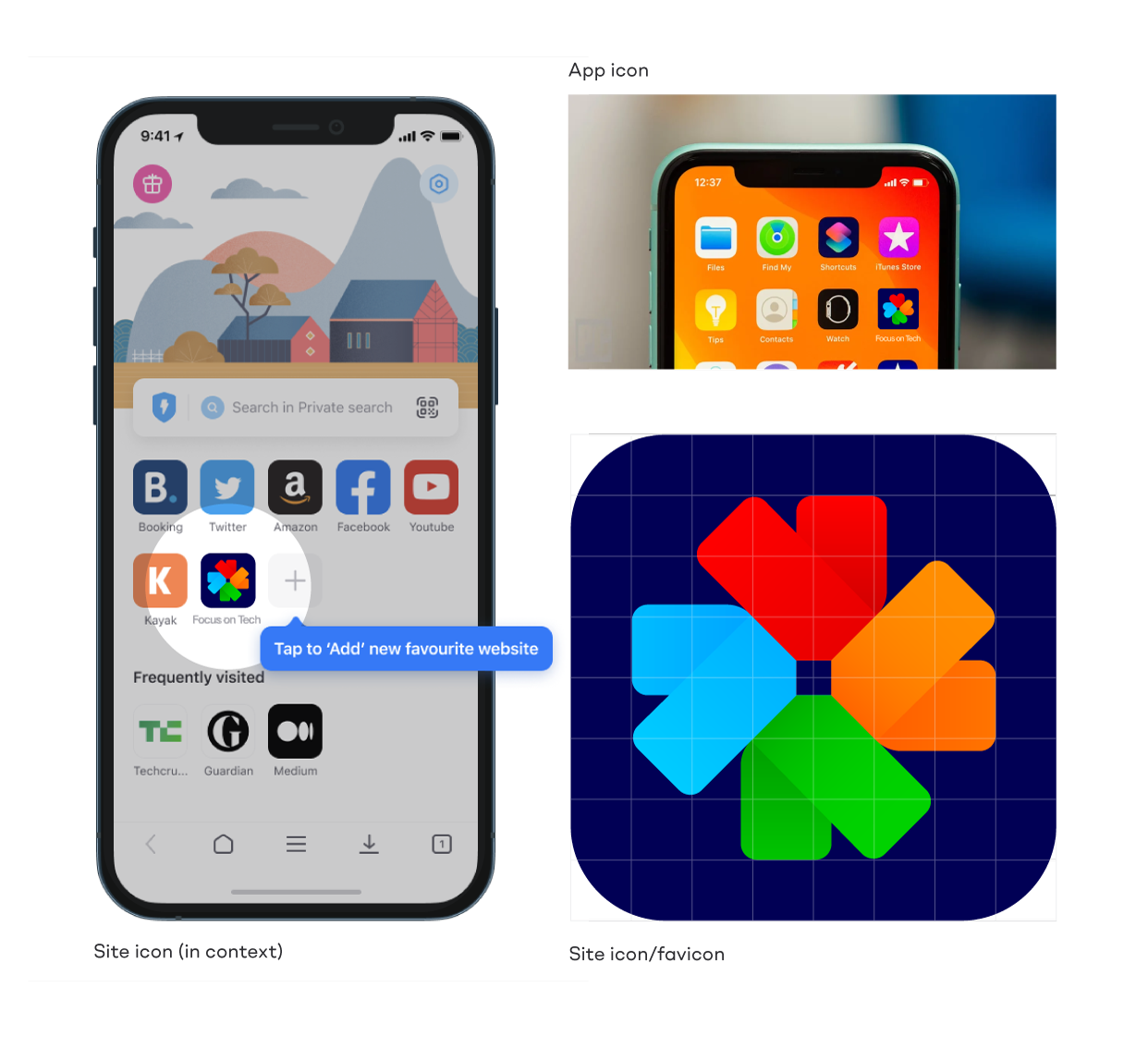
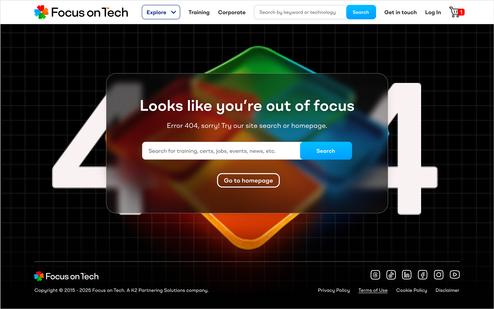
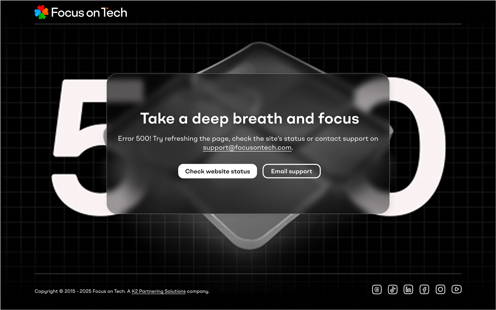
Fallback Images: I created a series of fallback images for each category to ensure that the dynamic multi-team website never had any missing images or let the brand down.

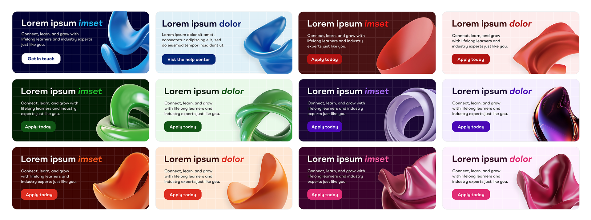
Responsive Illustration: I designed this suite of banners to be versatile and responsive. I.e. The illustrations are perfectly cropped and positioned no matter how much text the web team enter in the banner templates.

Developing an Illustration Style: A mix of figurative and abstract illustrations over a grid and bold colours ensure a unique and recognisable illustrations style.

10. Establishing photography guidelines
The situation:
The platform would need extensive photography to represent its diverse, global audience and bring life to the content.
Business— and technology— photography in general can be bland, safe and repetitive. Showing the same recognisable office scenes or colleagues in a blue office huddled over a work computer.
Our bold new brand needed a new approach, as well as something to help support the bold colours palette.
The strategy:
To help differentiate the new brand from its competitors, it was my idea that photography needed to represent the people behind the professions. I.e. shots that show the tech professionals as real people with full lives outside of work.
My art direction called for exotic, vibrant settings with bold colours complementing the brand's core palette of six— allowing the images to further colour-code content.
Models should be slightly quirky, in interesting poses with unusual distinguishing features.
This high-quality lifestyle photography would allow the brand to stand out in social marketing, and create strong associations of the exciting possibilities of their training.

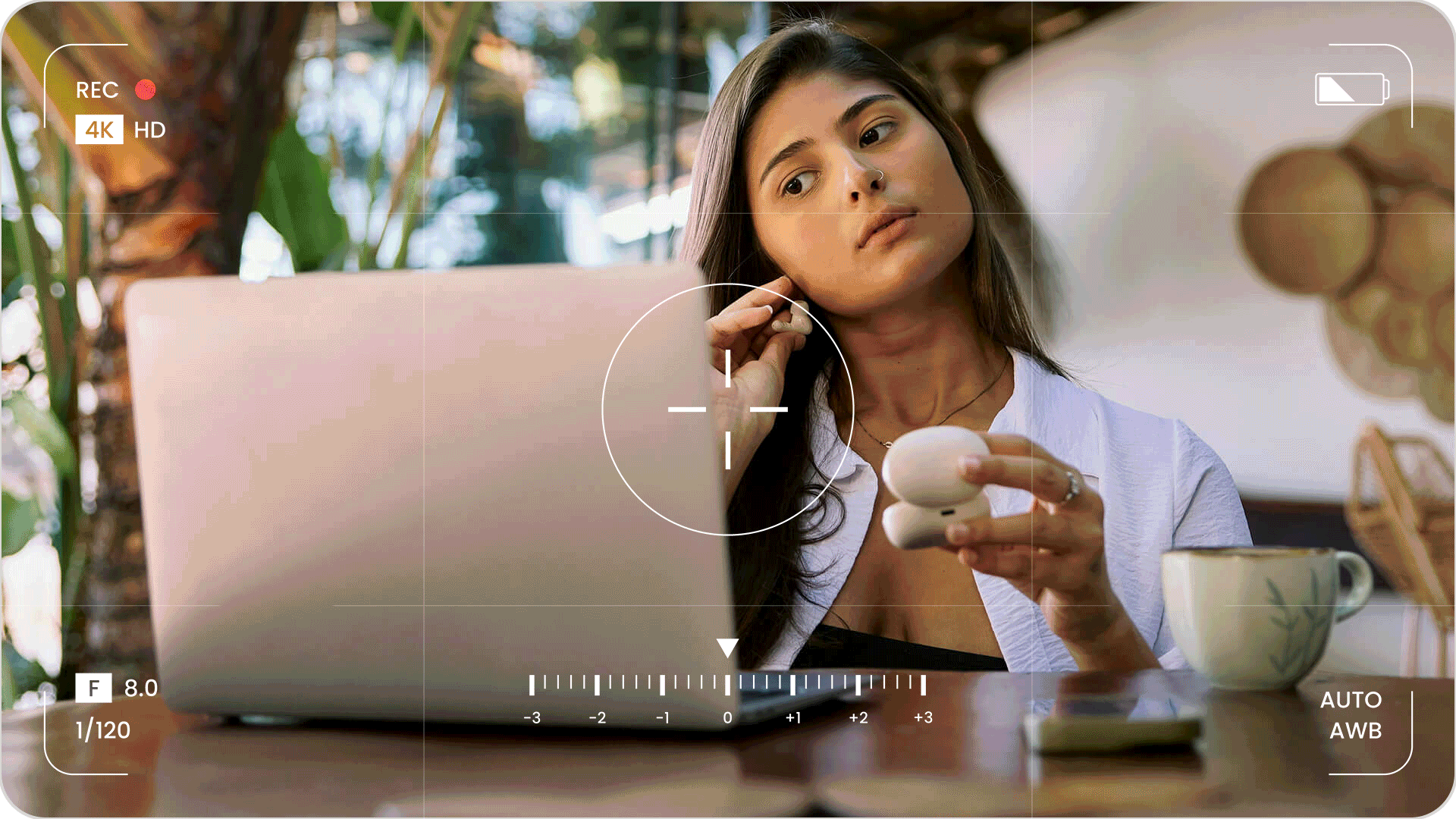
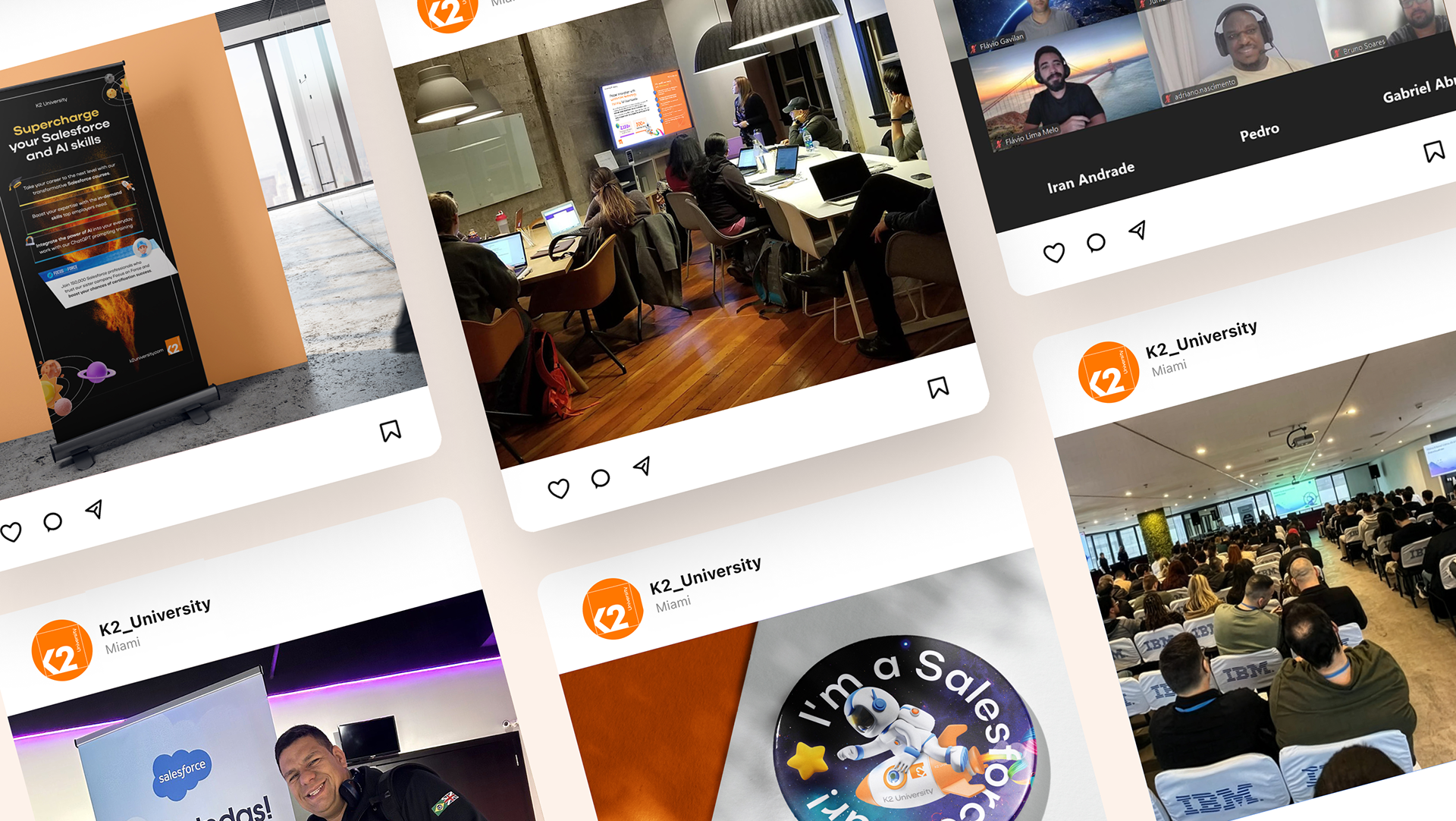
Photography Art Direction: Lorem ipsum isme dolor sit amet.

11. Wireframing the page templates
The situation:
We needed to nail down the information architecture and user journeys before me and the team began designing the web style guide.
Senior stakeholders had a clear vision for how the platform should function, but this needed to be tested and validated through wireframes.
Analytics data showed the vast majority of the legacy site's users browsed using laptops.
The strategy:
We would focus on wireframes, proof of concepts and initial web designs on the most common device width.
Our senior UI/UX designer and myself started by producing initial desktop wireframes for three critical pages. One landing page and two core templates that would be used regularly across the site.
I initially proposed a highly commercial eCommerce-style hub page that used the above-the-fold area to promote products, push content, and engage users with trending topics.
Feedback from senior stakeholders revealed a different vision: the website should act as a large intuitive menu, with users making their way to desired content by filtering through each page like an interactive menu. Technology pages should act more as 'discovery hubs' rather than hard-selling sales pages.
This feedback was invaluable in shaping our approach, ensuring the final product would match stakeholder expectations while still serving user needs.

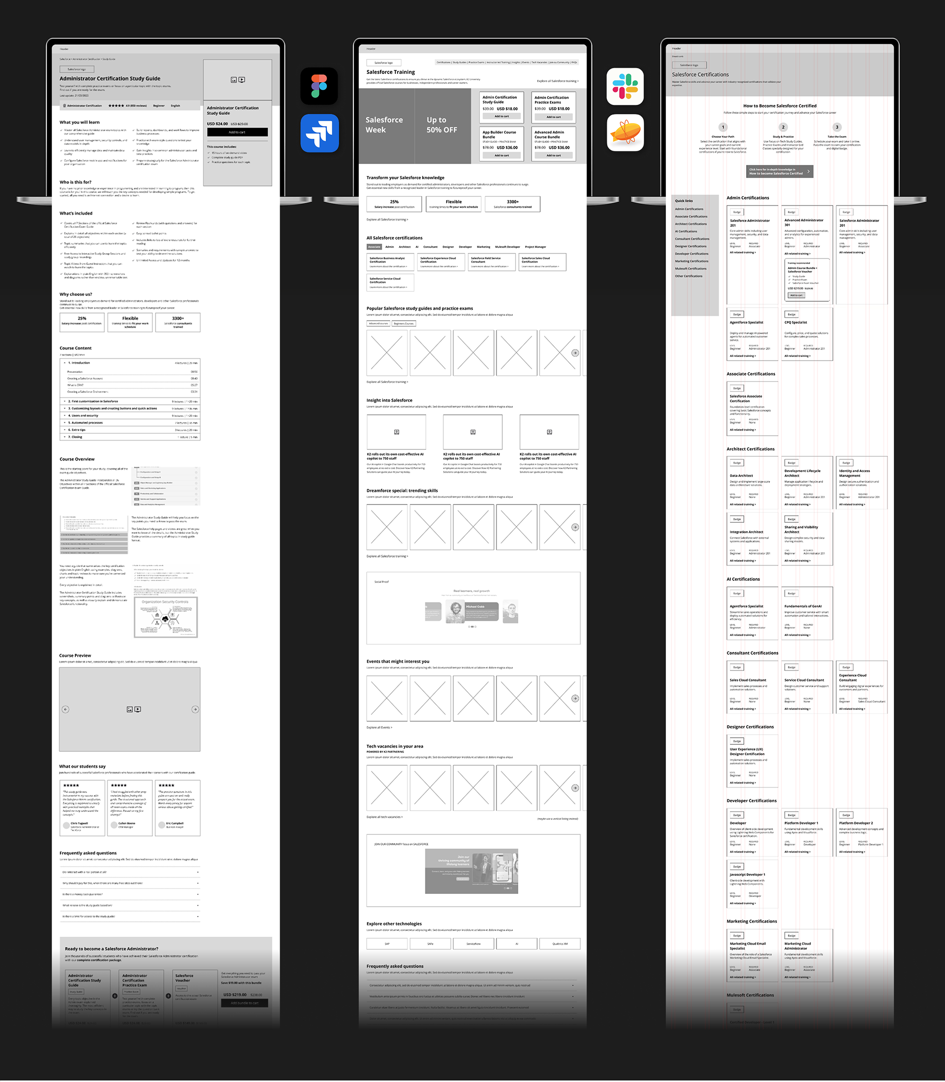
Wireframing: Laying out content and pinning down informational hierarchy in Figma allowed us to identify areas that needed additional discussion with stakeholders— such as the area above the fold.

12. Designing proof of concept pages
The situation:
The next step was to show stakeholders something tangible that established the visual direction and that would help secure buy-in.
The working group needed to see how the brand elements— its colours, typography, iconography, and illustration— would come together in the actual interface.
The strategy:
Together with our junior UX designer based in Bangkok, I designed proof of concept versions of the same three core pages, using and expanding upon the visual identity established during the branding process.
These high-fidelity designs demonstrated how the color-coding system would work in practice, how the brand would feel to use, and how the various content types would be presented.
The designs provided a concrete reference point for stakeholder discussions, moving us from abstract concepts to specific decisions about the user experience.

Proof of concepts: Initial concepts helped stakeholders get a good idea of the proposed look and feel of the site.It was decided after careful review to more clearly separate colour palettes to improve branding and cohesion.

13. Building the Figma prototype
The situation:
A comprehensive, interactive prototype was needed to communicate the full user experience to stakeholders and provide a detailed blueprint for development.
The prototype would need to demonstrate user flows, interactions, and the responsive behavior across different devices and screen sizes.
The strategy:
I worked closely with our senior UI/UX designer based in Brazil, who executed most of the Figma work itself while I reviewed, commented, and directed alongside our project manager.
I personally led on and artworked important new sections that required particular attention or presented unique challenges.
Together we built up a comprehensive block and component library, ensuring consistency and efficiency. A complete design system was documented, providing developers with everything they needed.
The result was a fully interactive prototype that stakeholders could click through and experience, making it much easier to gather meaningful feedback and make refinements.
Prototyping: No custom-designed website would be complete without bespoke branded error pages. I designed these two to be in contrast to the light-themed pages of the primary site, with rich colours and a sense of humour.
14. Presenting to stakeholders
The situation:
It was time to present our progress to the entire working group. We needed to ensure alignment and gather feedback.
These prototype presentations needed to clearly communicate design and decisions and strategy while remaining open to input and further iteration.
Busy stakeholders unable to attend the call would need a link to the prototype to review in more detail in their own time.
The strategy:
I presented the working prototype in Figma, walking stakeholders through key user journeys and explaining the rationale behind design decisions.
The interactive nature of the prototype made these sessions much more engaging than static presentations—stakeholders could experience the platform as users would, leading to more informed feedback.
These sessions created valuable dialogue, surfacing concerns early and building confidence in the direction we were taking.

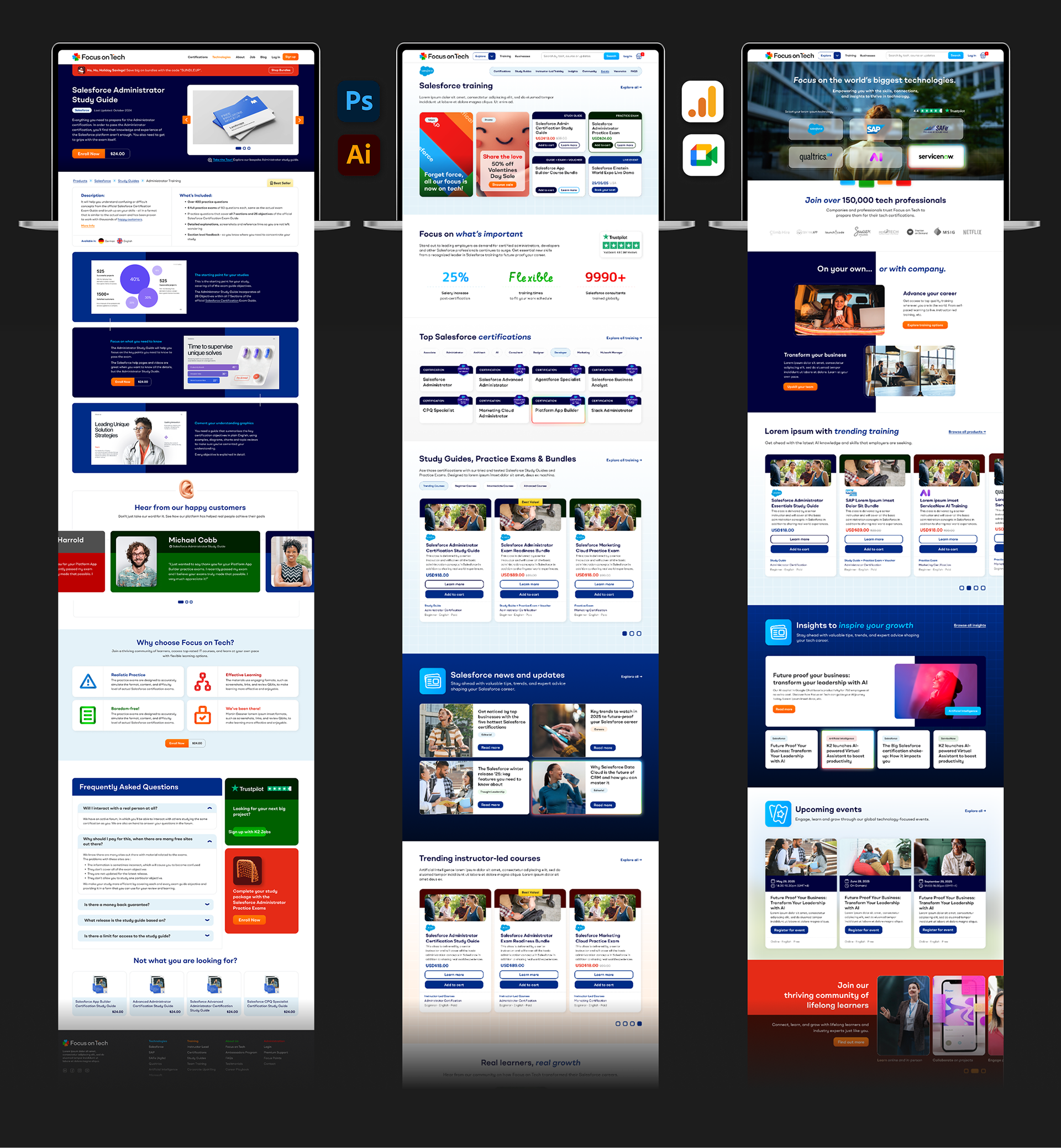
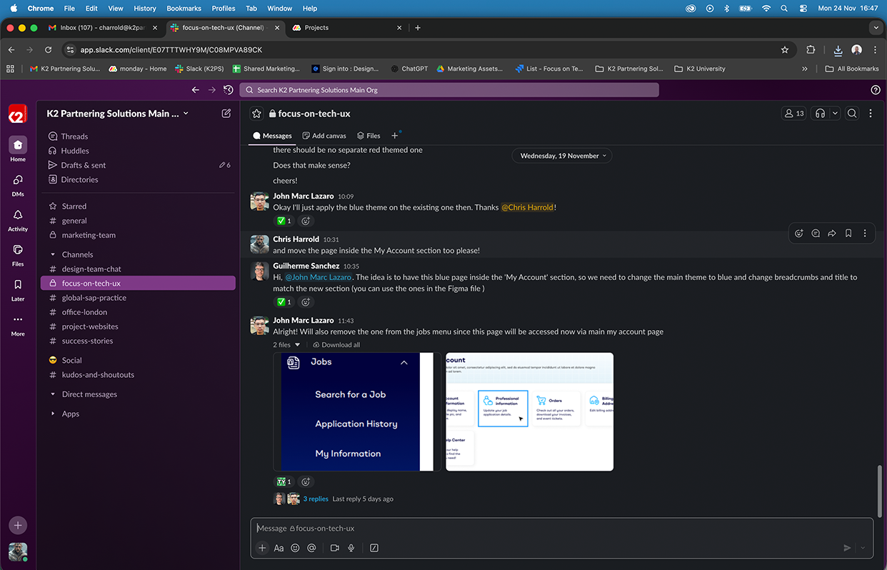
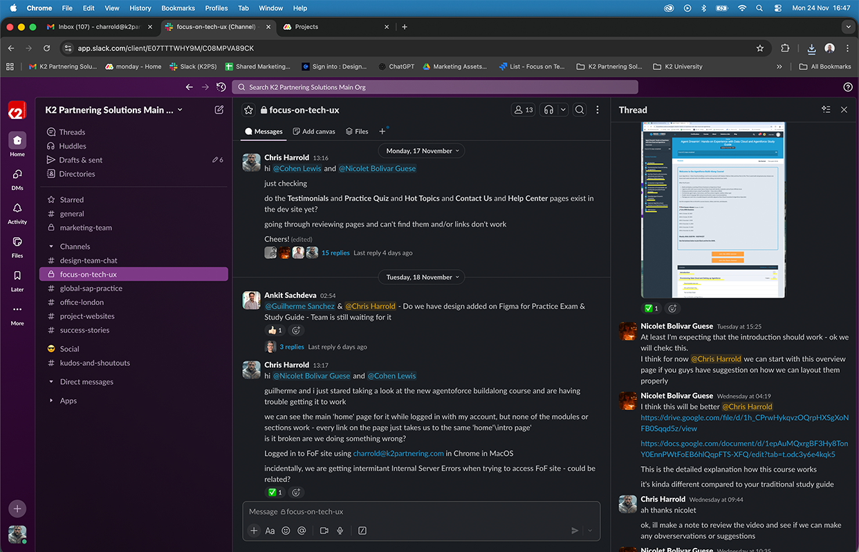
Presenting the Prototype: I presented the functional prototypes to the stakeholders and received some great feedback. They were "very pleased and impressed".

Mobile Prototypes: The UX designer and myself prototyped the core user journeys. This e-commerce shopping flow was prototyped on mobile. 
15. Collaborating with developers
The situation:
The development team, based in the Philippines and Australia, would be responsible for bringing the designs to life. Close collaboration was essential to ensure the final product matched the vision.
Regular communication was needed to discuss technical constraints, provide missing assets, and make practical decisions about implementation.
There was a chance some of the nuances of the design could be missed and complex behaviour and logics may need to be explained in person.
The strategy:
Each week, the development team presented their progress. We would discuss, provide feedback, make suggestions, and supply any additional or missing assets they needed.
Sometimes changes to the prototype were made based on learnings from the first build. It was important to stay flexible and pragmatic while maintaining design quality.
This regular cadence ensured problems were caught early and the team remained aligned throughout the development process.
16. Quality assurance and refinement
The situation:
As development progressed, thorough quality assurance was needed to ensure the platform met both functional requirements and design standards.
The QA team would inevitably uncover issues—from technical bugs to UX inefficiencies—that needed addressing before launch.
The strategy:
The QA team began testing the development website and feeding back to us in our weekly calls.
They noted areas where the UI could be improved, identified problems or inefficiencies in user flows, and flagged technical bugs that affected the user experience.
I worked with the team to delegate and oversee fixes as required, prioritizing issues and making decisions about what could be addressed pre-launch versus post-launch.
This rigorous testing process ensured we delivered a polished, professional platform that would reflect well on the new brand.
Quality Assurance: I worked closely with the QA team after the first build to improve the designs and interface, address errors or bugs or, in this first example, spot elements that have not been successfully colour-coded.
17. Handover and launch
The situation:
With brand guidelines, prototype, design system, development site, and training materials complete, the project needed a smooth handover to the teams who would operate and maintain it.
Four different teams would take ownership of different aspects of the platform, each requiring clear documentation and training.
The strategy:
The Education team would populate the website with training materials, courses, and dates. The Marketing team would maintain prices, promotions, news, and events. The Sales team would manage the jobs board. The Web team would handle technical maintenance and optimization.
Comprehensive brand rollout training and internal brand training ensured each team understood not just what to do, but why—helping them make on-brand decisions independently.

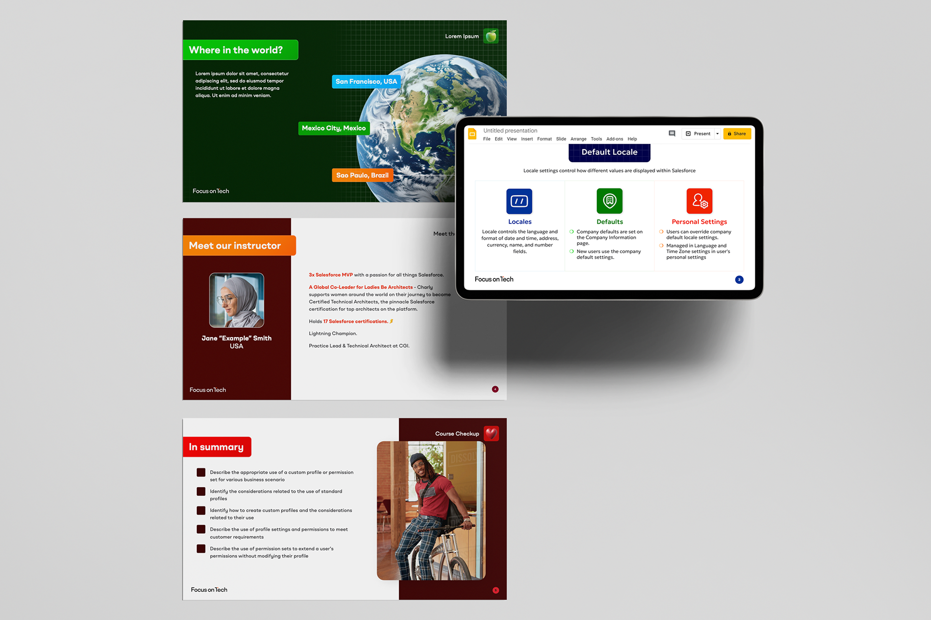
Handover and Training: I created a branded template for training materials. Over time, this would allow the Education team to replace out-of-date course materials. Trainers and marketers also got training on the new brand.

18. The project's impact
8 months
delivery time from brief to launch-ready platform.
4x
integrations (Salesforce, BuddyBoss, WooCommerce, Trakstar)
SEO
equity preserved from existing e-commerce site
Satisfied
stakeholders with a self-service platform built to scale
While the project is currently in its final stages in preparation for going live in Q2 2026, I am pleased to list the following successes:
The stakeholders were extremely pleased with the transformation, recognizing that Focus on Tech now had a brand and platform that could scale with their ambitions.
The new brand successfully communicates a multi-technology offering while preserving the SEO equity of the original ecommerce store—solving the core challenge that initiated the project.
The color-coded design system enables users to navigate the complex hub intuitively, quickly identifying different content types and sections.
The comprehensive design system, component library, and brand guidelines empowered the internal teams to create new content and pages efficiently while maintaining brand consistency.
Focus on Tech successfully transformed from a single-product store into a sophisticated technology learning platform, positioning the business for growth across multiple technologies and markets.
"I just wanted to tell you you've been awesome every time we've worked together."
Luca Manera, Global Solutions Director, Focus on Tech
"It was really great working with you. You were always easy to collaborate with and brought such good energy. You've been doing great work."
Amson Maurice, UI/UX Designer, Focus on Tech

You may also like

Back to Top