Launching into a new market

Repositioning a B2C training brand for enterprise clients: How I defined K2 University's brand and shaped its marketing through the development and rollout of a bold theme and powerful visual metaphors.

1. Identifying the challenges
The situation:
After a long period of growth and a number of strategic acquisitions, K2 University needed to adapt its brand and expand its marketing to appeal to the B2B market.
As well as recognising that a new more professional visual language and messaging were required, a new B2B business model had been developed that provided businesses with qualified, experienced, ready-to-work teams.
The young professionals chosen for these programs would have an accelerated pathway directly into their dream career. I also needed to ensure that these candidates could engage with the brand.
2. My role in the project
In my hands-on role as Head of Design for K2 group, I worked with the brands’ managing director and the global marketing team to evolve and adapt K2 University's brand for its new audiences over a period of 18 months.
The agile team of international creatives I led worked methodically to improve the effectiveness of both B2B and B2C marketing across multiple channels and mediums by developing the foundations of a bold, effective tech educator brand.
3. Branding the new program
The situation:
K2 University had traditionally targeted individual students looking to upskill and progress their careers and its marketing relied heavily on basic aspirational marketing or mirror strategy.
The brand's tone of voice was casual, guidelines were ill defined and a coherent visual identity had never been developed.
The needs of businesses were not directly addressed in marketing collateral.
The strategy:
After a number of creative brand workshops in which names were discussed, these new service offerings were named "Launchpads". This evocative name gave the brand a strong theme and visual identity.
Accelerating quickly through the atmosphere, rushing towards an exciting unknown future, leaving the everyday behind and traversing the (enterprise) clouds, students could think of themselves as astronauts starting their training, or pioneers escaping the humdrum of a boring career.
Businesses could quickly grasp the concept of the product with the 'acceleration' and 'launch' themes so obviously reflected in the brands visual identity and motifs.
K2 University knew that accelerated placements and ready-to-work, skilled teams are desirable and the company could leverage its parent's 25 years experience of placing talent.

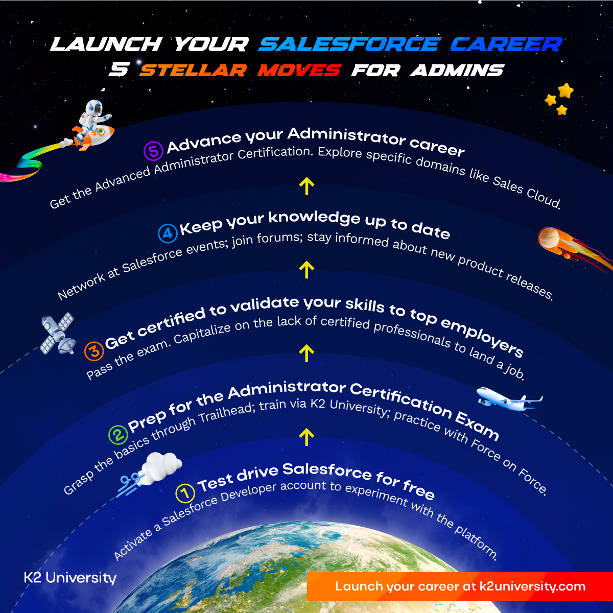
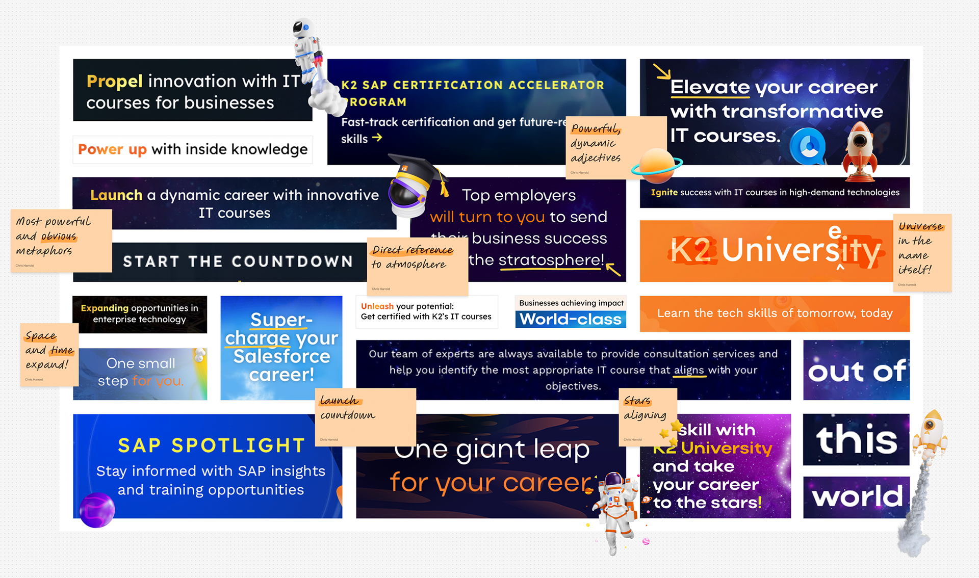
Brand messaging: It was important for the brand to fully embrace 'launch' themes to provide clarity and confidence. Subtle and not-so-subtle references were built into the brand's boilerplate copy and ad messaging.

inclusion
inclusion
Diversity
Diversity
Representation
Representation
Launchpad
Launchpad
DE&I: Communicating the company's DEI commitment was a key brand requirement. I used atmospheric gradients and rainbow spectrums throughout the identity, connecting the space theme to DEI values in a way that felt organic, not forced.
4. Developing the art direction and theme
The situation:
A unique brand identity had never been developed for K2 University. It had its own legacy orange brand colour, but shared many of the same brand guidelines as its parent.
How would the brand evolve to be able to communicate complex training and placement programs in a language understood by business? 
How would it stand out against its competitors, and ensure it was trusted over SAP and Salesforce's own training offerings?
The strategy:
A new refreshed colour palette allowed the brand to speak confidently in the tech sector while retaining its character and quirky personality.
A new space/launch theme opened up a huge world of opportunities for rich, high contrast visuals and in-vogue grainy gradients. 
Rainbows— a common and well known atmospheric— also acted as a metaphor for the diversity, equality and inclusion integral to the brand's global enablement.

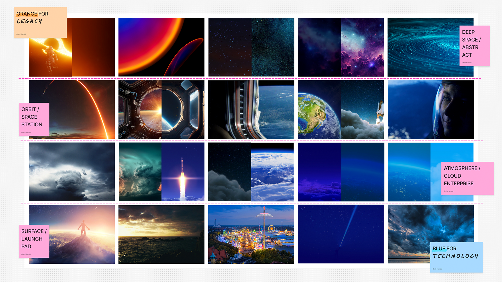
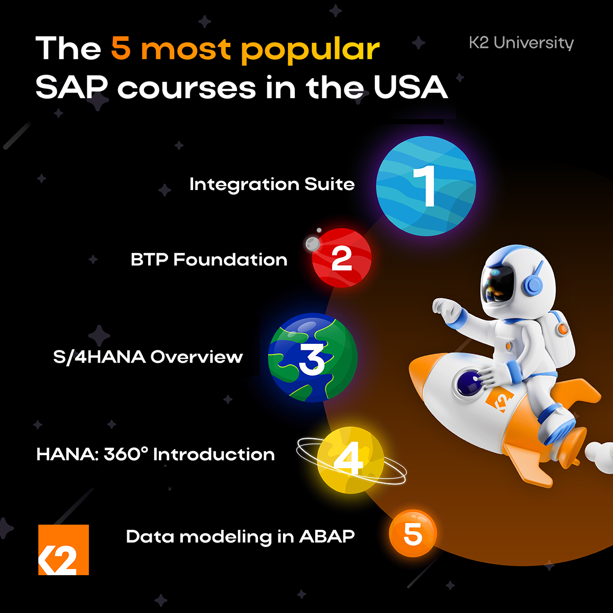
Moodboarding: Moodboards were created to explore the new 'launch' and 'space' themes. The brand's legacy orange colour was balanced against the tech industry's ubiquitous blue palettes.

5. Designing a mascot
The situation:
From my research, I knew it was important for the brand to feel like a trusted friend and advisor, guiding tech professionals at the start of their career through complex qualifications and career trajectories.
The brand also needed a versatile and repeatable illustration style— something that could be easily used by social media marketers, trainers and content teams.
The strategy:
A brand mascot was developed, designed to be androgynous, friendly and enigmatic.
"Kosmo" the astronaut (with a "K", of course) helped shape marketing into a much more personal briefing from an experienced, trusted companion.
I wanted potential students to put themselves in the shoes of an astronaut on the launchpad - excited for the life changing journey they were about to blast off on.
At first, the lack of features seemed a useful way to ensure the mascot would not alienate (no pun intended) any of our global audience. However, it became apparent that the lack of personality could be stopping our audience building a connection with the brand.
I started looking for a better solution...

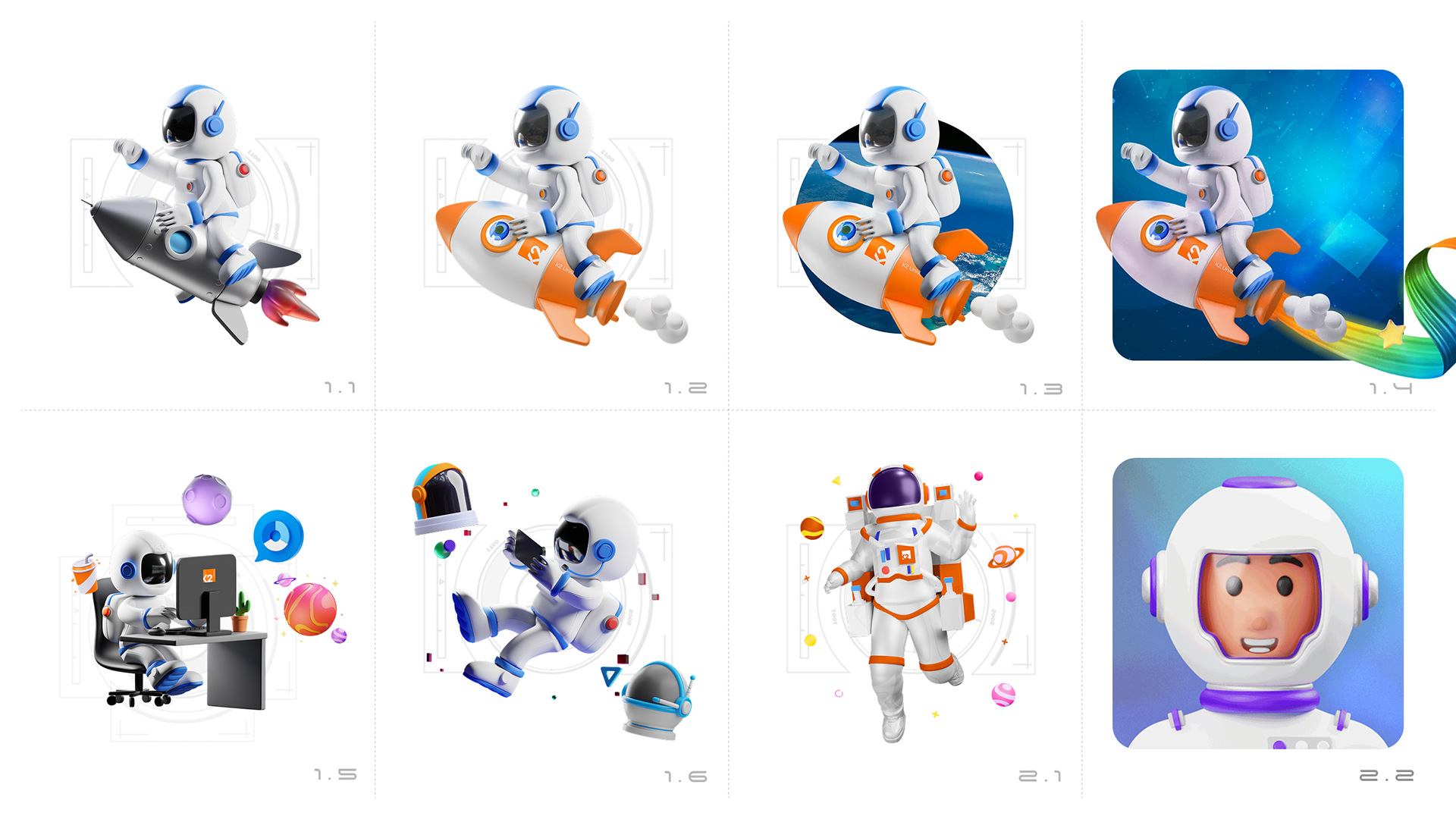
Mascot design: A trusted, repeatable astronaut mascot was conceived to act as a trusted guide and mentor. These initial concepts show the character developing in complexity and incorporating more core brand motifs.

6. Generating an advanced AI avatar
The situation:
Marketing directly to businesses, it seemed, required something a bit more sophisticated. Something with more depth than a static 3D character could provide.
As a brand built on providing one-on-one training to a typically younger market than its parent K2 Partnering Solutions, it also needed to prove its value through personal content-creator style short form video marketing.
Something difficult to do with a faceless helmet-wearing astronaut.
The strategy:
With the increasing availability of generative AI tools, I used key insights from our web analytics, salesforce data, trainer experiences and marketing input to pin down a number of audience personas.
After some official training and some trial and error, I made use of a suite of AI tools including Gemini, Midjourney, Kling, Eleven Labs and Udio to generate an AI avatar that can lip-sync to scripts and adapt to any environment.
Sex, race, distinguishing features, voice timbre, accent, tone of voice and eye contact were all carefully chosen to most effectively communicate with our target audience demographic.
Speaking to camera in front of a carefully considered and themed background has proven successful for creators on YouTube and TikTok.
AI Mascot development: The first step was generate the visual characterises of the avatar, designed to appeal to our target demographic. Gender, age, race and distinguishing features were carefully considered along with environment design.
AI Video Editing: A consistent accent, tone of voice and lip syncing ensured generating new short form video content was quick and easy.
7. Recruiting the students 
The situation:
K2 University’s first launchpad client was Calzedonia (now "Oniverse"). The Italian company needed a Salesforce team in Naples for their new omni-channel digital hub. They committed to hiring 100 young IT professionals over two years.
It was now time to find the right people for the program. The ads needed to use the clients' brand as these students would end the program with a job at Calzedonia itself.
The strategy:
Instagram and LinkedIn ad campaigns were devised to target tech professionals at the suitable stage of their careers in the Naples catchment area.
The positions were advertised by K2's international team of recruiters and via its job board(s).
Sales enablement materials such as one-page sales sheets and pitch decks were made available to the sales teams, along with a high-converting Calzedonia-branded landing page.
Positions on the team were quickly filled with an agreement to repeat the program the next year.

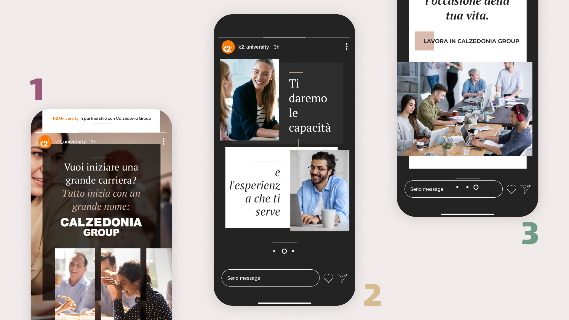
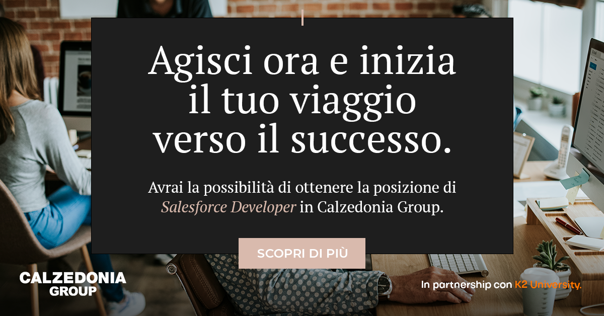
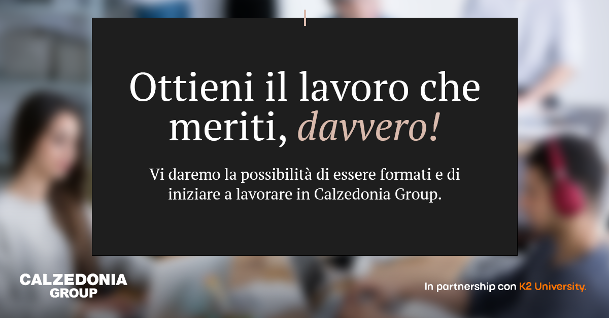
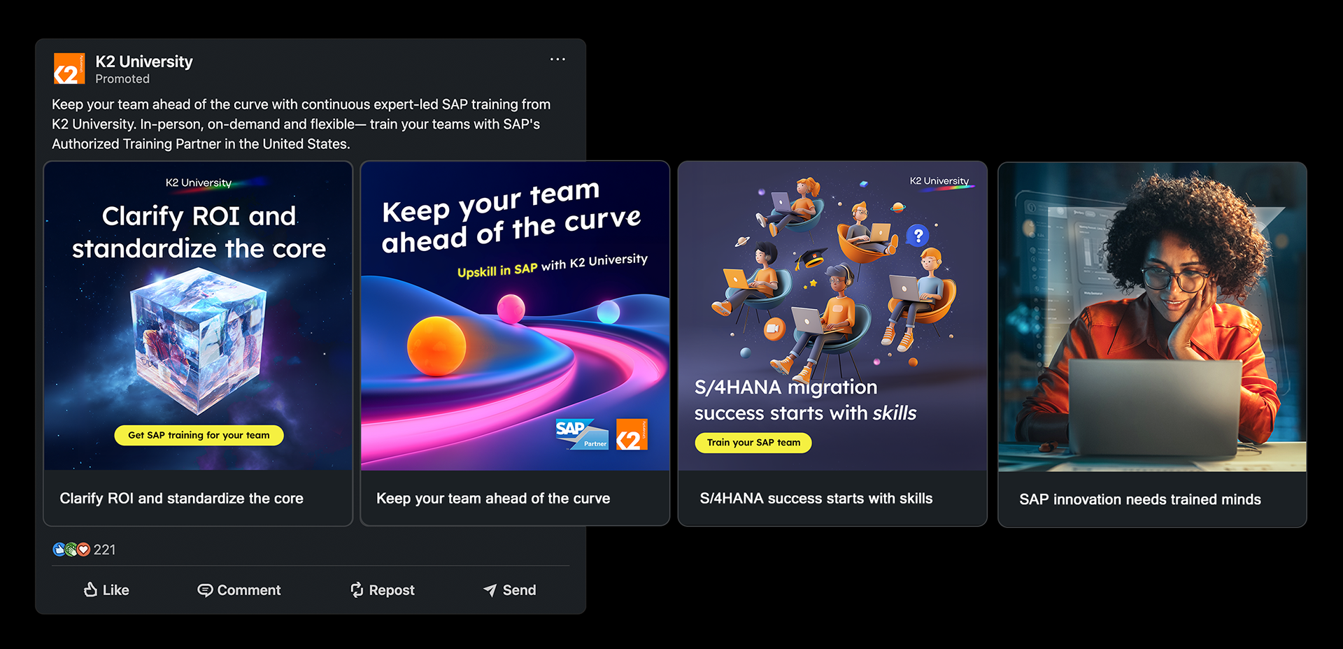
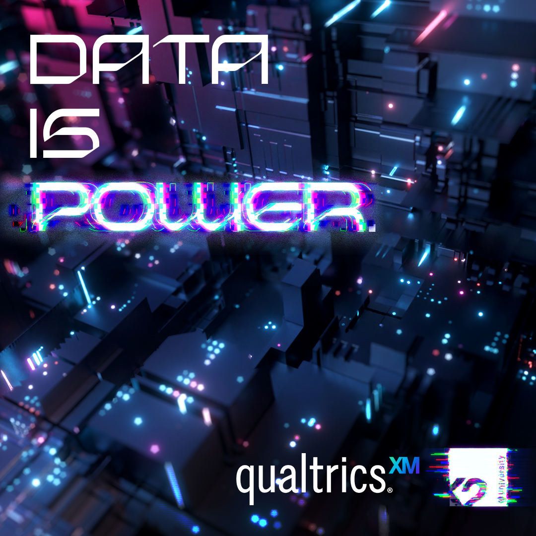
Co-marketing: I designed a series of social media ads using the client's branding to attract the perfect students for the new program in the Naples area. Two marketing interns in Boston worked under me me overhaul the brand's social profiles during this time.

Social Ad Campaign: As well as Instagram, LinkedIn was chosen as the most suitable platform to find young tech professionals at the start of their careers. Static and video ads were designed and written for the Italian audiences.
Successful Placements: The first group of Launchpad students were placed thanks to a successful paid social media ad campaign and a high converting landing page.
8. Marketing to business leaders
The situation:
The launchpad concept started as a pilot program for Salesforce talent only. In order to prove its worth, it needed to attract businesses looking to fulfil technical projects using other enterprise technologies such as SAP and ServiceNow.
The multi-stage process needed to be explained clearly and the real-world value of the program needed to be obvious from the start.
The strategy:
A paid ad campaign was written, designed and launched to generate interest in the new service offerings.
Myself and the design team created an initial series of paid ads targeting pain points of businesses and developed a new landing page on K2 University's website providing information about the new program and its benefits.
The programs were promoted through the homepage slider, fixed banners and the Salesforce consulting pages on K2's other websites.
I made sure that sales enablement materials such as pitch decks, sales sheets and case studies were updated to include the new programs.
Social Ads: Assorted paid ads targeting businesses make use of the high contrast space theme while ensuring the brand's  orange remains prominent. Simple messaging addressing specific pain points was found to have the best results.

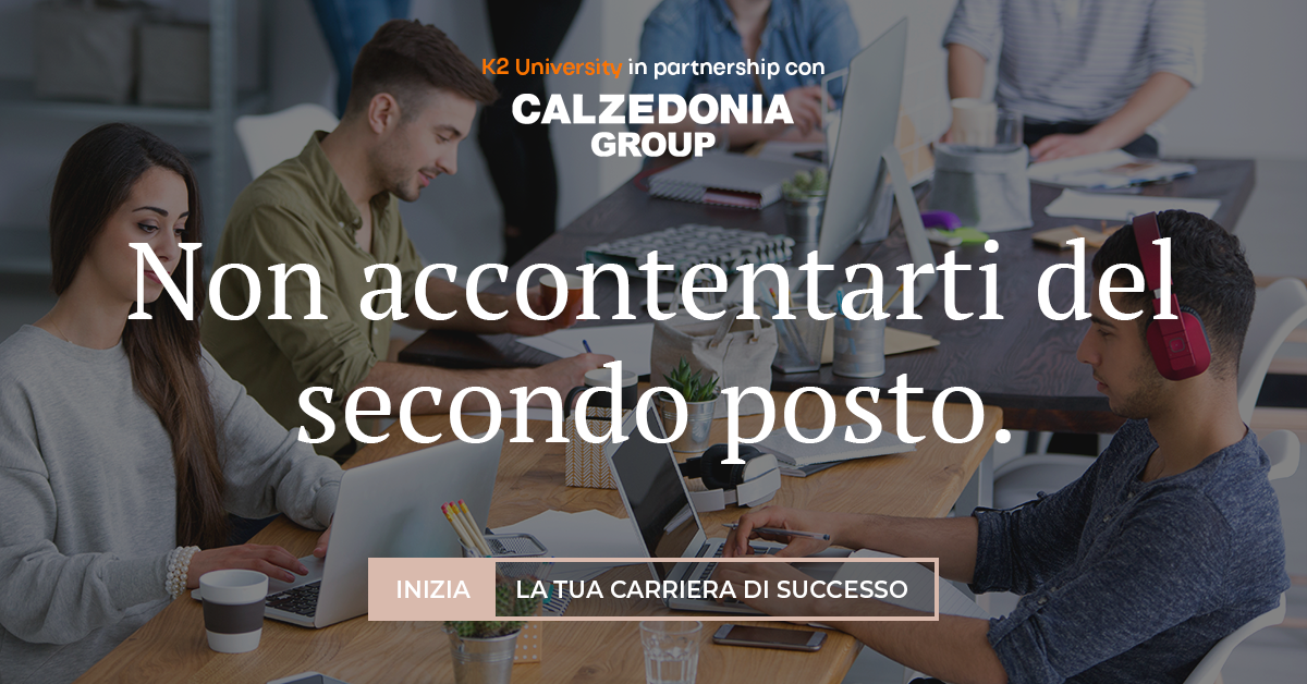
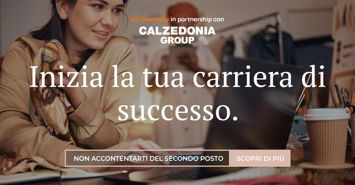
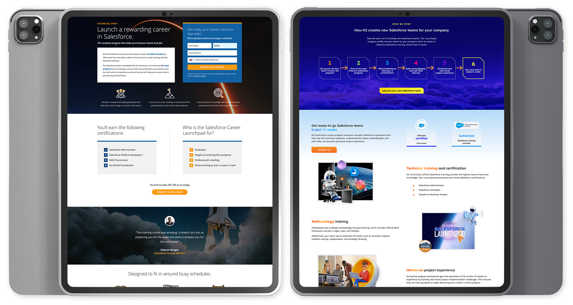
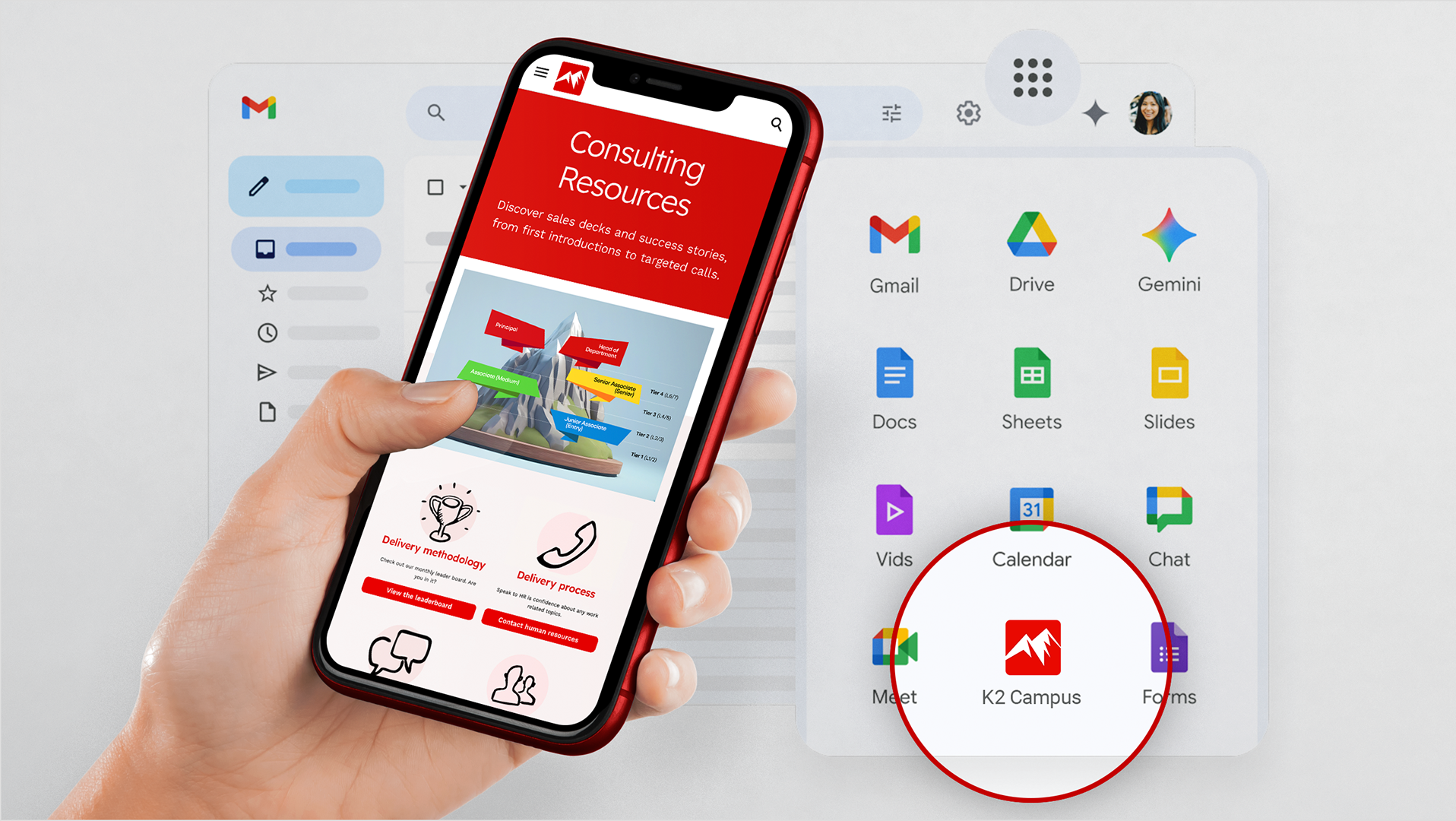
Landing page design: A landing page was designed using the existing branding (left) and compared to a proof of concept I designed using the new launchpad theme (right). The brand would be further refined and a cleaner web interface designed in time.
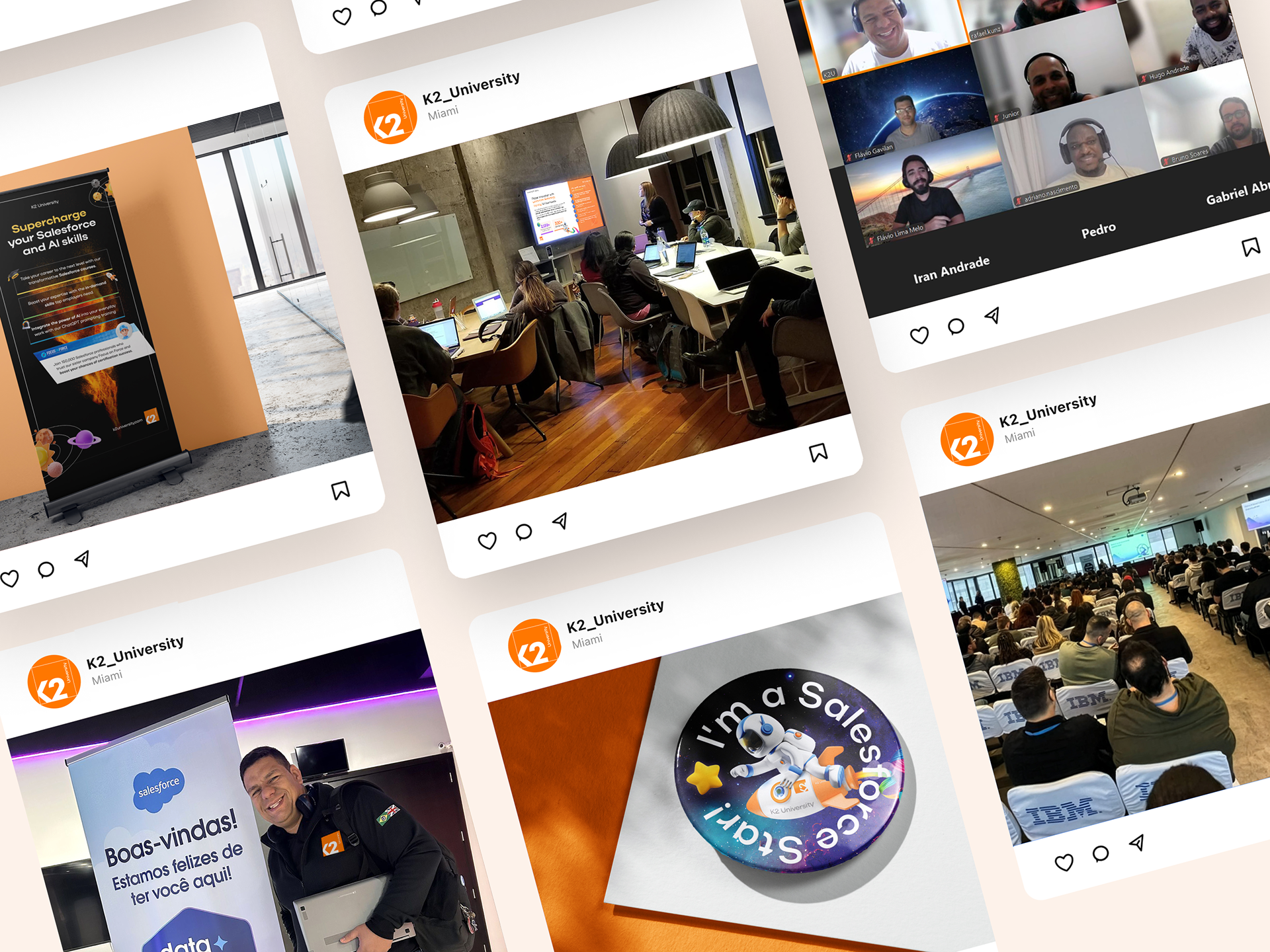
9. Educational marketing
The situation:
Regular webinars were planned to be hosted by key trainers and promoted via the brand’s extensive social network, email and paid ads. The company would also arrange a presence at important industry events.
Co-ordinating with trainers, our digital marketing executives and education heads in Brazil, I designed simple, compelling hero imagery and mini event lockups to promote the year's program of events. 
When the hero imagery for a campaign had been finalised, my team rolled out all the variants and templates required.
The strategy:
Regular webinars were hosted by key trainers and promoted via the brand’s extensive social network, email and paid ads.
The bold new colour palette, launch/space themes and new B2B messaging were combined to cement the brand's position in the market.
I led the design of simple, compelling hero imagery, mini event logo lockups, promotional material printed event collateral and signage.
Webinar marketing: ​​​​​​​Compelling, powerful titles were given to the brand's numerous webinars and virtual training sessions. In this campaign, I liaised with the brand's marketing manager to test the effectiveness of abstract imagery against aspirational photography.

Event marketing: ​​​​​​​The space/launch theme was proved a success at events, in-person training sessions and webinars via puller up banners, presentations, merchandise, video conferencing backgrounds and more.
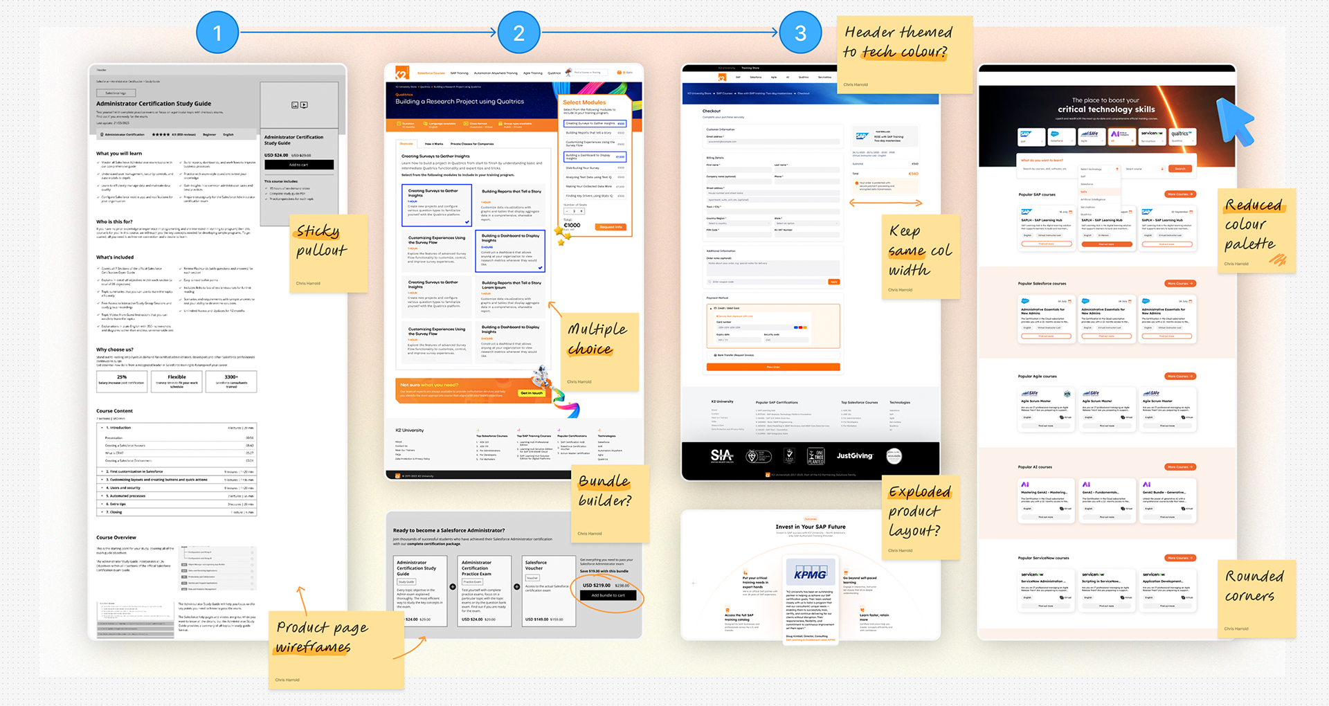
10. Optimising the user experience
The situation:
The company sold its training directly via its sales teams and close client relationships, but also via its eCommerce store.
Business and individuals both needed to be able to purchase training, but the shopping and checkout processes were very different.
The strategy:
These distinct user journeys needed to be mapped and the UI updated. We also needed to ensure the web store matched the new refreshed branding.
Working with our UI/UX designers in Brazil and India and our web developers in Spain, we started a program of iterative improvements and testing last over 18 months.

UI/UX design: ​​​​​​​When it was time to update the e-commerce stores UI/UX for our new B2B users, we wireframe and designed the layouts using our new 'launch' theme. Through testing my team improved the user experience greatly.

11. Content marketing and infographics
The situation:
We needed to simplify the complex world of enterprise cloud qualifications and help our audience understand the human resources required for digital transformation projects.
The brand needed to build trust, provide more thought leadership and improve engagement rates across organic social media posts.
The strategy:
The content team and I developed a bi-weekly series of infographics.
More in-depth website blogs expanded upon many of the highlighted themes.
The core "accelerated launch" themes were designed into this marketing along with the brand's colour palette, raising brand awareness and market share.
Infographics proved to regularly exceed the brand's average engagement and share rates.
Infographics: Atmospheric conditions, planets, space-age HUDs and planetary orbits were all natural visual motifs for infographics, allowing the data to be bold and highly legible.
12. The brand's impact
197%
increase in SAP training enquires from businesses in the US and Canada
947%
increase in pageviews of SAP pages on k2university.com
15%
increase in engagement rate across all social media ad campaigns
51.5%
increase in conversion rate across paid and organic social ads
K2 University now has a strong and coherent brand with which to build further marketing.
A strong visual identity has been developed that can provide design guidelines across its digital marketing, training materials and event collateral.
The launchpad concept was proven successful and can be rolled out across other technologies (such as SAP and ServiceNow) building on the strong 'launch' and 'acceleration' themes.
A comprehensive library of brand documents and templates is now available to help international trainers communicate the brand to their local markets.
The increasing sophistication of AI tools allow the brand to save time and resources marketing via social media, especially short form videos.
The eCommerce store now provides a much better user experience to potential students and business customers with further updates in the pipeline.
"It was a pleasure working with you, and your impact on K2 University’s brand and growth has been tremendous. Looking forward to when our paths cross again!"
Wahridj Gergian, Executive Managing Director, K2 University
Looking for brand strategy expertise and design leadership?

You may also like

Back to Top