Designing a media hub
How considered product design leadership enabled the successful evolution of a Salesforce training store into a sophisticated new education brand and media hub.
Project delivery and impact
8 months
Delivery time from brief to launch-ready and hand over
5+
Complex integrations (CRM, LMS, Payment Gateway, Job Board, Forum, etc.)
SEO
Equity preserved from existing eCommerce site
Enabled
Stakeholders and marketers armed with design system & template library
1. Establishing the project foundations
The situation:
Recently acquired Salesforce training provider Focus on Force was massively broadening its scope, adding five more technologies and methodologies including Artificial Intelligence.
Forums, job boards and training materials would all need to sit under one cohesive platform — without compromising the legacy site's hard-won SEO and customer loyalty.
The board wanted brand heritage preserved, so the new name kept the naming convention: Focus on Tech.
The strategy:
I assembled an international team of creatives, project managers and developers drawn from the parent company's acquired businesses, in-house teams and new hires, with an external agency advising on the technically complex migration.
Senior stakeholders had presented a hub/portal vision; I refined it into a more commercial, less resource-intensive approach.
Project management: The clear segmentation of content and colour-coding of this site by LVMH inspired our initial designs.
2. My role
I led on every aspect of design across the four-part project: designing the new brand, delivering functional prototypes of the platform, shaping the web development, then handing over the brand and educating the teams.
Directing a small, agile design team across a working group spanning Australia and the Philippines, I ran a UX researcher, two UI/UX designers, a senior and a junior designer, alongside marketing and project managers, a scrum master and the development team.
3. Auditing the existing brand
The situation:
While Focus on Force was doing well commercially, its brand execution told a different story. Its visual identity, web marketing and digital products appeared messy, dated, and provided a poor user experience.
The brand lacked consistency across touchpoints, with terminology and navigation changing throughout the site. This confusion created friction for users navigating the purchase path.
The strategy:
I started by conducting a comprehensive brand audit examining every customer touchpoint—from marketing to website to training materials, dashboard, and checkout process.
To validate our findings, research was commissioned from specialist agency Conversion Rate Experts. Their carefully selected testers provided important external perspective.
Their feedback confirmed our concerns:
"It's kind of giving college project vibes— not professional. Drop down menus are way too busy. Dated design. Course descriptions are not well organised."
These insights gave us the evidence needed to make the case for comprehensive improvements across the entire platform while identifying specific pain points.
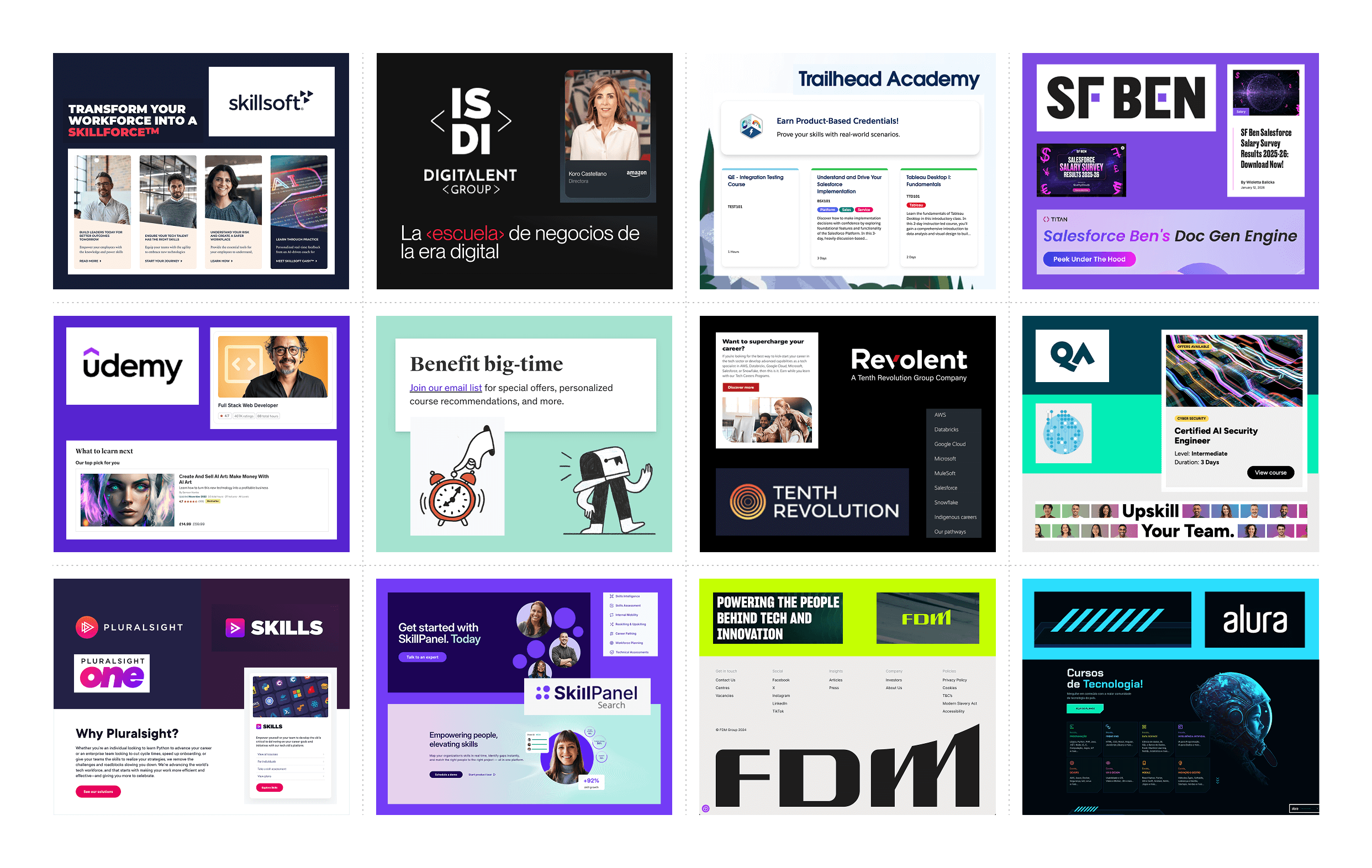
4. Understanding the competitive landscape
The situation:
Our brand needed to embody multiple technologies and prove itself as a trusted voice.
The new multi-technology media hub would compete with many different websites—training providers like Udemy and Coursera, job boards like Indeed and Hired, and media platforms like HubSpot and Salesforce Ben.
But more than that, what design language was the tech industry as a whole using? How would we make sure we fit in and what gaps could we exploit?
The strategy:
I undertook comprehensive competitor research, analysing direct competitors in the technology training space and adjacent players in the broader learning and certification market.
I also investigated industry design trends to ensure the new brand would feel contemporary and credible while standing out from the crowd.
This research informed everything from our approach to the site's navigation to our colour palette and aesthetic. It helped us identify opportunities to differentiate while meeting audience expectations.
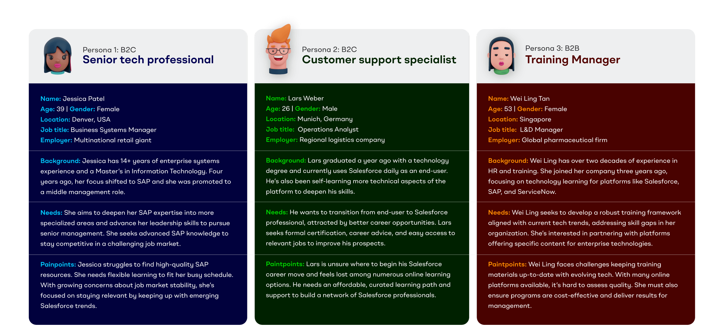
5. Defining the audience
The situation:
The platform would serve multiple distinct audiences—from students beginning their tech careers to experienced professionals seeking advanced certifications, plus businesses looking to train and upskill their teams.
Each audience had different needs, motivations, and levels of familiarity with the subject matter. The brand needed to speak to all of them without alienating any.
The strategy:
I worked with our UX researcher and head of content to pin down and flesh out detailed audience personas.
These demographics, behaviours, pain points and goals were presented clearly and visually to the entire team, discussed and tweaked so everyone was aligned.
These personas, along with the brand's new mission statement, tagline and tone of voice, helped us make consistent decisions about everything from boilerplate copy to menu structure.
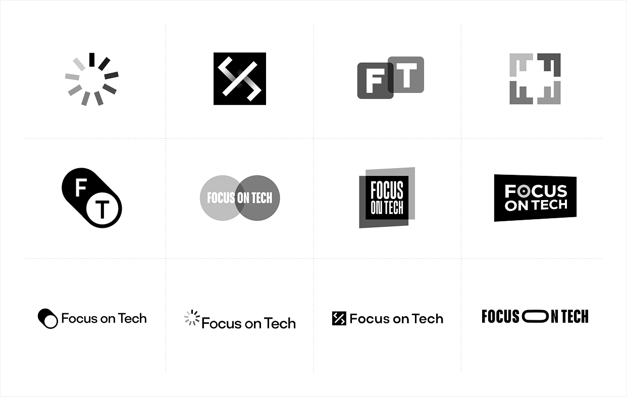
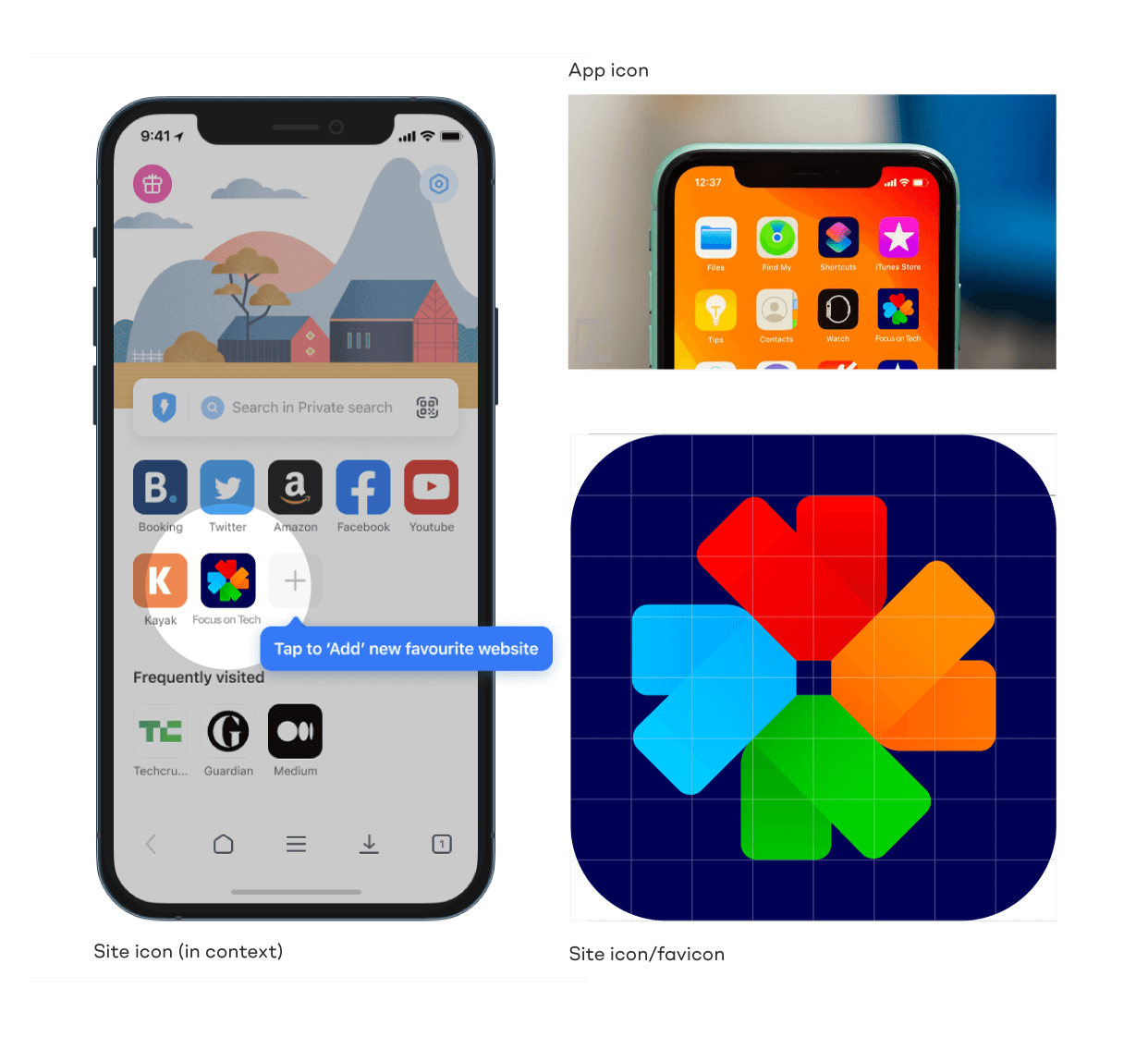
6. Designing the logo
The situation:
The new logo had several jobs to do. It needed to communicate core themes while still being recognisable as an evolution of the legacy brand.
I knew I needed to clearly represent the concept of focus—key in both the new and old company name and an obvious indicator of the company's commitment to the tech industry.
Transparency should visually represent the brand's commitment to just that—showing the contents of certification exams, the truth behind industry news stories or the day-to-day responsibilities of exciting new roles.
Lastly, stakeholders felt it was important for the brand to reference its parent company. It was its own unique brand, but part of a small family.
The strategy:
I designed the brandmark around a semi-ambiguous crosshair motif, crop marks or camera shutter. These symbols all represent "focus" in their own unique ways.
Not only was the liquid glass aesthetic being popularised by Sky and Apple, this render also symbolised the brand's promise of transparency and inside knowledge.
This powerful brandmark reinforced the ultra-clear logotype, designed to reflect the brand's core vision—providing clear guidance and support for those navigating complex technology careers.
The red, orange and blue represent the primary colours of the three existing brands in the family, in their order of establishment.
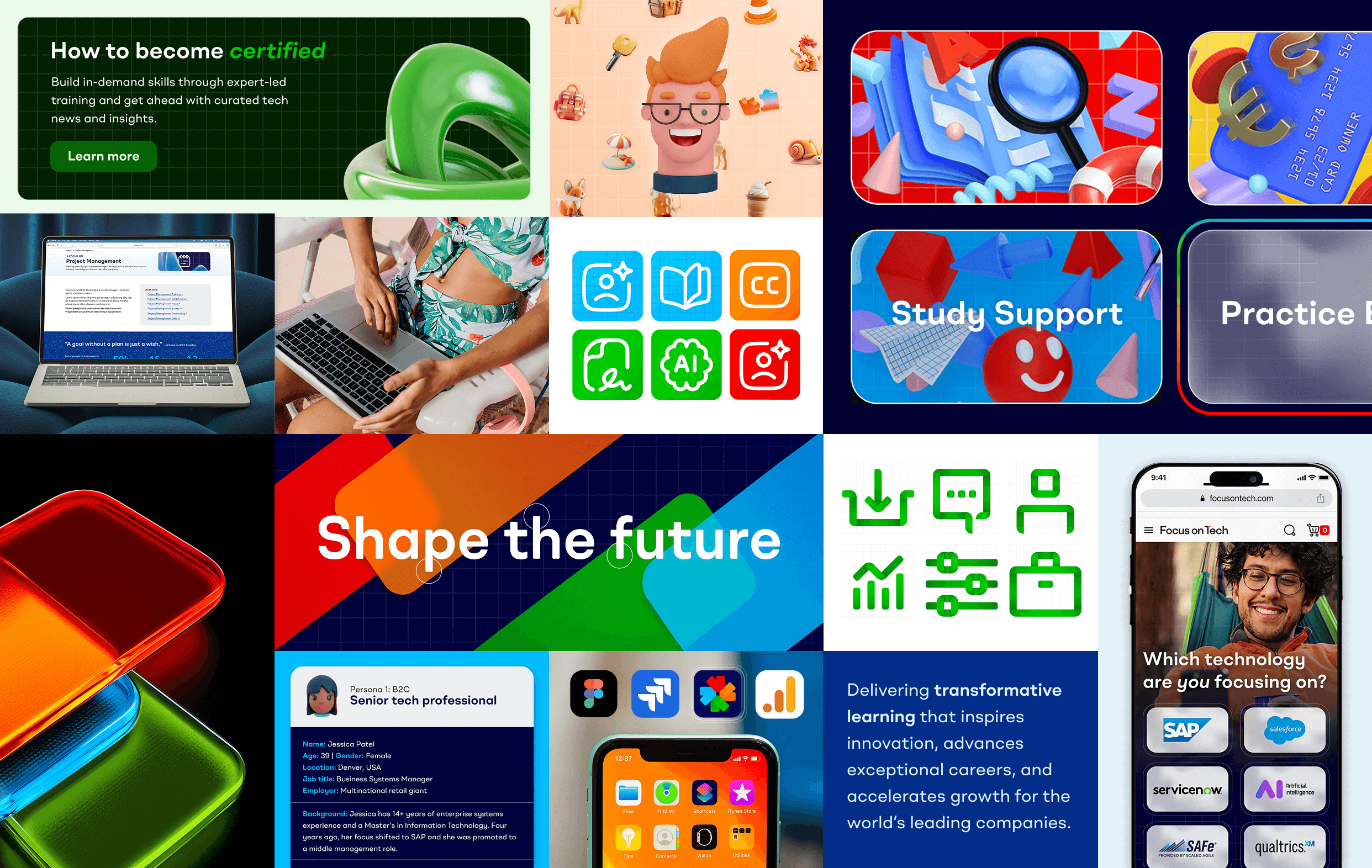
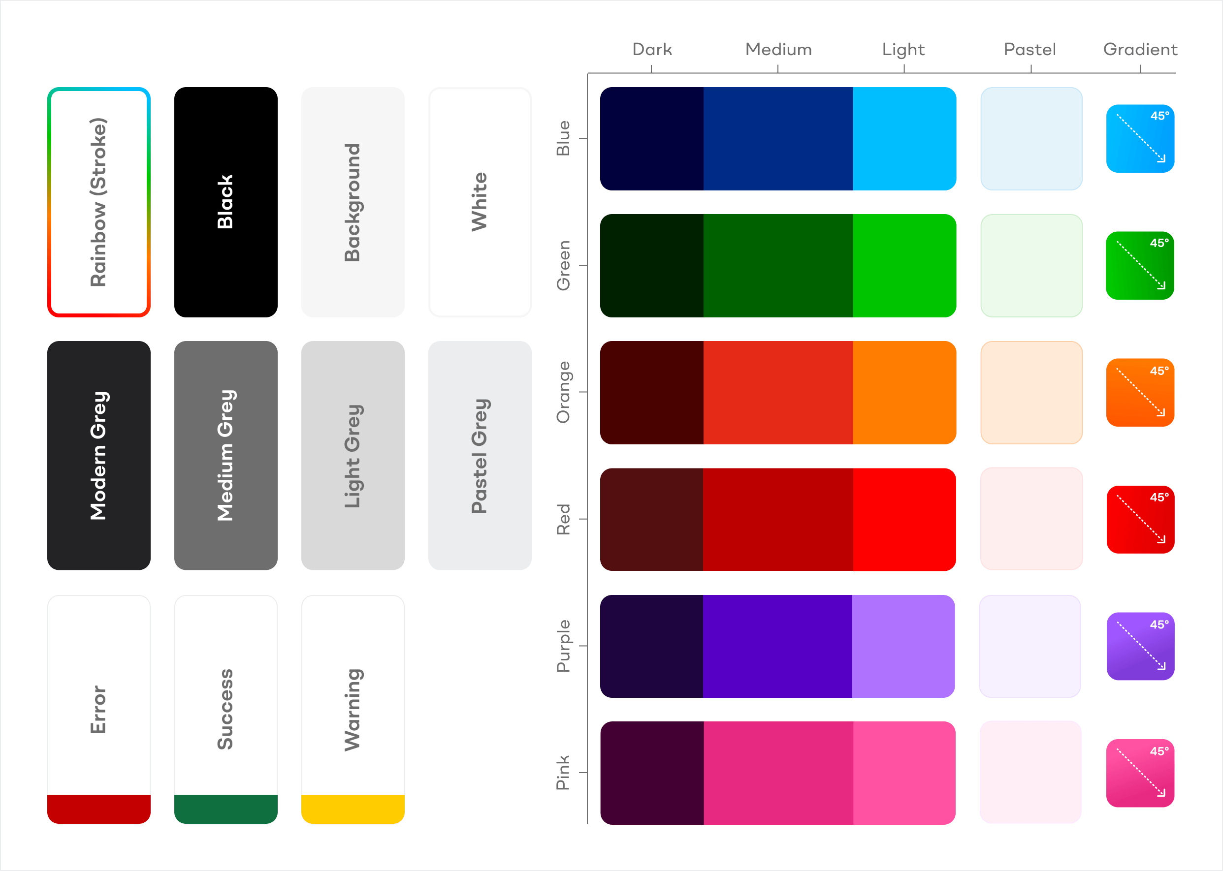
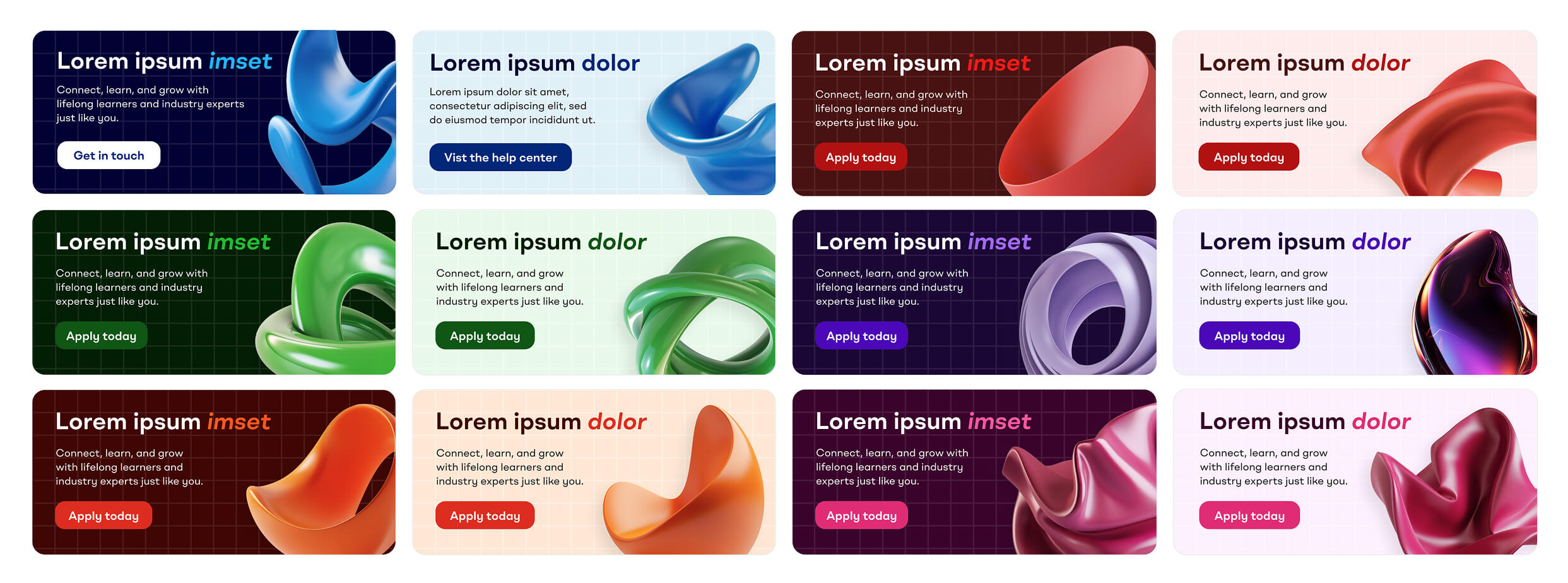
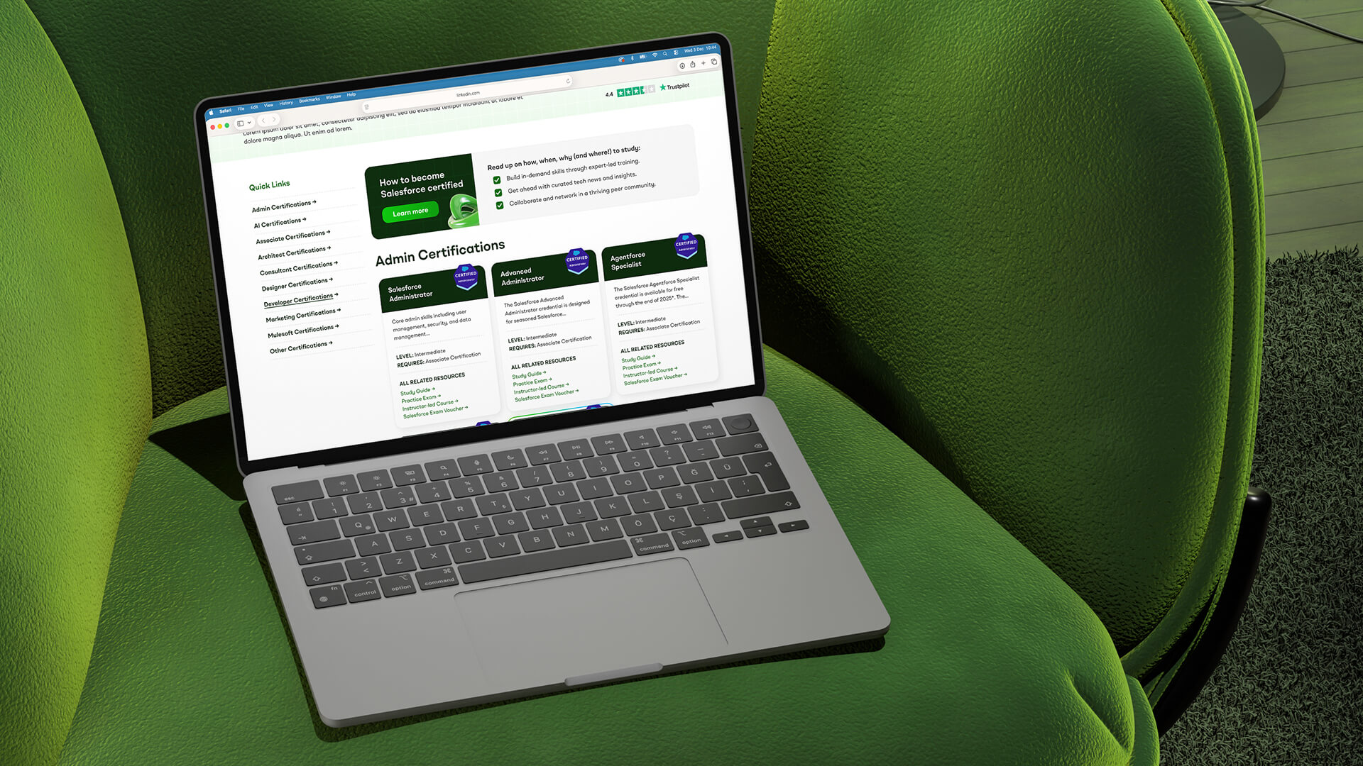
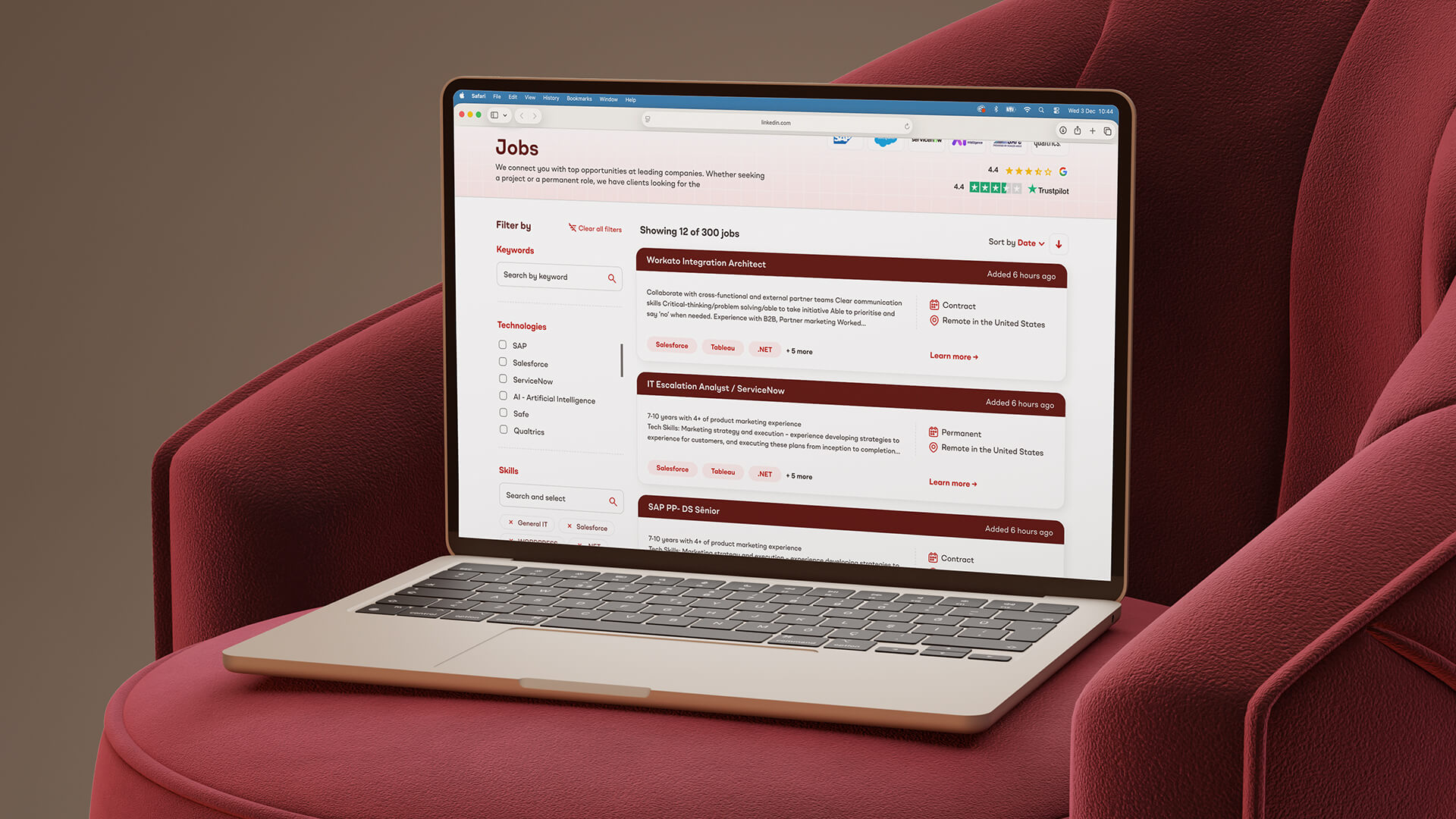
7. Building a colour-coded design system
The situation:
The new site would contain six distinct content types. Users would need to quickly identify where they were and what they were looking at.
The colour system needed to be versatile enough to work across ecommerce, editorial content, forums, job boards, and more—all while maintaining brand cohesion and reducing visual stress.
The colours would need to be easily useable and editable by the designers, developers and web content team after launch. They should be saved as swatches, tokens and variants.
The strategy:
I designed a sophisticated colour system with six primary colour palettes, each with dark, medium, light, and pastel variants. I was careful to ensure the dark and medium swatches met WCAG AA standards and could be used to theme headings and content online.
These palettes, coupled with a comprehensive suite of versatile modern greys, would provide the tools needed to style varied user interfaces and large amounts of technical information.
This colour-coding became crucial for way-finding, helping users navigate between different sections and quickly identify what they had in their shopping cart.
The palette was designed to be friendly, bold and energetic—reflecting the dynamic nature of the technology industry while remaining professional enough for B2B audiences.
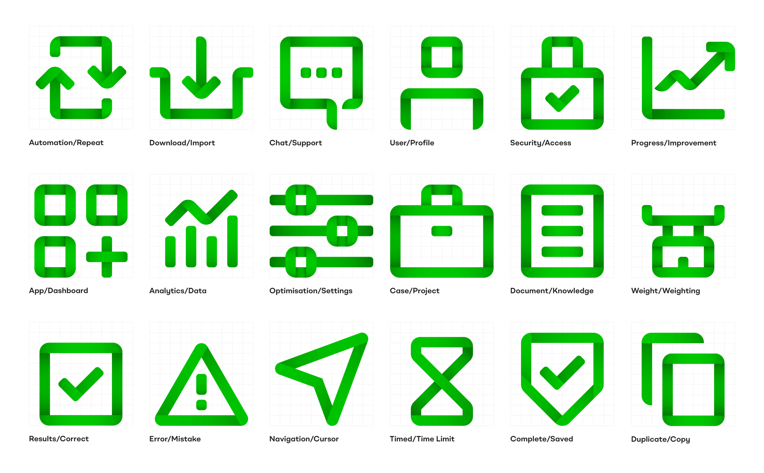
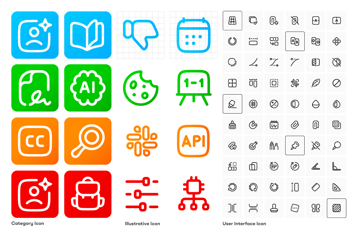
8. Creating a bespoke icon library
The situation:
Icons would play a crucial role in the interface, helping users navigate the complex hub and quickly identify different content types and features.
The hosted digital products wouldn't have their own product photography or hero images. Additionally, icons could help illustrate the often complex or abstract concepts referred to in the literature.
The icons needed to feel distinctive and on-brand while aiding comprehension. Content creators and trainers would need easy access to the icon library when the brand was live.
The strategy:
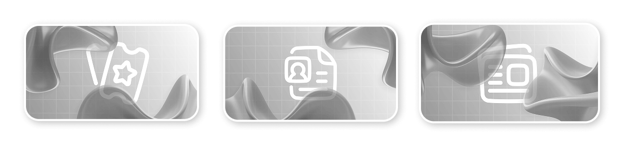
I designed a set of bespoke illustrative icons using overlaid, gradiented, rounded-corner, folded rectangles—echoing the same shapes and effects found in the logo.
However, testing proved these were too unusual and complex for navigation or user interfaces. I recommended this library be saved for more illustrative media such as advertisements and social media.
For the site's user interface icons, I sourced a pre-made library from Streamline that contained the same open, friendly feeling through wide strokes, rounded corners, and off-perfect angles.
These icons, customised and styled, would act as identifiers for each of the site's six content types.
I created detailed usage instructions to ensure these icons were implemented consistently, making them look like a natural and bespoke part of the brand rather than generic off-the-shelf assets.
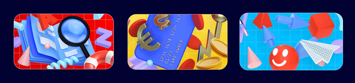
9. Developing the illustration style
The situation:
One of the biggest creative challenges was illustrating non-physical products. How would we differentiate between different training courses, certifications, and career paths? Would products even have a thumbnail image?
I decided to use high quality aspirational photography to illustrate the individual courses themselves. Each product would feature a different student-focused lifestyle photograph as its thumbnail and featured image.
However, I thought our new brand needed something more unique. The illustrations needed to complement the vibrant colour palette, break up text-heavy pages, and 'lighten' the designs without appearing cheap or amateurish.
The strategy:
Initially, I proposed bold, bright, 3D-render styled illustrations set against dark backgrounds—emoji-esque spot illustrations that would pop against the brand's dark colours and inject personality. However, after additional market research and stakeholder feedback, I evolved this approach.
More abstract 3D illustrations were developed that could be colour-coded to each platform section without being too literal in their representation.
These organic forms that I named "fluid shapes" worked as metaphors—representing an elastic, learning brain and the cloud-based nature of enterprise software. They easily incorporated the gradients seen in the brandmark, creating visual continuity.
This approach proved more versatile and sophisticated, allowing us to illustrate complex concepts without being constrained by literal interpretations.
10. Establishing photography guidelines
The situation:
The platform would need extensive photography to represent its diverse, global audience and bring life to the content.
Business and technology photography in general can often be bland, safe and repetitive—showing the same recognisable office scenes or colleagues in a blue office huddled over a work computer.
Our bold new brand needed a new approach, as well as something to help support the strong colour palette.
The strategy:
To help differentiate the new brand from its competitors, it was my idea that photography needed to represent the people behind the professions—shots that show the tech professionals as real people with full lives outside of work.
My art direction called for exotic, vibrant settings with bold colours complementing the brand's core palette of six—allowing the images to further colour-code content.
Models should be slightly quirky, in interesting poses with unusual distinguishing features.
This high-quality lifestyle photography would allow the brand to stand out in social marketing and create strong associations of the exciting possibilities of their training.

11. Wireframing the page templates
The situation:
We needed to nail down the information architecture and user journeys before the team and I could begin designing the pages themselves or the component library.
Senior stakeholders had a clear vision for how the platform should function, but this needed to be tested and validated through wireframes.
Analytics data showed the vast majority of the legacy site's users browsed and converted using laptops, not mobile devices.
The strategy:
We would focus our wireframes, POCs and initial designs on the most common device width.
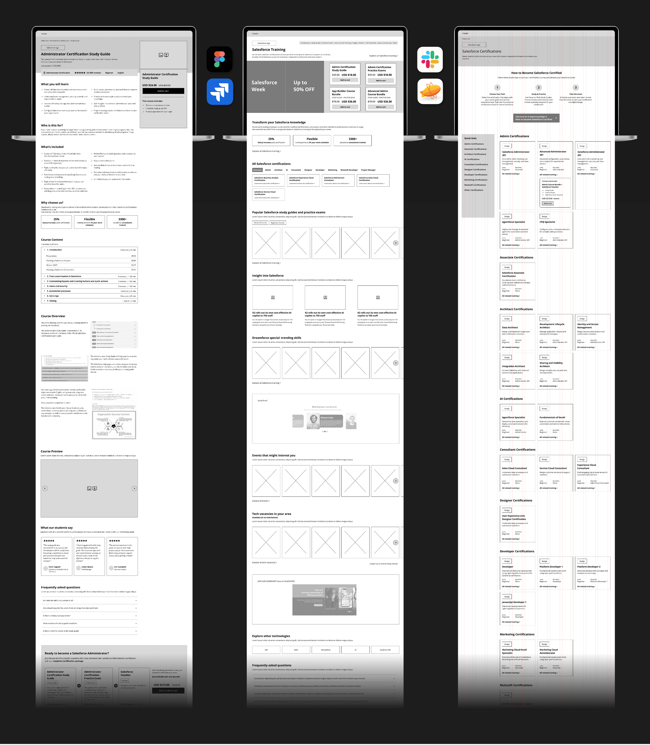
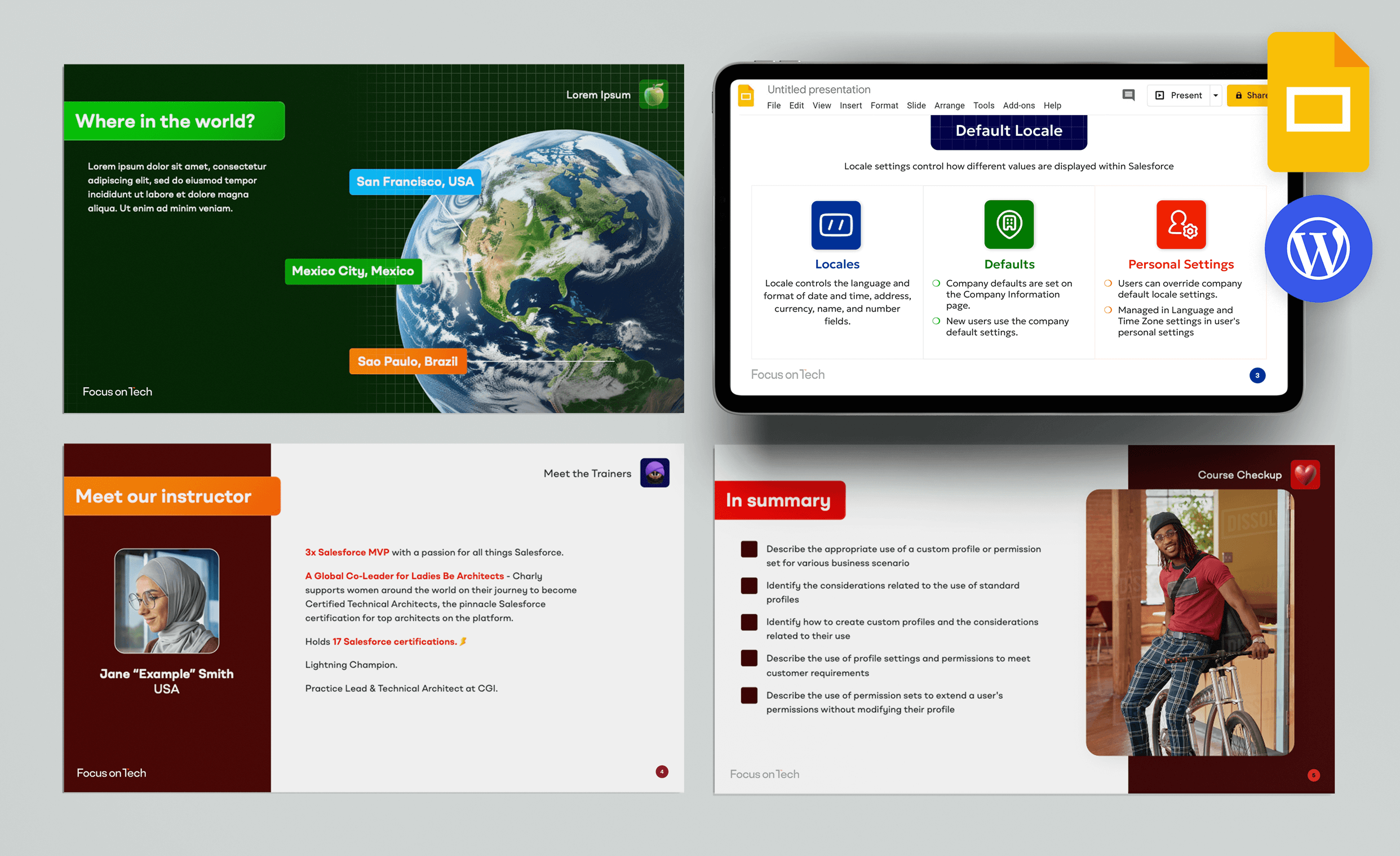
Our senior UI/UX designer and myself started by producing initial wireframes for three critical pages—the homepage and two core templates that would be used regularly across the site.
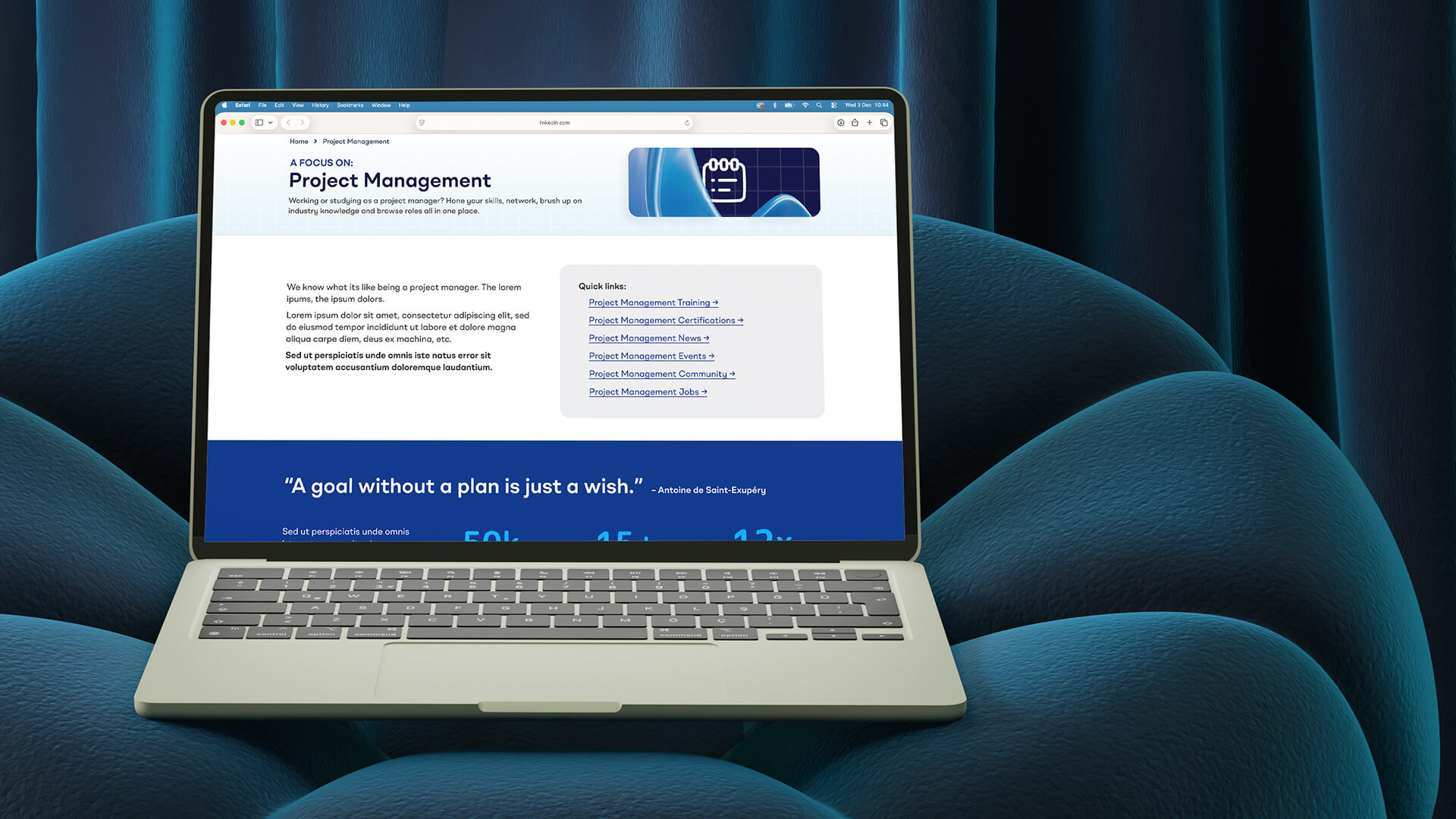
I initially proposed a highly commercial eCommerce-style hub page that used the above-the-fold area to promote products, push content, and engage users with trending topics.
Feedback from senior stakeholders revealed a different vision: the website should act as a large intuitive menu, with users making their way to desired content by filtering through each page like an interactive menu. Technology pages should act more as 'discovery hubs' rather than hard-selling sales pages.
This feedback was invaluable in shaping our approach, ensuring the final product would match stakeholder expectations while still serving user needs.
12. Designing proof of concept pages
The situation:
The next step was to show stakeholders something tangible that established the visual direction and secured buy-in.
They needed to see how the brand's colours, typography, iconography and illustration would come together in a user interface.
The strategy:
Together with our junior UX designer based in Bangkok, I styled these same three core pages, expanding upon the visual identity we had developed.
These screens demonstrated how the colour-coding system would work in practice, how the brand would feel to use, and how the various content types could be laid out.
The designs provided a concrete reference point for stakeholder discussions, moving us from abstract concepts to specific decisions about the user experience.
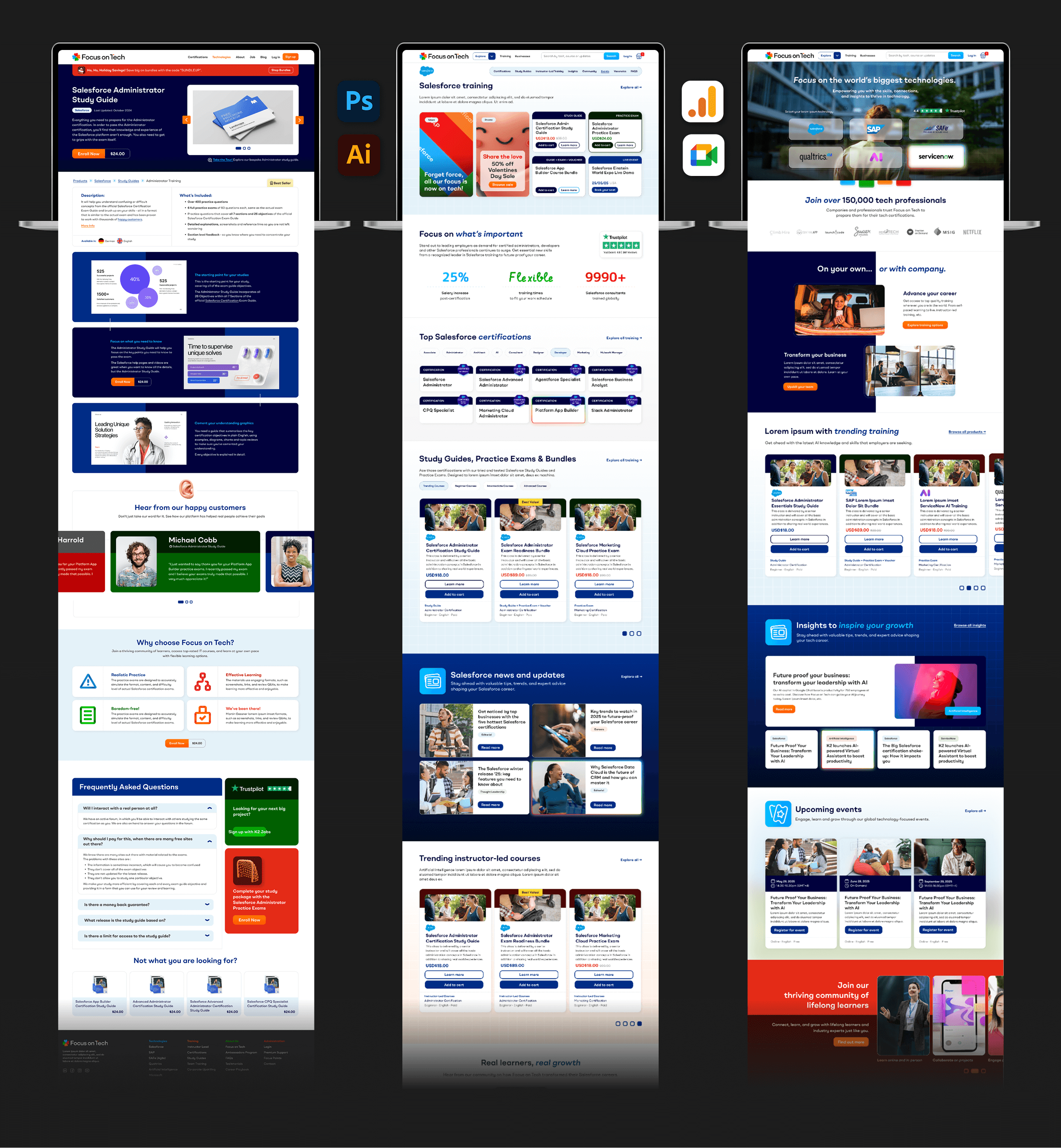
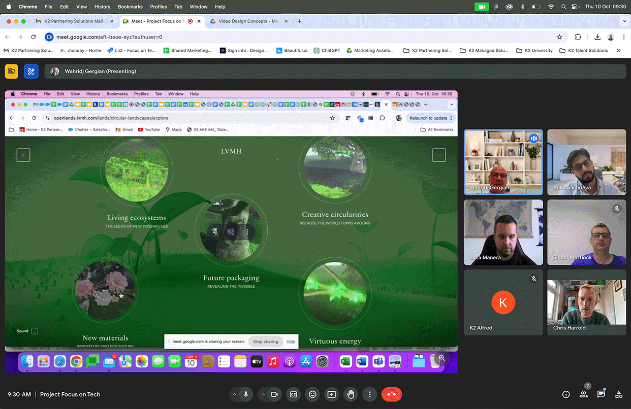
13. Building the Figma prototype
The situation:
A comprehensive, interactive prototype was needed to communicate the full user experience to stakeholders and provide a detailed blueprint for development.
The prototype would need to demonstrate user flows, interactions, and the responsive behaviour across different devices and screen sizes.
It would need to prototype the front end that the brand's potential students would see, as well as the dashboards they would use to manage their products, events, jobs, forum profile and training materials.
The strategy:
I worked closely with our senior UI/UX designer based in Brazil, who took over most of the prototyping while I reviewed, commented, and directed alongside our project manager.
I personally led on and artworked important new sections that required particular attention or presented unique challenges.
Together we built up a comprehensive template component library, ensuring consistency and efficiency. A complete design system was documented, providing developers with everything they needed.
The result was a fully interactive prototype that stakeholders could click through and experience for themselves, making it much easier to gather meaningful feedback and make refinements.
14. Presenting to stakeholders
The situation:
It was time to present our progress to the entire working group. We needed to ensure alignment and gather feedback.
My presentation of the prototype needed to clearly communicate design decisions and strategy while remaining open to input and further iteration.
The strategy:
I presented the working prototype in Figma, walking stakeholders through key user journeys and explaining the rationale behind design decisions.
The interactive nature of the prototype made these sessions much more engaging than static presentations—stakeholders could experience the platform as users would, leading to more informed feedback.
These sessions created valuable dialogue, surfacing any concerns early and building confidence in the direction we were taking.
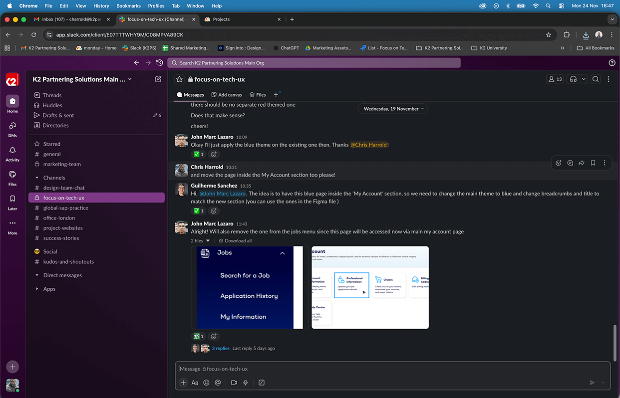
15. Collaborating with developers
The situation:
The development team would be responsible for turning our prototype into a fully-functional live site. Close collaboration was essential to ensure the final product matched the vision.
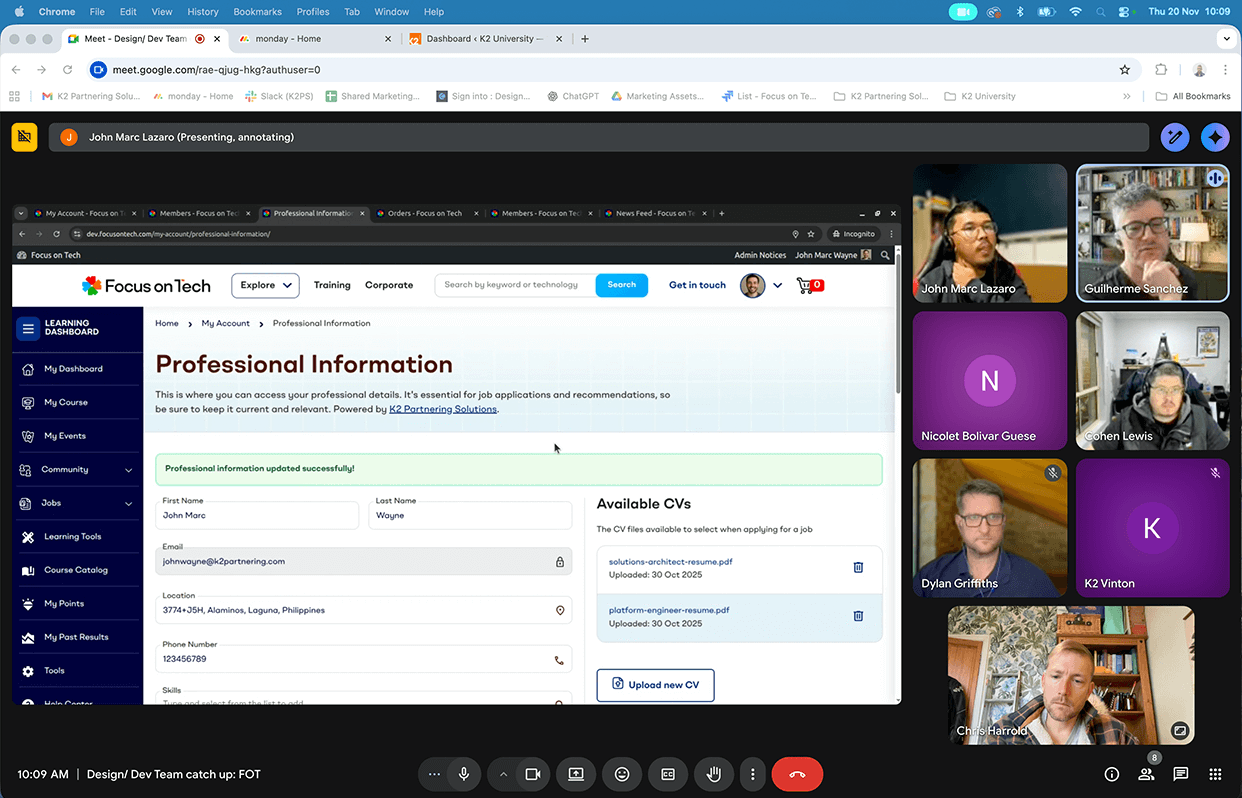
Regular communication was needed to discuss technical constraints, provide missing assets, and make practical decisions about implementation. Jira, Ziflow, Figma, Slack and Google Meet were used to collaborate efficiently across timezones and continents.
There was a chance some of the nuances of the design could be missed and complex behaviour and logic may need to be explained in person. Additionally, time or resource constraints could require certain elements to be added to the backlog or a phase two.
The strategy:
Each week, the development team presented their progress. We would discuss, provide feedback, make suggestions, and supply any additional or missing assets they needed.
Sometimes changes to the prototype were made based on learnings from the first build. It proved important to stay flexible and pragmatic while maintaining design quality.
This regular cadence ensured problems were caught early and the team remained aligned throughout the development process.
"I've learnt a lot working next to you. On design, UX, UI, etc. It made me grow a lot. You did an amazing job"
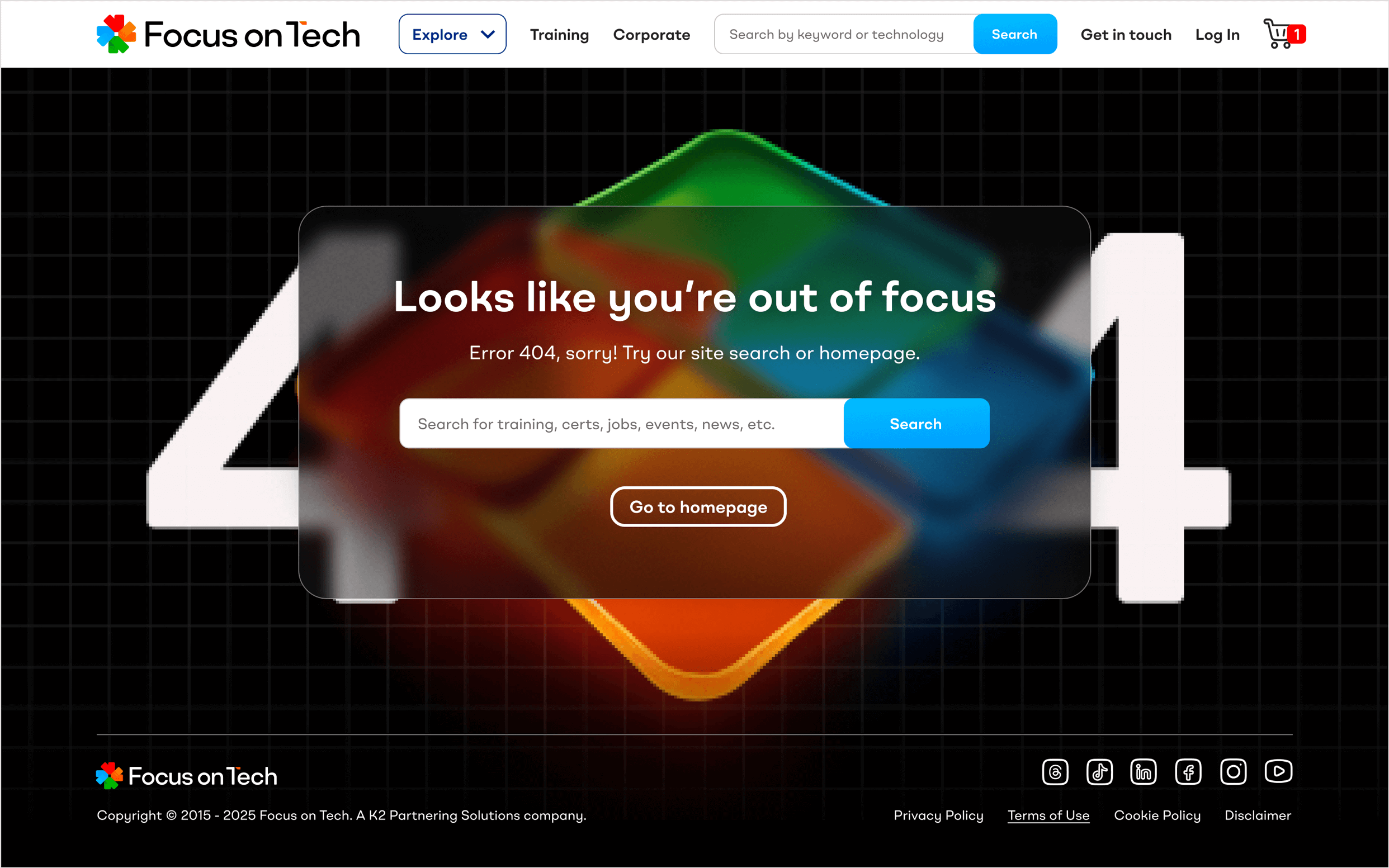
Developing for desktop: We designed, developed and reviewed the site on our user's most common device width. The dev team were accurate and clearly understood both the functional and aesthetic considerations.
Mobile prototypes: I prototyped the core e-commerce shopping flows on mobile after learning from session user flow and device analytics. Rainbow gradients commonly seen in AI tools are used for upsells and dynamic content.
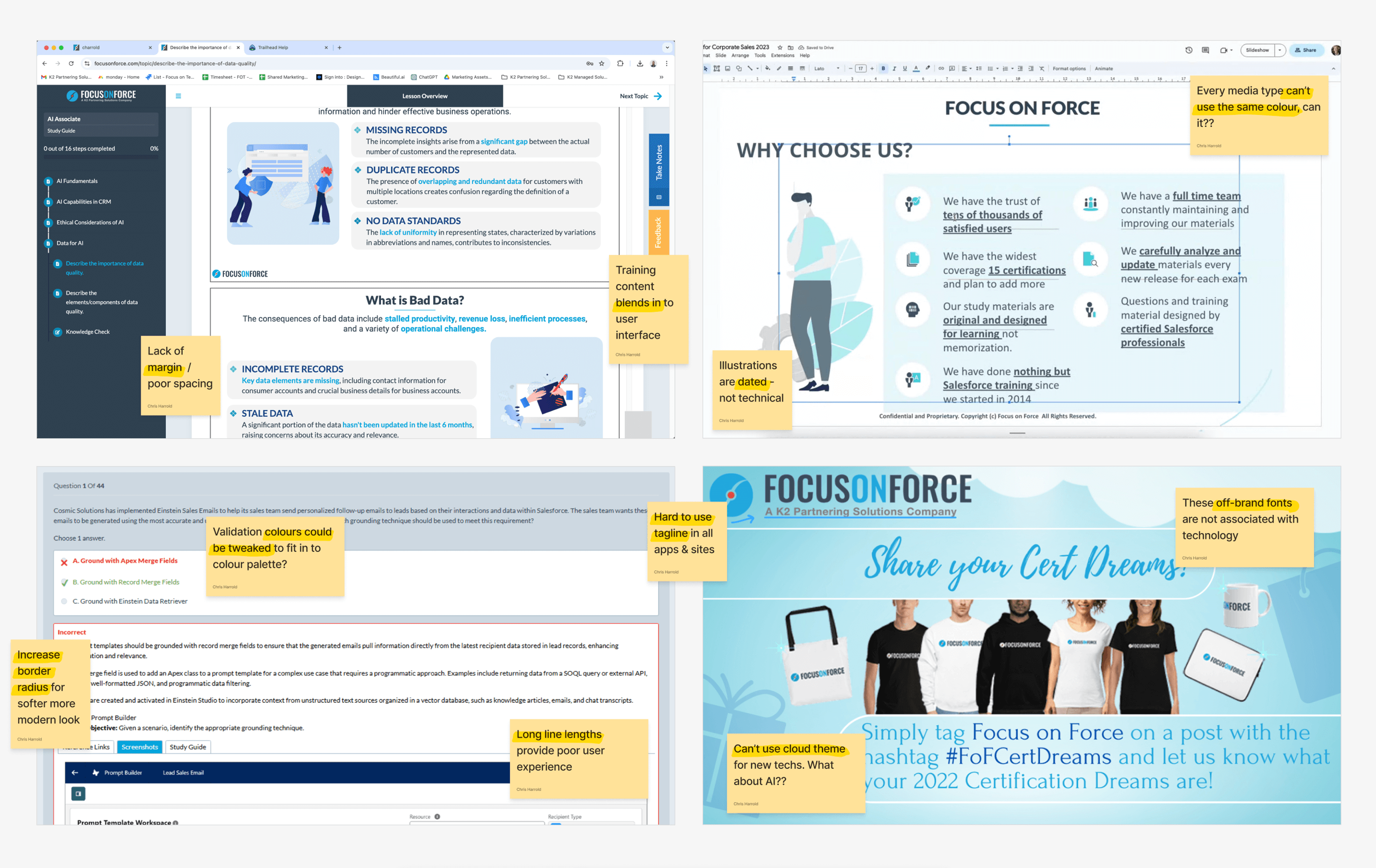
16. Quality assurance and refinement
The situation:
As development progressed, thorough quality assurance was needed to ensure the platform met both the functional requirements and high design standards I had set.
The QA team would inevitably uncover issues—from technical bugs to UX inefficiencies—that needed addressing before launch.
The strategy:
The QA team began testing the development website and feeding back to us in our weekly calls.
They noted areas where the UI could be improved, identified problems or inefficiencies in user flows, and flagged technical bugs that affected the user experience.
I worked with the team to delegate and oversee fixes as required, prioritising mostly UI/UX and design issues and making decisions about what could be addressed pre-launch versus post-launch.
This rigorous testing process ensured we delivered a polished, professional platform that would reflect well on the new brand.
17. AI-enabled handover and launch
The situation:
With brand guidelines, prototype, design system, development site, and training materials complete, the project needed a smooth handover to the teams who would operate and maintain it.
Four different teams would take ownership of different aspects of the platform, each requiring clear documentation and training.
The strategy:
The Education team would populate the website with training materials, courses, and dates. The Marketing team would maintain prices, promotions, news, and events. The Sales team would manage the jobs board. The Web team would handle technical maintenance and optimisation.
Comprehensive brand rollout training and internal brand training ensured each team understood not just what to do, but why—helping them make on-brand decisions independently.
Because we had developed such a strong design system and brand guidelines, it was possible to increase the efficiency of the rollout by integrating AI-powered tools. Pilot programs in Beautiful.ai and Prezi, Canva, Midjourney and ChatGPT were initiated and showed promising results.
18. The project's impact
While the project is currently in its final stages in preparation for going live in 2026, I am pleased to list the following successes in lieu of the usual metrics:
- The stakeholders were extremely pleased with the transformation, recognising that Focus on Tech now had a brand and platform that could scale with their ambitions.
- The new brand successfully communicates a multi-technology offering while preserving the SEO equity of the original ecommerce store—solving the core challenge that initiated the project.
- The colour-coded design system enables users to navigate the complex hub intuitively, quickly identifying different content types and sections.
- The comprehensive design system, component library, and brand guidelines empowered the internal teams to create new content and pages efficiently while maintaining brand consistency.
- Focus on Tech successfully transformed from a single-product store into a sophisticated technology learning platform, positioning the business for growth across multiple technologies and markets.
"I just wanted to tell you you've been awesome every time we've worked together."
"It was really great working with you. You were always easy to collaborate with and brought such good energy. You've been doing great work."