Launching into a new market
The pivotal role I played in defining K2 University's brand and marketing enabled the successful rollout of an ambitious new program for the B2B market.
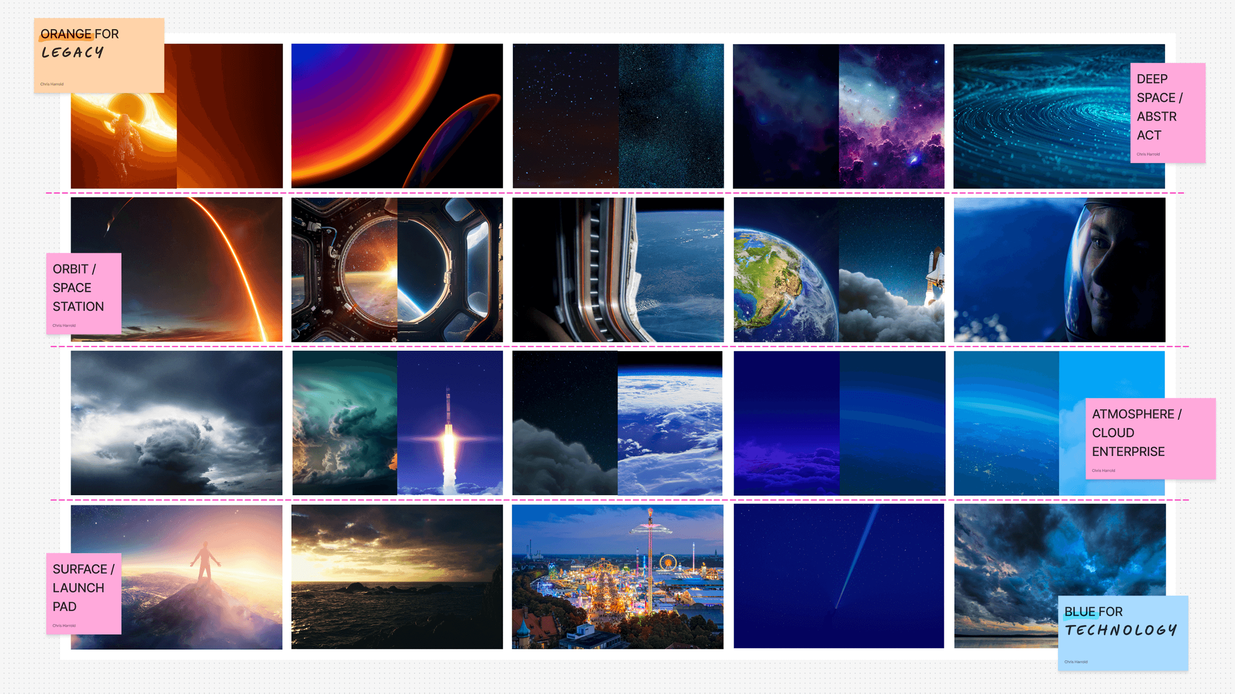
Brand repositioning & campaign impact
197%
increase in SAP training enquiries from businesses in the US and Canada
947%
increase in pageviews of SAP pages on k2university.com
78%
engagement rate across social media ad campaigns
51.5%
increase in conversion rate across paid and organic social ads
1. Identifying the challenges
The situation:
After a long period of growth and strategic acquisitions, K2 University needed to expand into the B2B market with a new model providing businesses with qualified, ready-to-work teams — while still engaging the young professionals those programs put on an accelerated path into their careers.
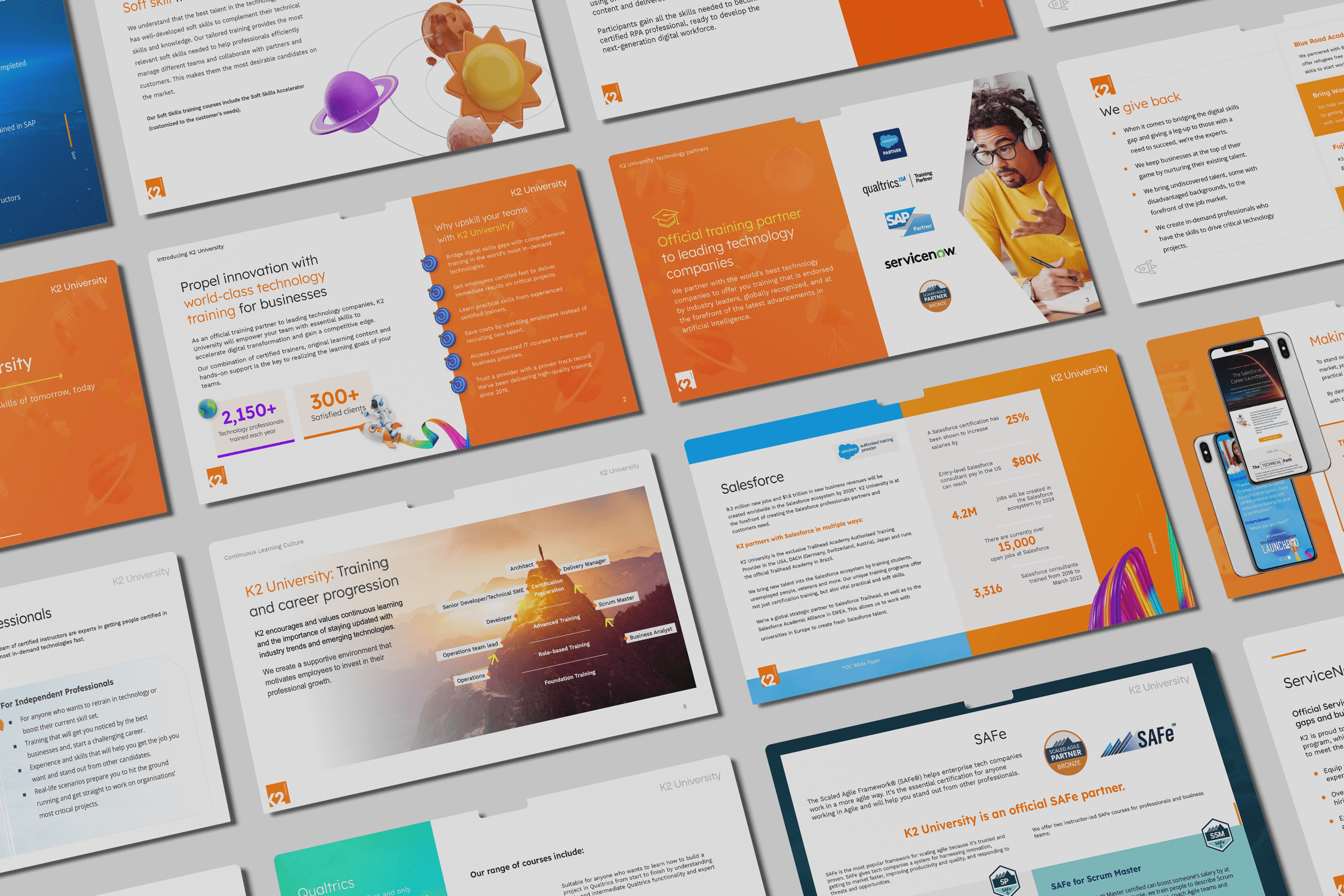
Beyond its orange colour, the brand had no guidelines distinct from its parent.
The strategy:
I focused first on overhauling the messaging and visual language, then developed the templates and guidelines to shape the brand's many touchpoints.
2. My role
As hands-on Head of Design for the K2 group, I partnered with the managing director and global marketing team over 18 months to evolve K2 University's brand for its new audiences.
Leading an agile, international team of creatives, I built the foundations of a bold, effective tech educator brand — improving both B2B and B2C marketing across multiple channels and mediums.
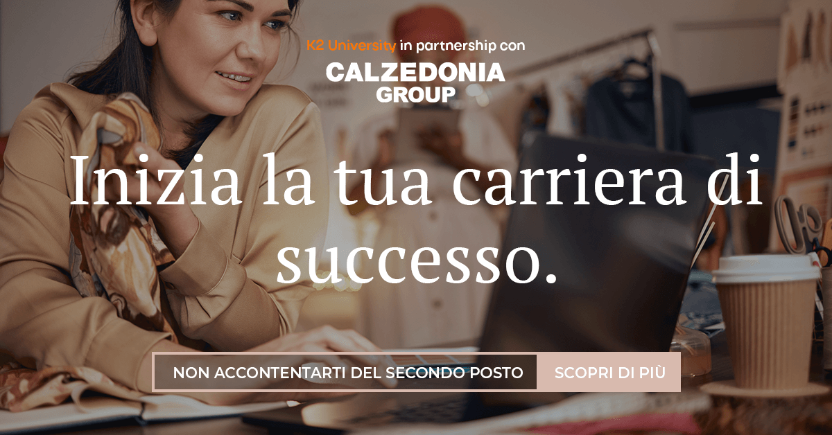
3. Branding the new program
The situation:
K2 University had always targeted individual students upskilling their careers, leaning on basic aspirational marketing.
Its tone of voice was casual, guidelines were ill-defined and a coherent visual identity had never been developed — and nothing in the collateral spoke directly to businesses.
The strategy:
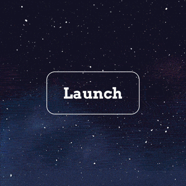
Through a series of creative brand workshops, we landed on a name for the new service offerings: "Launchpads". It gave the brand an instant theme and visual identity.
Students could see themselves as astronauts at the start of their training — accelerating through the atmosphere, leaving the everyday behind, traversing the (enterprise) clouds.
Businesses grasped the product immediately through the same 'acceleration' and 'launch' themes, backed by the parent company's 25 years of placing talent.
"Learn the tech skills of tomorrow, today!"
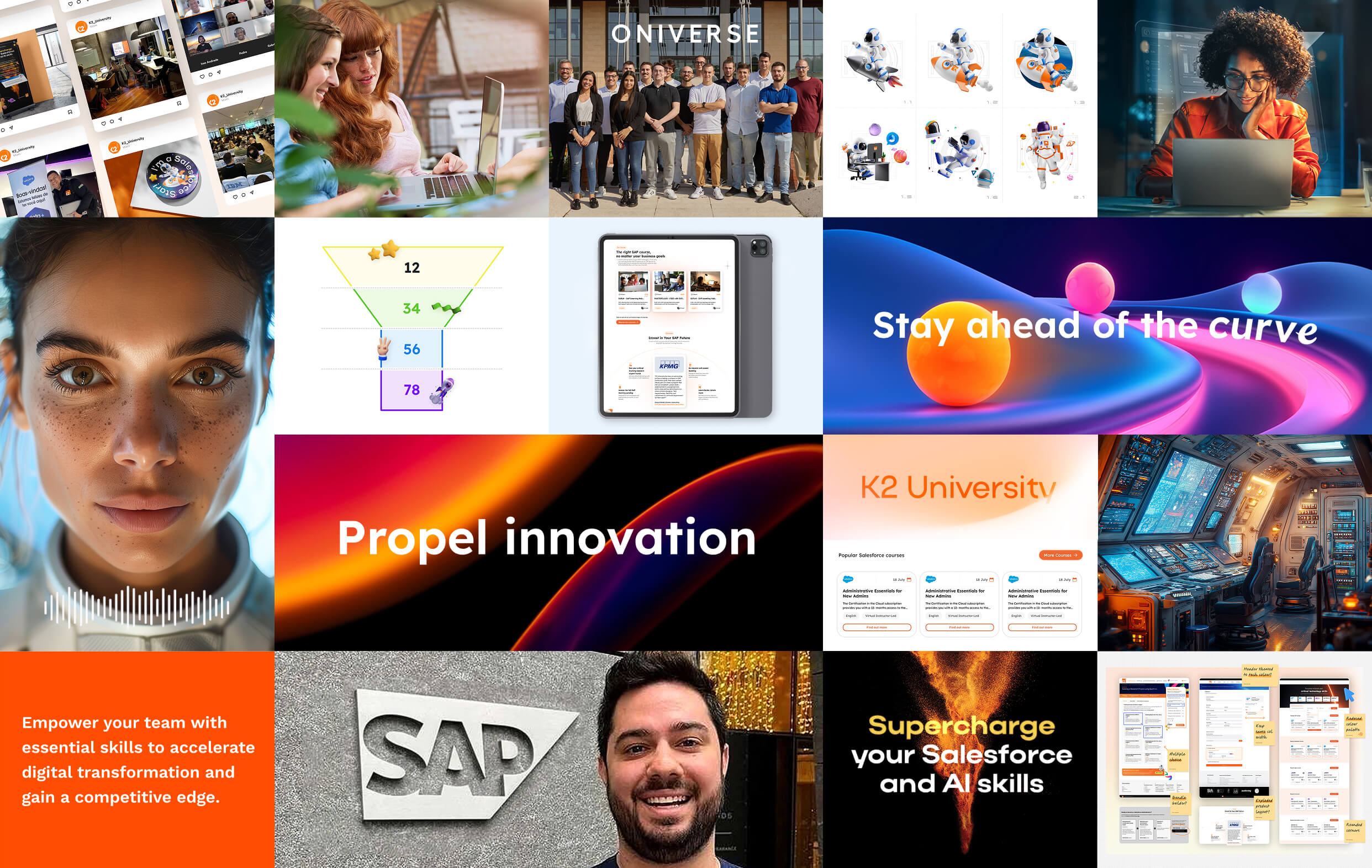
4. Developing a visual identity
The situation:
A unique brand identity had never been developed for K2 University. It had its own orange brand colour, but shared much of its identity and guidelines with its parent.
How could the brand evolve to represent complex training and placement programs in a language understood by businesses?
How would it stand out against its competitors and ensure it was trusted over SAP and Salesforce's own training offerings?
The strategy:
A new refreshed colour palette allowed the brand to speak confidently in the tech sector while retaining its character and quirky personality.
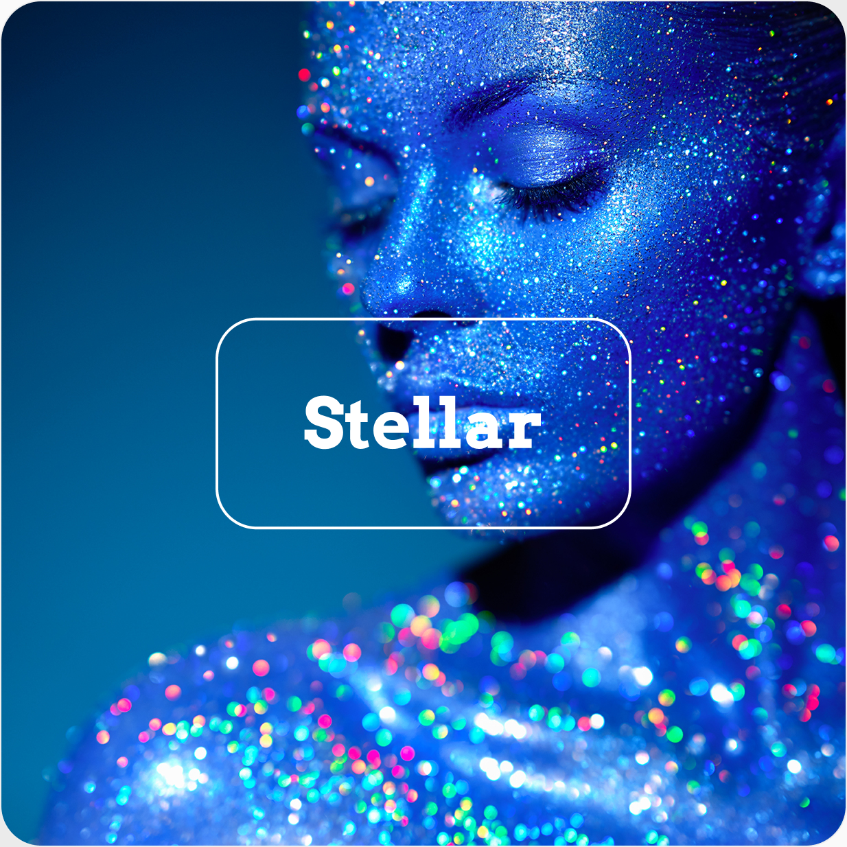
A new space/launch theme opened up a huge world of opportunities for rich, high contrast visuals and in-vogue grainy gradients.
Rainbows—a universally recognised atmospheric condition—also acted as a metaphor for the diversity, equality and inclusion integral to the brand's global enablement mission.
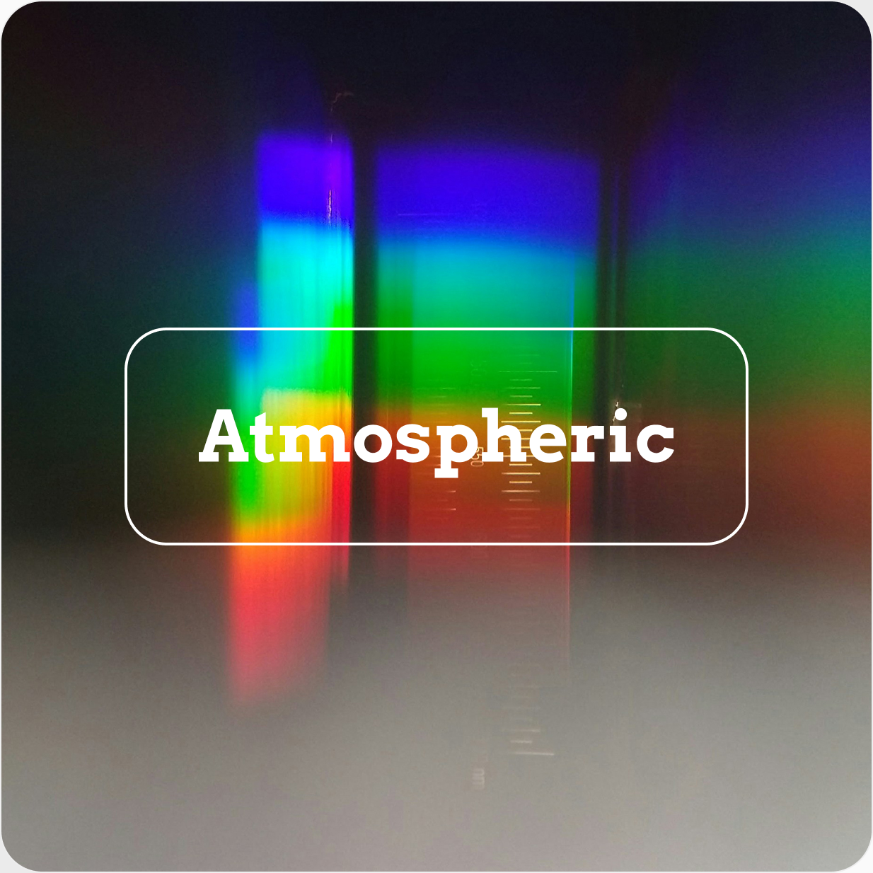
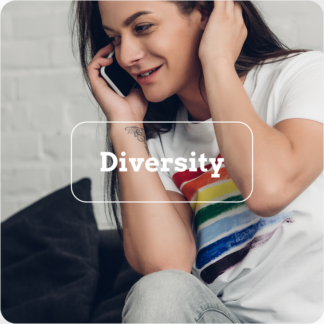
DE&I: Communicating the company's DEI commitment was important to stakeholders. I used atmospheric spectrums and rainbow gradients to connect the "space" theme to DEI values in a way that felt organic, not forced.
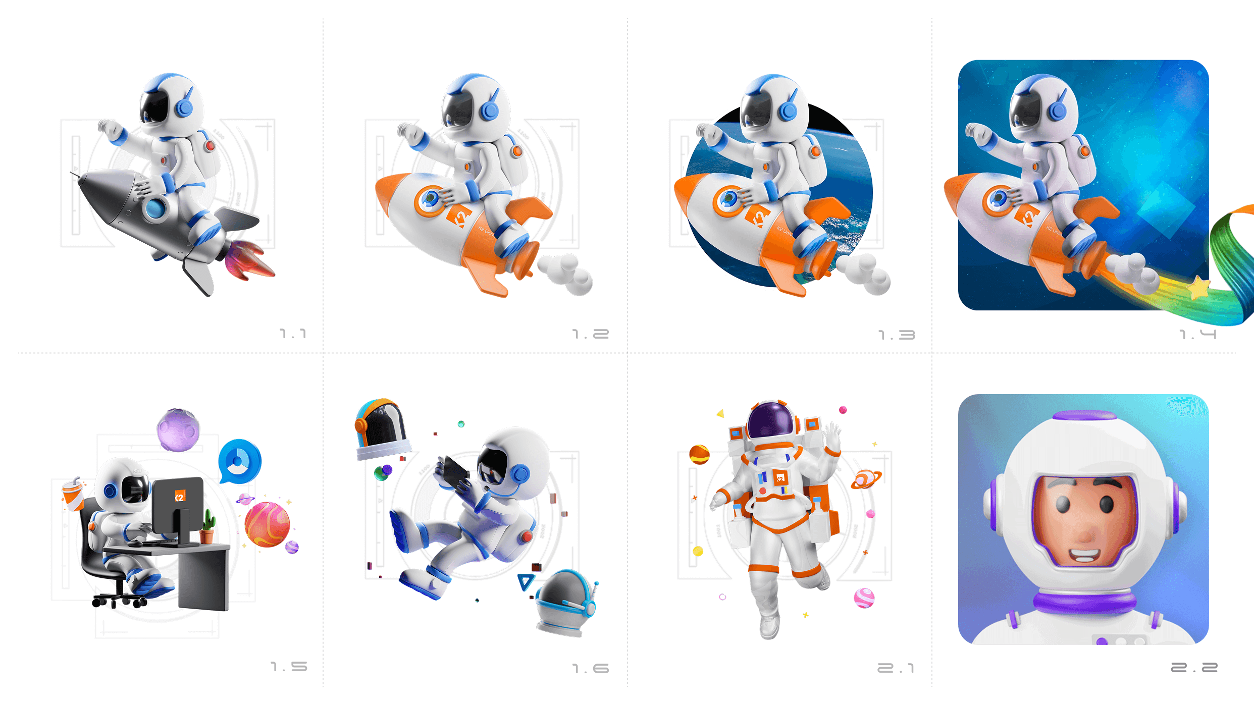
5. Designing a mascot
The situation:
From my research, I knew it was important for the brand to feel like a trusted friend and advisor, guiding tech professionals at the start of their career through complex qualifications and career trajectories.
The brand also needed a versatile and repeatable illustration style—something that could be easily used by social media marketers, trainers and content teams.
The strategy:
A brand mascot was developed, designed to be androgynous, friendly and unobtrusive. "Kosmo" the astronaut (with a "K", of course) helped shape marketing into a much more personal briefing from an experienced, trusted companion.
I wanted potential students to put themselves in the shoes of an astronaut on a rocket's launchpad—excited for the life-changing journey they were about to blast off on.
At first, the lack of features seemed a useful way to ensure the mascot would not alienate (pun intended) any of our global audience. However, it became apparent that the lack of personality could be a barrier to our audience building a connection with the brand.
I started looking for a better solution.
6. Generating an advanced AI avatar
The situation:
Marketing directly to businesses, it seemed, required something a bit more sophisticated. Something with more depth than a static 3D model could provide.
As a brand built on providing one-on-one training to a typically younger market than its parent company, it also needed to prove its value through personal content-creator style short-form video marketing.
This is something that would be difficult to do with a faceless helmet-wearing astronaut.
The strategy:
With the increasing availability of generative AI tools, I used key insights from our web analytics, Salesforce data, trainer experiences and marketing input to pin down a number of audience personas.
After some official training and some trial and error, I made use of a suite of AI tools including Gemini, Midjourney, Kling, ElevenLabs and Udio to generate an AI avatar that can lip-sync to scripts and adapt to any environment.
Sex, race, distinguishing features, voice timbre, accent, tone of voice and eye contact were all carefully chosen to most effectively communicate with our target audience demographic.
Speaking to camera in front of a carefully considered and themed background has proven successful for creators on YouTube and TikTok.
AI Mascot development: The first step was to generate the visual characteristics of the avatar. Gender, age, race, facial features and environment were carefully considered and designed to appeal to our target demographic.
AI Video Editing: Once I had found the best AI tools available, a consistent accent, tone of voice and lip syncing ensured generating new short form video content was quick and easy.
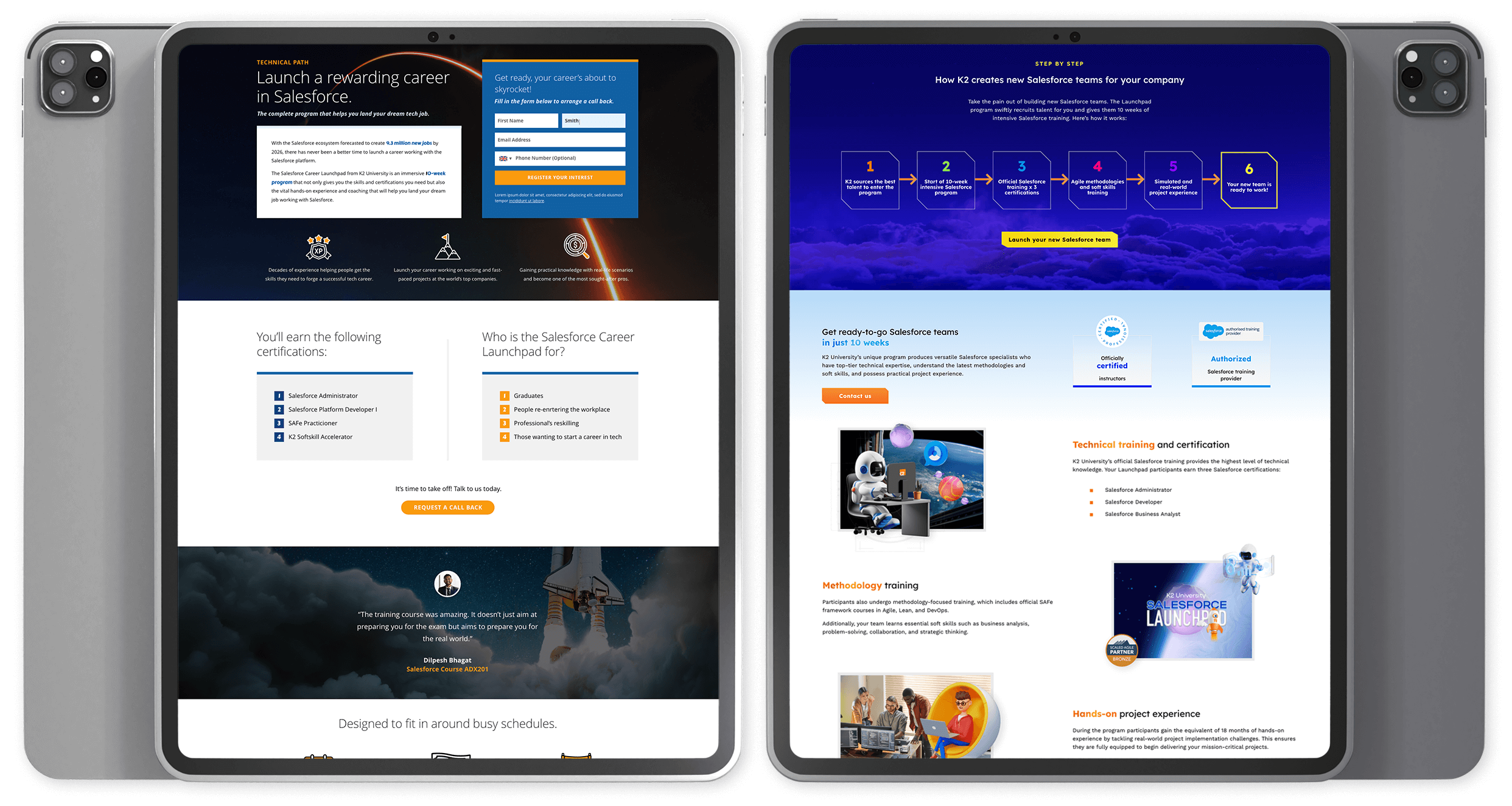
7. Recruiting the students
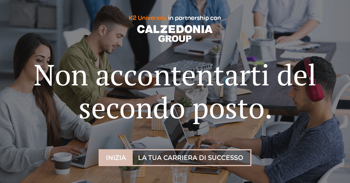
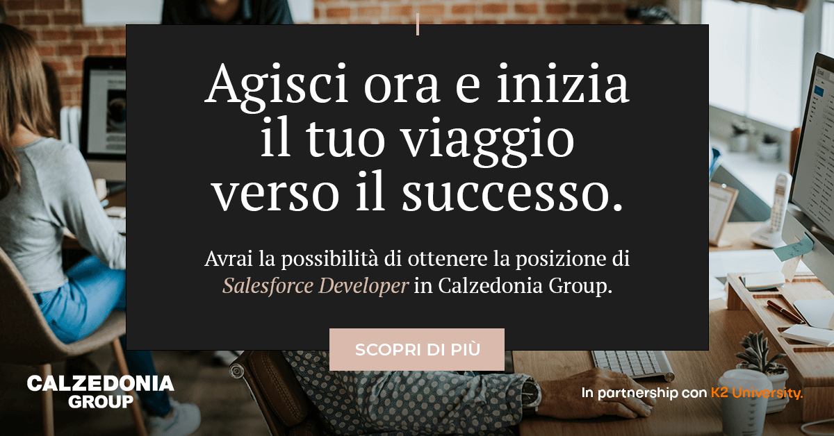
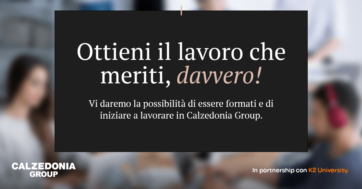
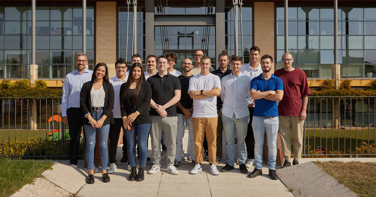
The situation:
K2 University's first launchpad client was Calzedonia (now "Oniverse"). The Italian fashion brand needed a Salesforce team in Naples for their new omni-channel digital hub. They committed to hiring 100 young IT professionals over two years.
It was now time to find the right people for the program. The advertising needed to use the client's brand as these students would end the program with a job at Calzedonia itself.
The strategy:
Instagram and LinkedIn ad campaigns were devised to target tech professionals at the suitable stage of their careers in the Naples catchment area.
The positions were also advertised by K2's international team of recruiters and via its job boards.
Users that converted from the social campaign were sent to a standalone landing page that registered interest and captured potential students' details. Landing page variants were A/B tested with Unbounce and Google Analytics.
Sales enablement materials such as one-page sales sheets and pitch decks were made available to the sales teams, along with a high-converting Calzedonia-branded landing page.
Positions on the team were quickly filled with an agreement to repeat the program the next year.
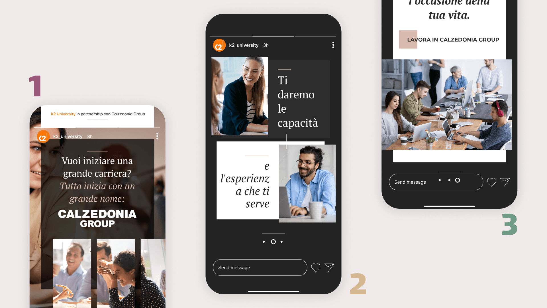
Social Ad Campaign: As well as Instagram, LinkedIn was chosen as the most suitable platform to find young tech professionals at the start of their careers. Static and video ads were designed and written for the Italian audiences.
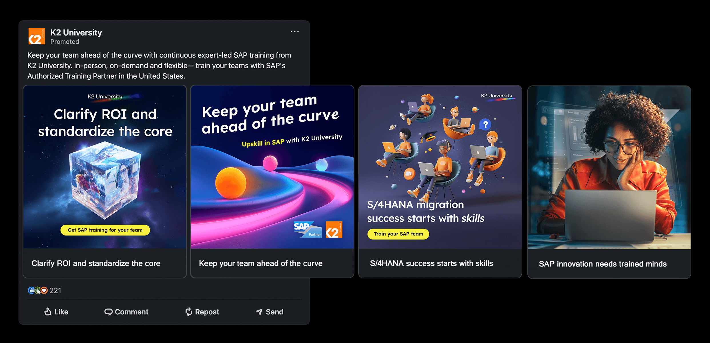
8. Marketing to business leaders
The situation:
The launchpad concept started as a pilot program for Salesforce talent only. In order to prove its worth, it needed to attract businesses looking to fulfil technical projects using other enterprise technologies such as SAP and ServiceNow.
The multi-stage process needed to be explained clearly and the real-world value of the program needed to be obvious from the start.
The strategy:
A paid ad campaign was written, designed and launched to generate interest in the new service offerings.
Myself and the design team created an initial series of paid ads targeting pain points of businesses and developed a new landing page on K2 University's website providing information about the new program and its benefits.
The programs were promoted through the homepage slider, fixed banners and the Salesforce consulting pages on K2's other websites. I made sure that sales enablement materials such as pitch decks, sales sheets and case studies were updated to include the new programs.
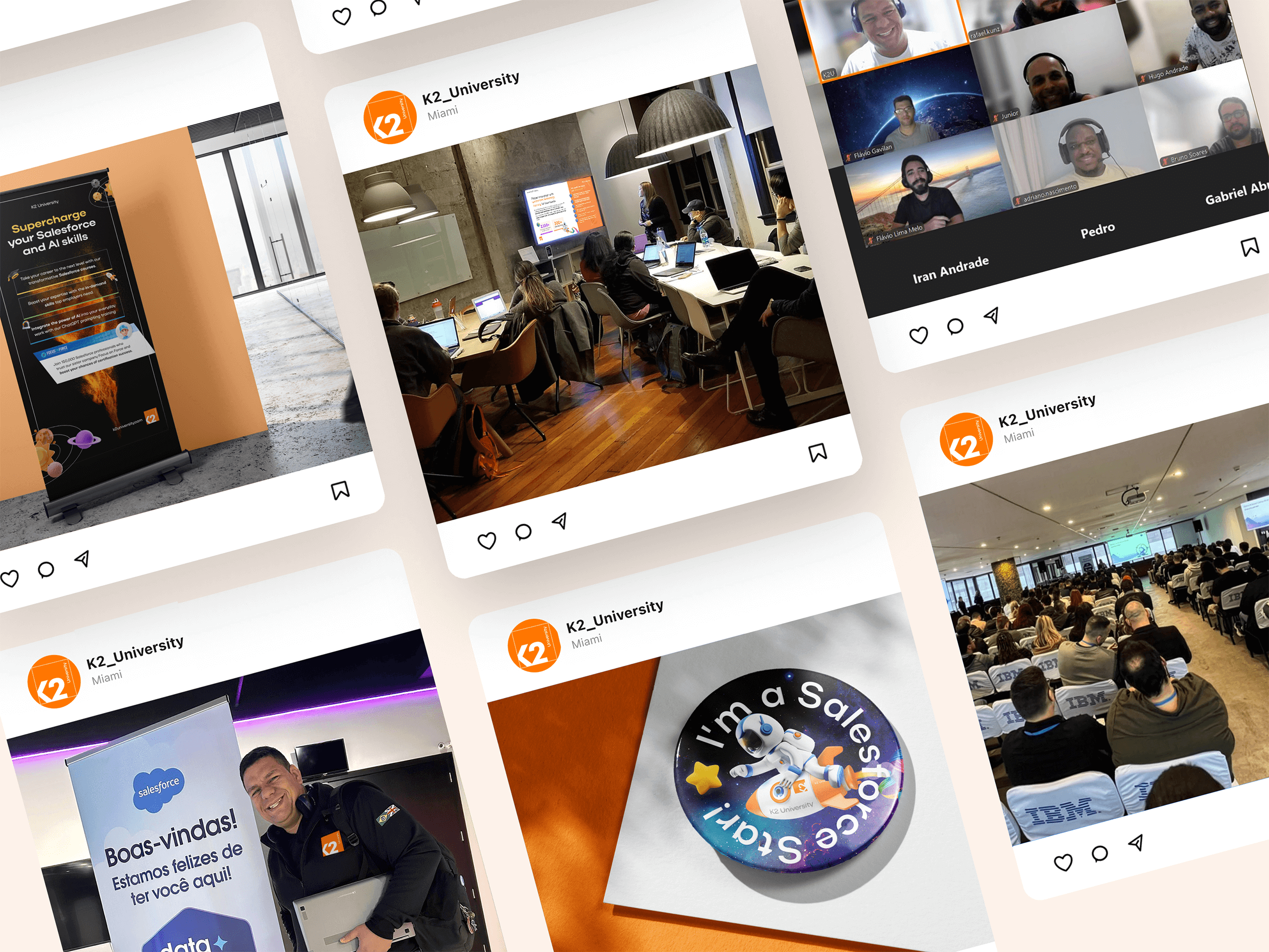
9. Educational marketing
The situation:
The brand needed a consistent presence across a full year's programme of webinars, in-person training and industry events — hosted by trainers across multiple regions, promoted through social, email and paid ads.
Each needed its own hero imagery and event identity, produced fast and on-brand, without the visual language fragmenting across regions and formats.
The strategy:
Co-ordinating with trainers, digital marketing executives and education heads in Brazil, I led the design of compelling hero imagery, mini event logo lockups, promotional material, printed collateral and signage.
Once a campaign's hero imagery was signed off, my team rolled out every variant and template required — combining the bold new palette, launch/space themes and B2B messaging to cement the brand's position.

Webinar marketing: Compelling, powerful titles were given to the brand's numerous webinars and virtual training sessions. In this test campaign, the aspirational photography consistently achieved higher conversion rates.
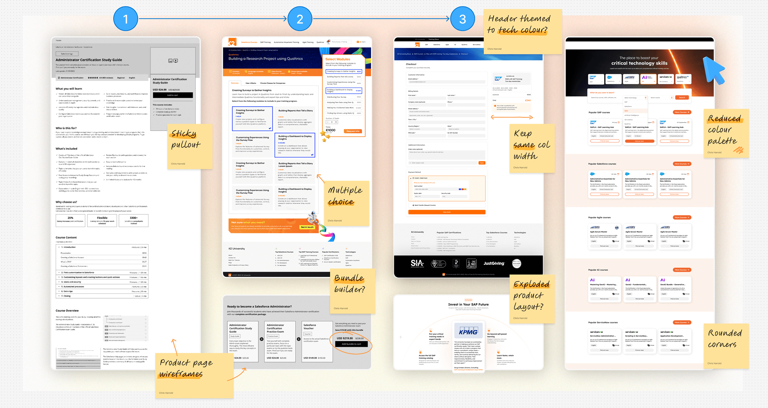
10. Optimising the user experience
The situation:
The company sold its training directly via its sales teams and close client relationships, but also via its eCommerce store.
Business and individuals both needed to be able to purchase training, but the shopping and checkout processes were very different.
The strategy:
These distinct user journeys needed to be mapped and the UI updated. We also needed to ensure the web store matched the new refreshed branding.
Working with our UI/UX designers in Brazil and India and our web developers in Spain, we started a program of iterative improvements and testing lasting over 18 months.
11. Thought leadership and brand awareness
The situation:
Our social advertising needed to simplify the complex world of enterprise cloud qualifications and help our audience understand the human resources required for digital transformation projects.
The brand needed to build trust, provide more thought leadership and improve engagement rates across paid campaigns.
The strategy:
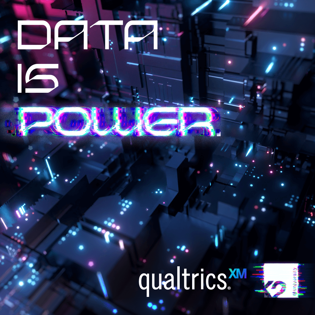
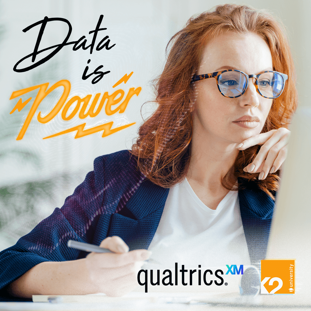
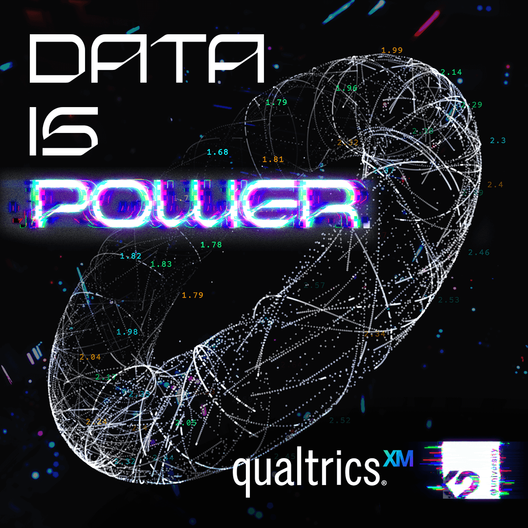
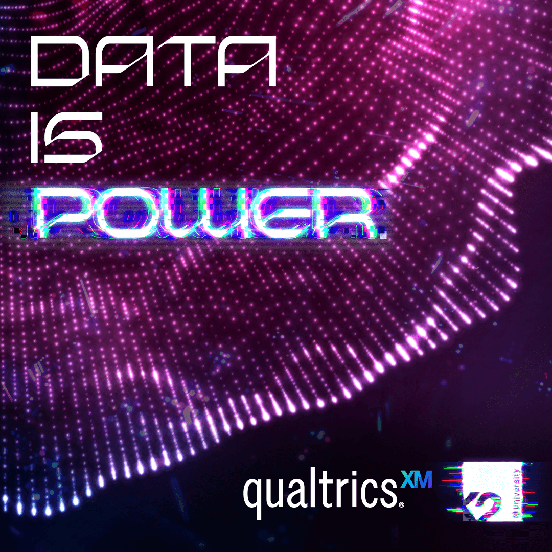
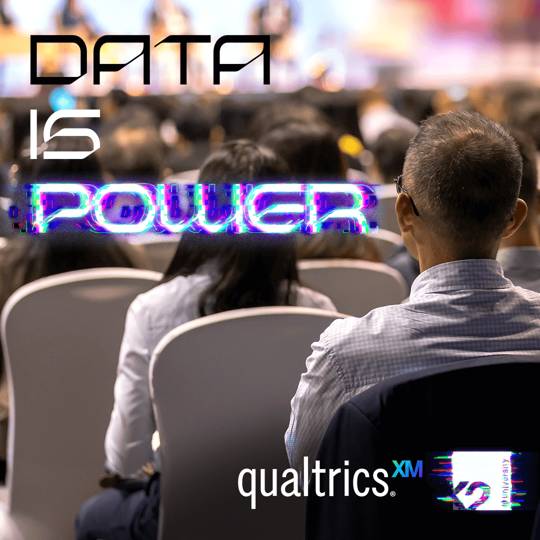
The content team and I developed a bi-weekly series of infographics.
More in-depth website blogs expanded upon many of the highlighted themes.
The core "accelerated launch" themes were designed into this marketing along with the brand's colour palette, raising brand awareness and market share.
Infographics proved to regularly exceed the brand's average engagement and share rates.
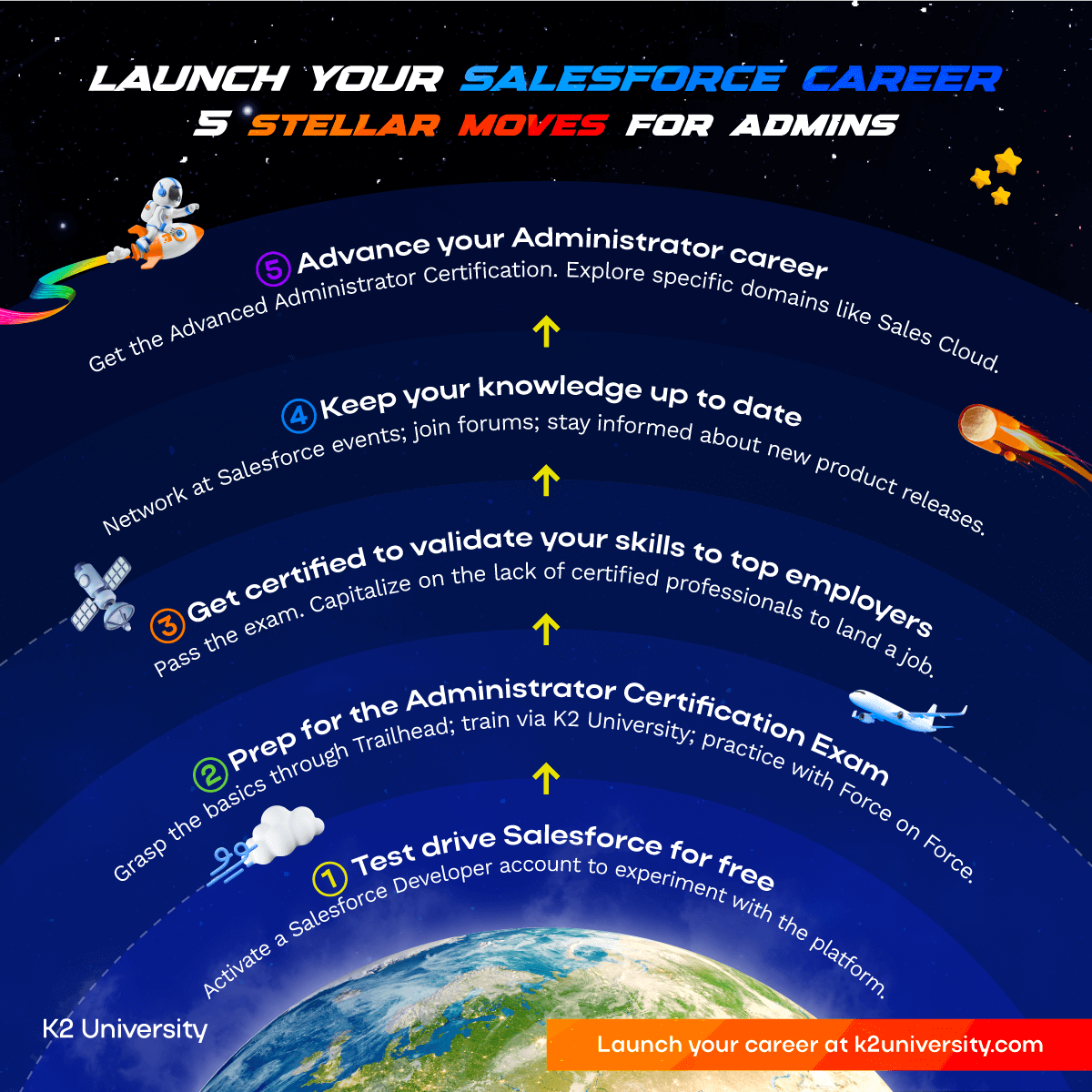
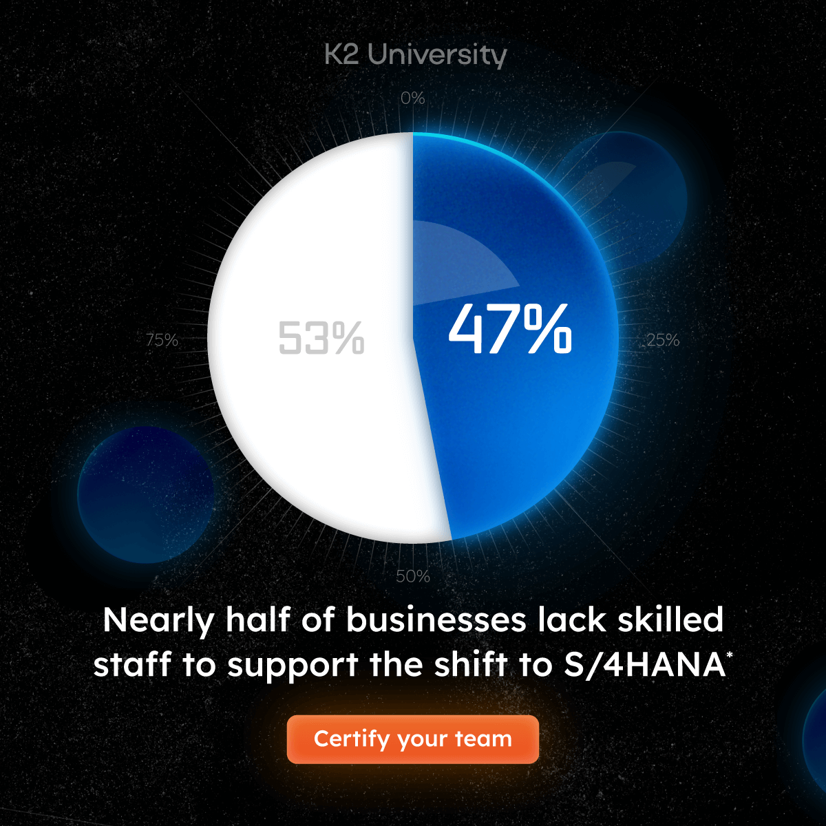
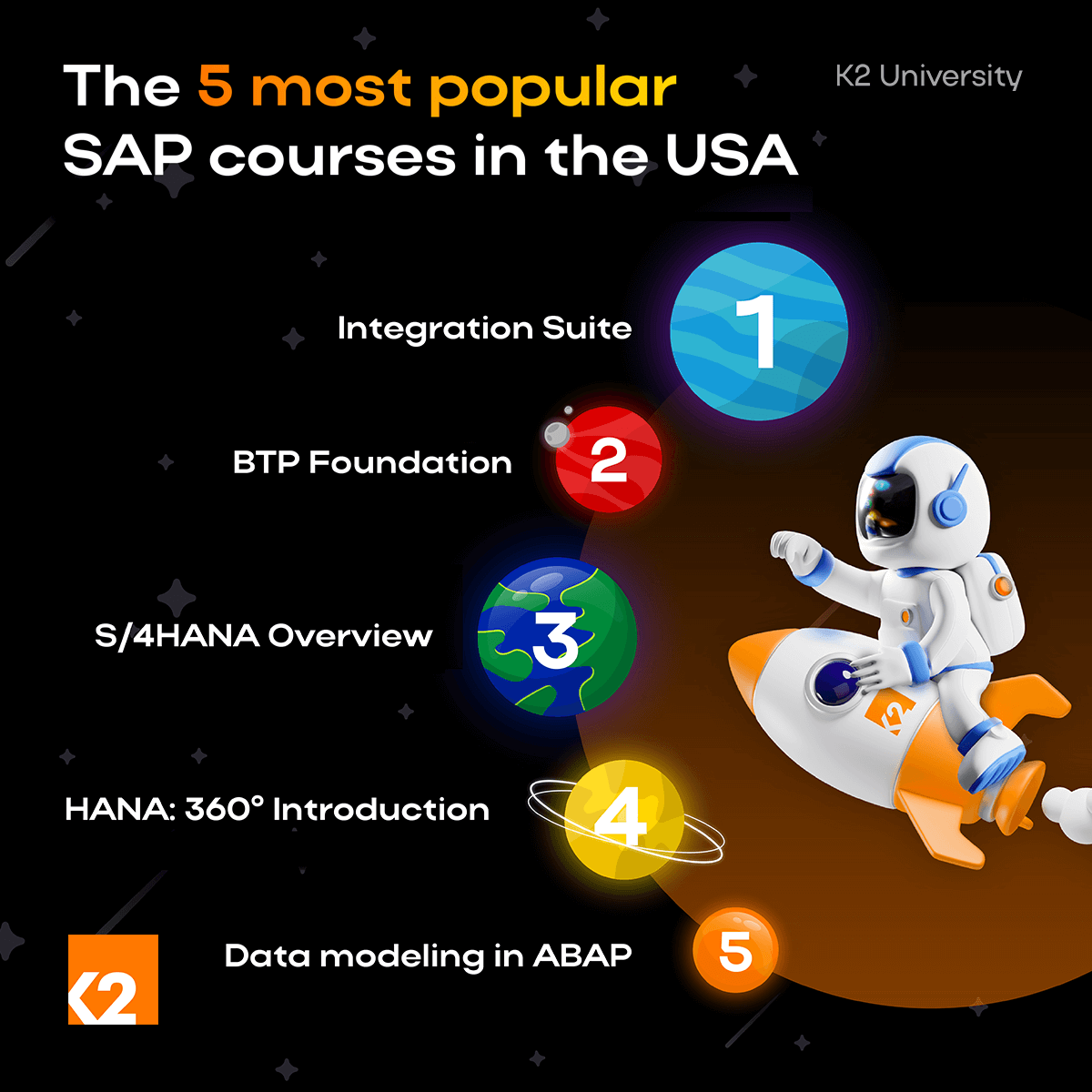
Infographics: Atmospheric conditions, planets, space-age HUDs and planetary orbits were all natural visual motifs for infographics, allowing data to be bold, appealing and highly legible.
12. The brand's impact
K2 University launch generated 952 qualified leads and attracted 15,808 users with an exceptional 78% engagement rate, while building a LinkedIn community of 5,400+ followers from zero within months.
- K2 University now has a strong and coherent brand with which to build further marketing.
- A strong visual identity has been developed, providing strict design guidelines across its digital marketing, training materials and event collateral.
- The launchpad concept was proven successful and can be rolled out across other technologies (such as SAP and ServiceNow) building on powerful 'launch' and 'acceleration' themes.
- A comprehensive library of branded documents and templates in multiple languages is now available to help international trainers communicate the brand to their local markets.
- The increasing sophistication of AI tools allow the brand to save time and resources marketing via social media, especially regarding short form videos.
- The higher-converting eCommerce store now provides a much better user experience to potential students and business customers with further updates in the pipeline.
"It was a pleasure working with you, and your impact on K2 University's brand and growth has been tremendous. Looking forward to when our paths cross again!"