An IT consultancy rebrand
From specialist recruiter to global IT consultancy: How I led the transformation and rollout of a new brand and marketing, leading to a huge increase in conversion rate.
Brand transformation impact
534%
increase in conversion rate for consultancy services web pages
$38.7m
pipeline value generated from consulting services digital marketing
100+
consulting opportunities generated through events marketing
3x
faster RFP responses on average for consulting projects
1. Identifying design challenges
The situation:
Known as a specialist IT recruiter for over 25 years, K2 Partnering Solutions' reputation — and its dated brand identity — blocked it from winning the larger digital transformation projects it wanted. Pitching as both recruiter and consultancy muddied the message and made SEO and ad targeting difficult.
The strategy:
As design manager, I audited the brand, messaging, marketing and sales enablement to find where to start. Over 24 months, working with senior leadership, the people office, practice leaders and with my international design team, I led the transformation across brand, digital and event marketing, sales enablement and internal comms, while the company maintained business as usual.
2. My role in the project
As design manager, I worked closely with senior leadership, the people office and practice area heads over 24 months.
I identified where the existing brand fell short, and with my international design team and in-house marketing support, implemented comprehensive transformation across brand, digital and event marketing, sales enablement and internal communications.
3. Helping to shape the early brand
The situation:
The brand transformation would be long and complex, involving every department across every channel. It needed creativity, industry insights, a critical eye, plus energy and enthusiasm across the board.
The strategy:
An inter-department working group was set up with senior figures, with elements of the brief coming directly from the CEO. I made sure to understand nuances and discover the bigger picture—crucial at this early stage.
I listened to the business's needs, challenges and goals while providing creative insights, critical observations and fresh ideas.
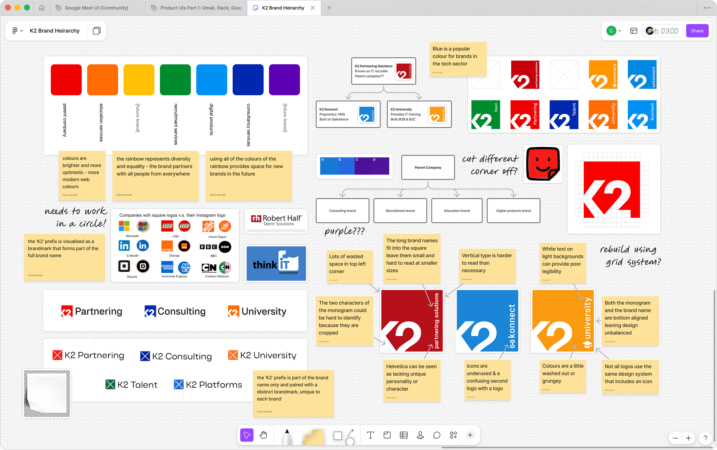
4. Reviewing brand architecture
The situation:
Three brands with a "K2" prefix existed: K2 Partnering Solutions, K2 University and K2 Konnect.
How would the consultancy offering be branded, and how would it sit within existing brand architecture? Introducing a new brand versus repositioning an existing one had different pros and cons.
The strategy:
Brand architecture diagrams, colour systems and proofs of concept were explored with the working group. I recommended approaches and ensured alternatives were clearly presented and discussed.
We agreed consultancy services would use the K2 Partnering Solutions brand, but every touchpoint would be reviewed and updated to better communicate the new offerings.
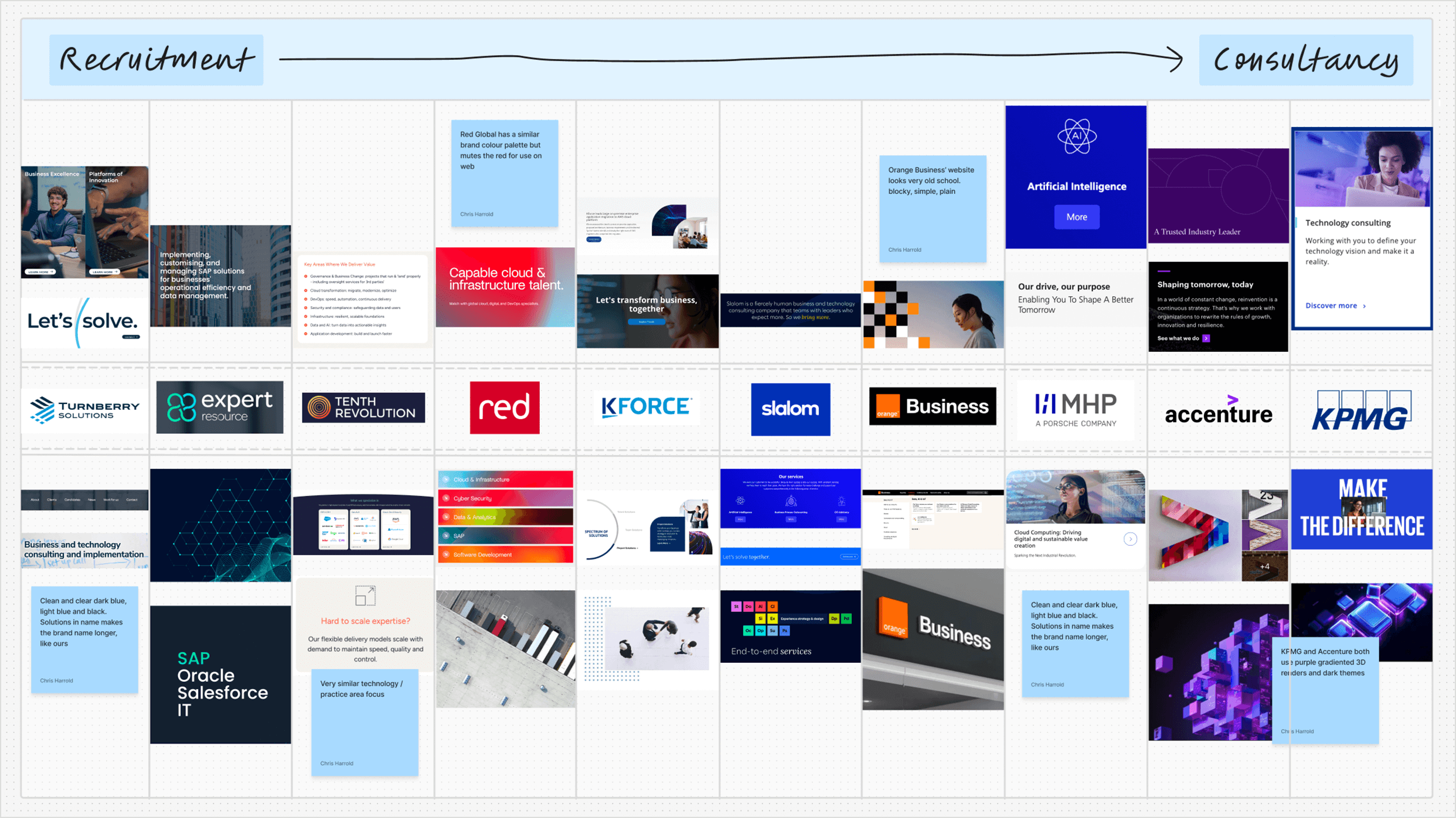
5. Understanding the competition
The situation:
Consultancies look and feel different to recruitment firms. How would the brand identity need to change to reflect the new offering?
Who would be the brand's main competitors after transformation? How would the updated brand differentiate itself?
The strategy:
I worked with business analysts, UX researchers and proprietary AI agents to identify direct competitors and aspirational brands. K2 already partnered with big IT consultancies and valuable insider knowledge was shared.
I also examined the design landscape to ensure the new brand fit in and was effective in the company's largest markets (US, Brazil and Europe).
Findings were discussed with the working group, letting us agree on market position, USPs and core values.
6. Gathering local market intelligence
The situation:
K2 Partnering Solutions had expanded into many global markets and planned to continue, with Japan and Germany enjoying rapid growth.
How could we ensure the new brand would be effective in these markets with their unique languages, cultures and customs?
The strategy:
I interviewed key associates in each region and recorded their insights on the brand's market position. I discovered regional and cultural considerations plus any challenges they saw ahead.
Insights from K2's talent teams in APAC and DACH helped tailor the brand to local markets, informing photography art direction and messaging.
"In Japan, formal dress including suits and ties are common and expected in business photography."
"Make sure to position 'sales' jobs as 'technical recruiter' jobs where possible, as Germans can sometimes look down on sales as a career and feel it is beneath them."
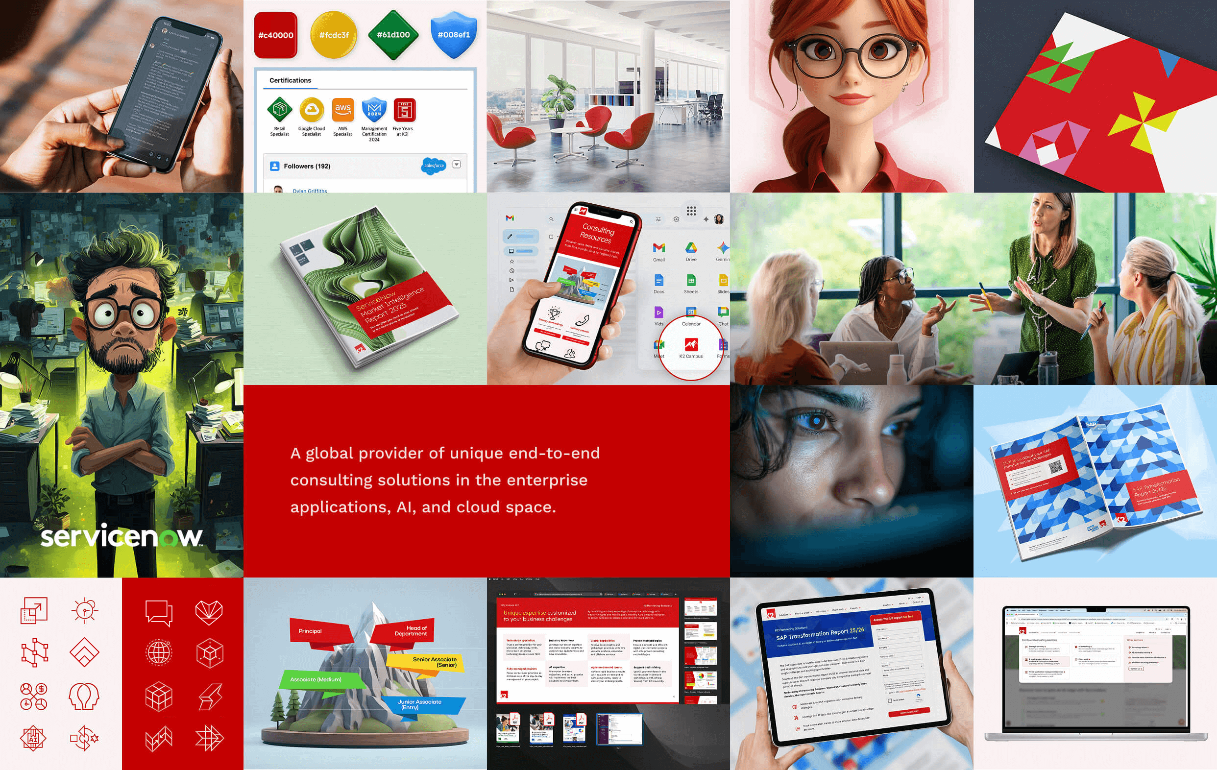
7. Building out a new colour palette
The situation:
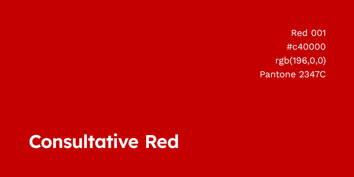
The brand's red looked washed out and old-fashioned compared to newer tech brands. More vintage car than Virgin Media.
Marketing frequently switched between red and navy blue as the primary colour. The palette needed simplifying to improve brand recognition.
The strategy:
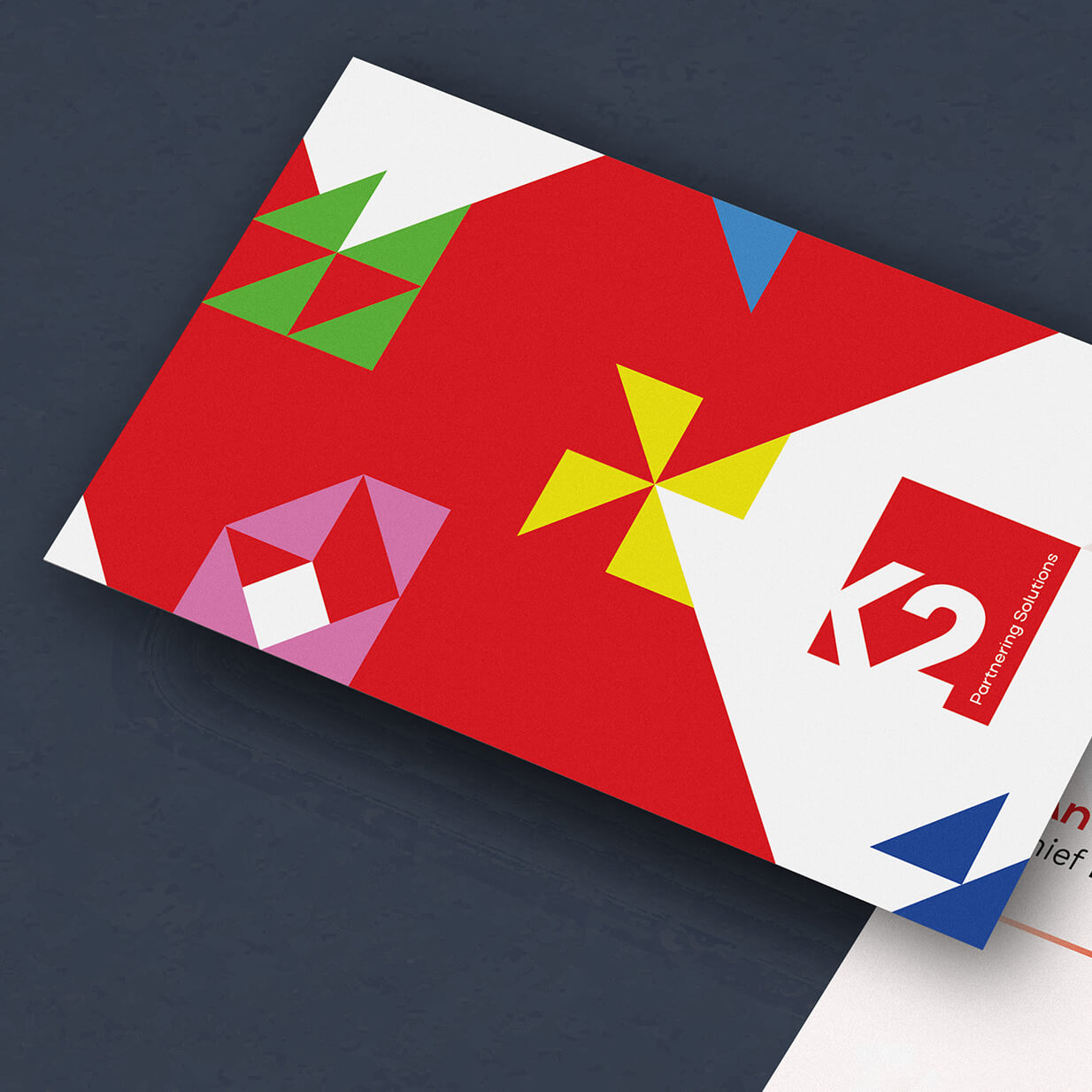
Using a grid system, I redesigned the logo with a new, more modern brand red.
The more vibrant, warmer red would shape brand perception—appearing full of life and passion while remaining recognisable and retaining its reputation.
I developed a full colour palette ensuring versatility, legibility, personality, professionalism and easy recognition, presenting it to the working group with explanations.
I asked the UI/UX designers to introduce a pale pastel tone—a subtler brand colour for web, applications and interfaces.
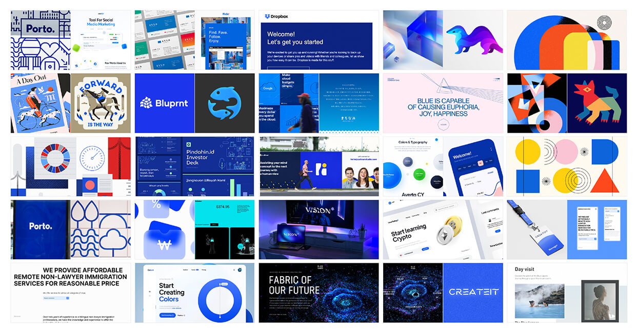
Colour System Design: The brand would need to frequently communicate large amounts of data and complex concepts. I curated a new palette of vibrant accent colours to provide greater informational hierarchy.
8. Modernising and optimising the logo
The situation:
The logo was unclear at small sizes with wasted space in the top left. The typefaces dated the marketing and conveyed little personality.
The strategy:
Using a grid system, the square logo and 'K2' monogram element was enlarged, emboldened and clarified.
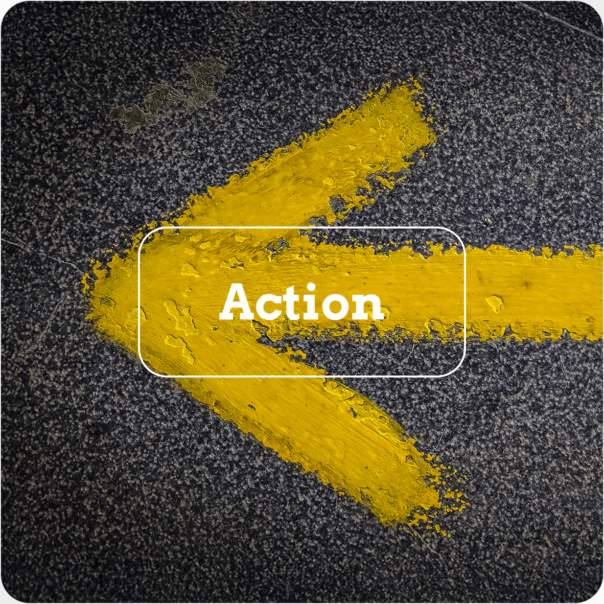
A versatile chevron motif was introduced as a strong visual hook—both a 'less than' sign from programming languages and an arrow representing movement or transformation.
I suggested creating an additional logotype variant to allow the full brand name to be read at small sizes and when space is limited.
New brand fonts provided more personality in headings and clarity in body copy. Display typography contained geometric flourishes matching angles in the monogram.
Logo evolution: From initial concepts through refinement to final application guidelines
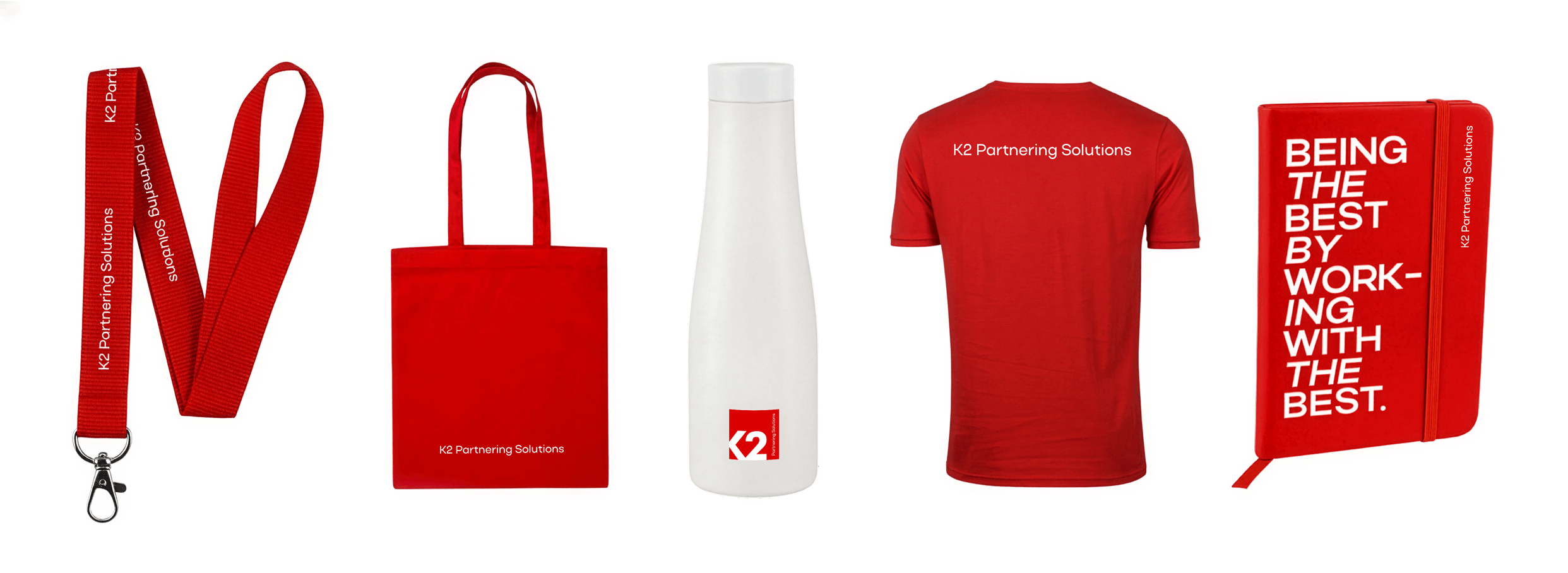
Brand Recognition: From new hire merch to event uniforms and sponsorships, I wanted to make sure that K2 Partnering Solutions' new brand was seen, recognised and remembered by strengthening colours and typography.
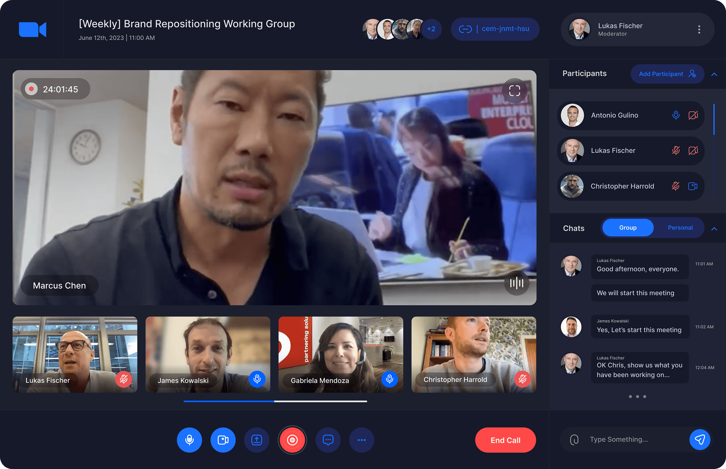
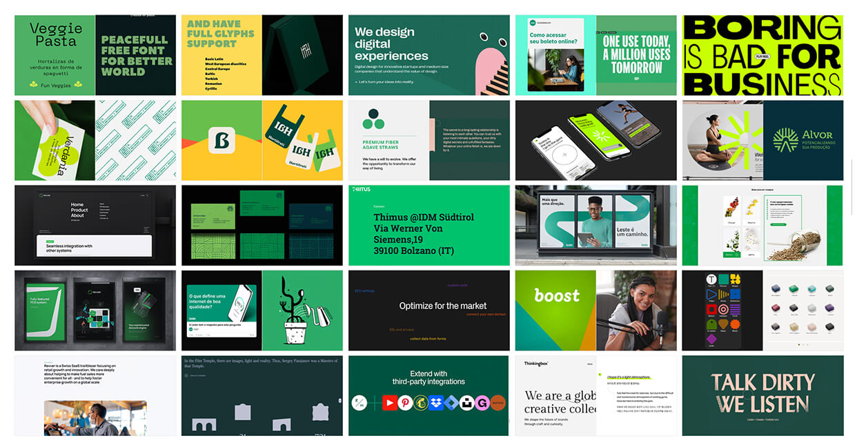
9. Defining photography and GenAI guidelines
The situation:
Legacy brand photography was dull, used dated treatments and seemed overly staged. This didn't reflect the increasingly young, nomadic and casually-dressed modern tech professional.
K2's marketing relied on static stock images—unsuitable for many popular advertising platforms and social media.
There was a compelling business case for utilising AI in content generation. How do we ensure AI-generated media consistently meets brand guidelines?
The strategy:
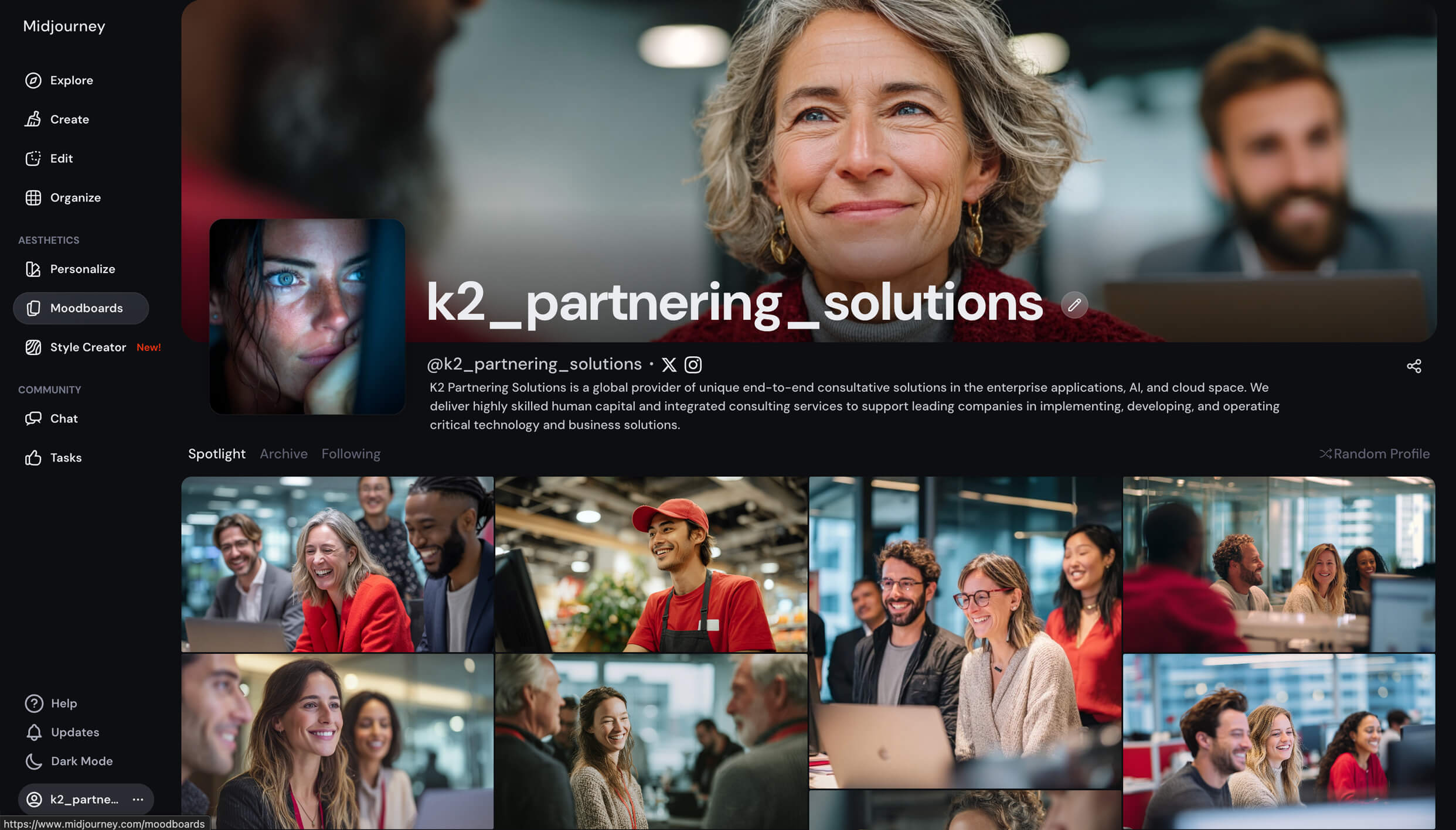
I designed and rolled out a new, more authentic and natural art direction. I wanted audiences to recognise and empathise with realistic environments.
New photography should have depth and be rich in colour and diversity. Photographers should avoid messy backgrounds and use large blocks of colour to complement brand colours.
I trained marketing team members on brand videography guidelines and created new Canva workflows. A curated library of approved brand video is shared with relevant associates.
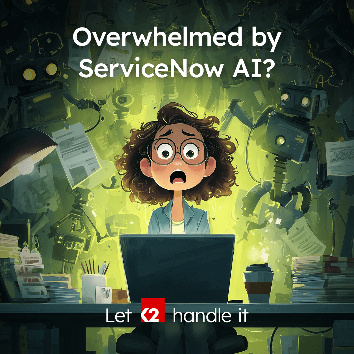
I worked with the group's head of AI to develop prompts and an internal AI agent for generating on-brand imagery for blog articles, case studies and social media.
Video direction: This hero video montage demonstrates the new photography art direction. Note the authentic, fly-on-the-wall style footage and how the camera focuses on the subjects' facial expressions.
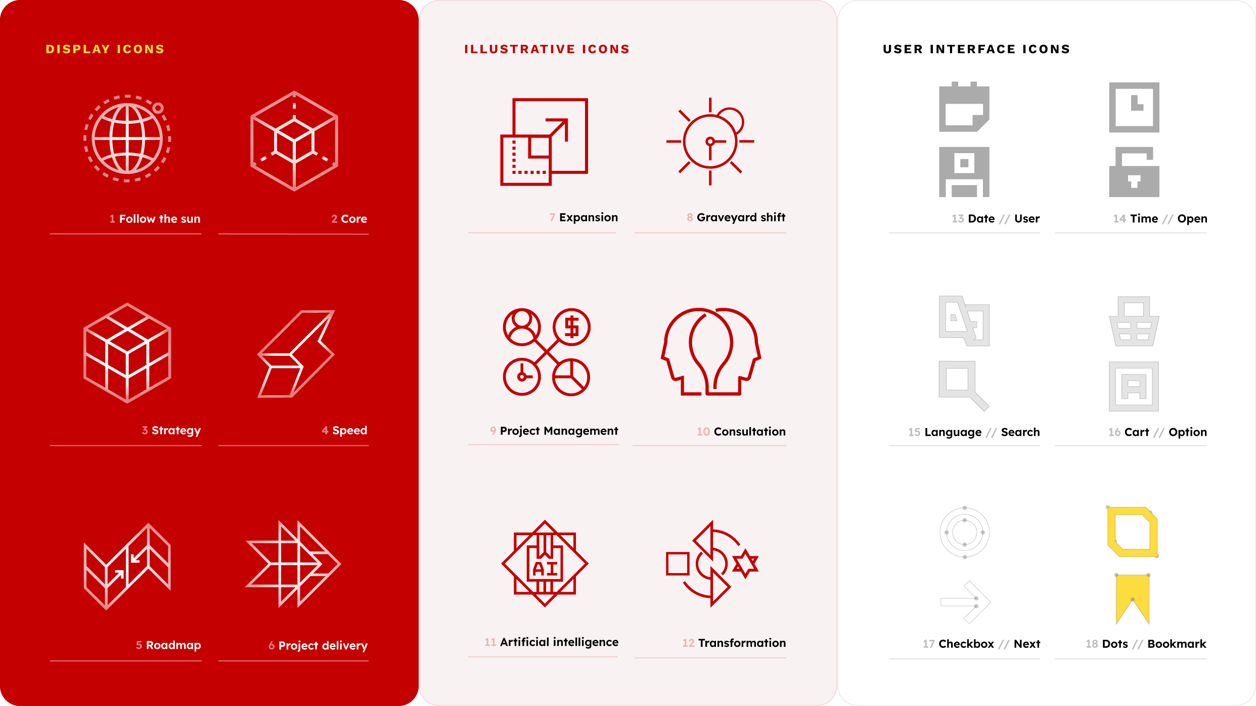
10. Illustrating technical concepts
The situation:
The shift to consultancy created a need for visual tools that could clearly support complex technical concepts.
Larger amounts of detailed text needed breaking up and additional web content needed enhanced user interfaces.
The strategy:
A new bespoke icon library and design system was created using a square grid based on angles formed by the 'K' in the monogram and the block serifs of the brand's typeface.
These versatile, geometric monotone icons provided visual shortcuts, anchored text and strengthened comprehension—while ensuring marketing reflected the more confident, professional consulting brand.
11. Clarifying the messaging
The situation:
Sales and marketing copy was confusing, hard to read and full of jargon.
Positioning new consulting services alongside existing recruitment services confused audiences and weakened both messages.
The strategy:
With the content team, we pinned down a new shorter and easier-reading brand voice and writing style guide. The new copy let us be bolder in designs and engage audiences more quickly on complex topics.
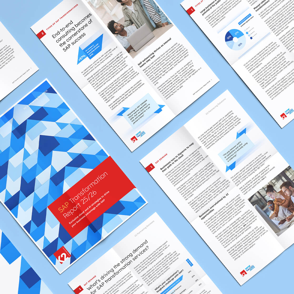
A clear focus on consulting was introduced across all channels—from ad copy to website UI to pitch decks and social ads.


Messaging and Tone of Voice: Shorter, simpler messaging coupled with AI-powered workflows was found to be effective on social media.
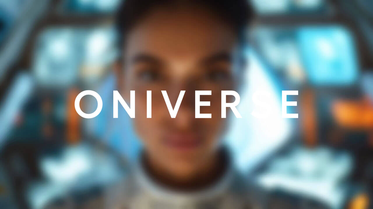
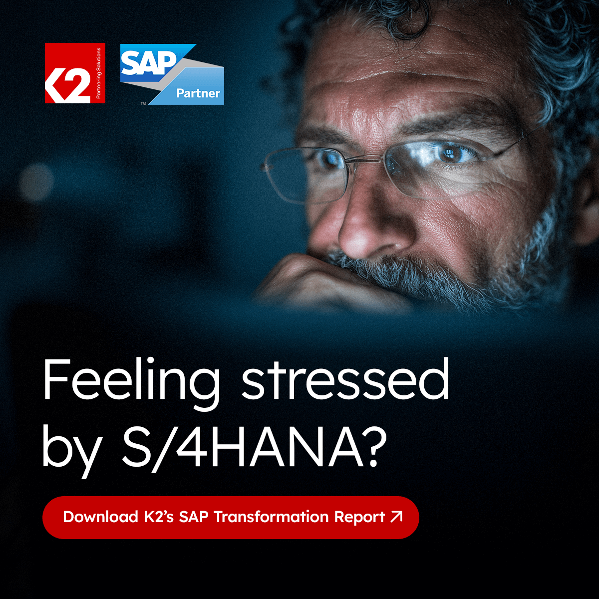
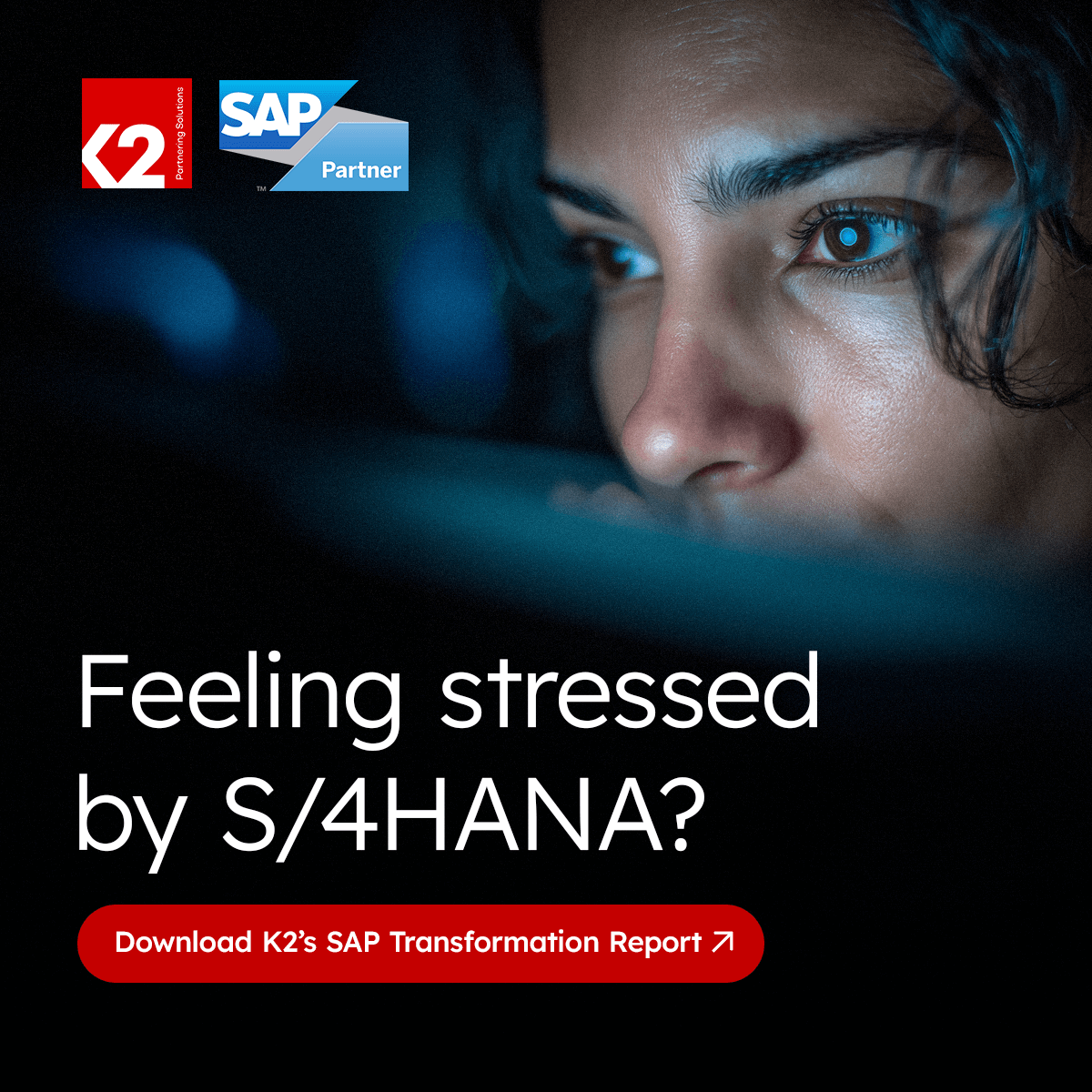
Video Generation: "AI is everywhere you look. Let's bring it into focus." Gemini and Midjourney were used to produce the footage for a moving-image style ad campaign to promote SAP consulting services.
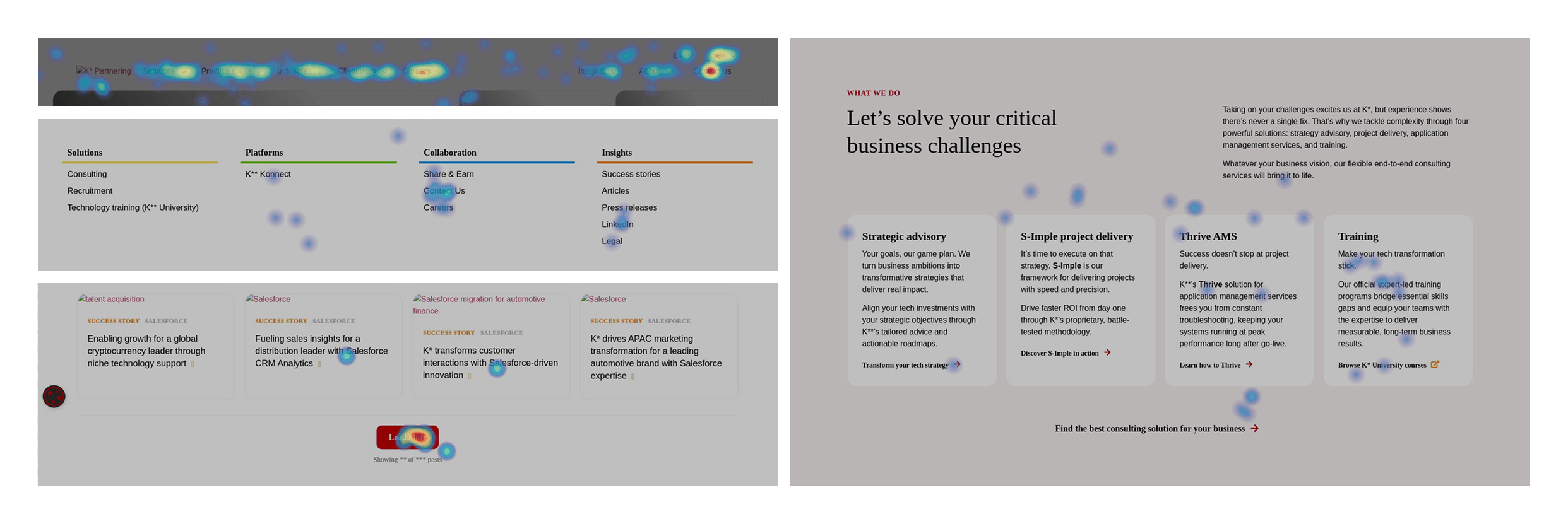
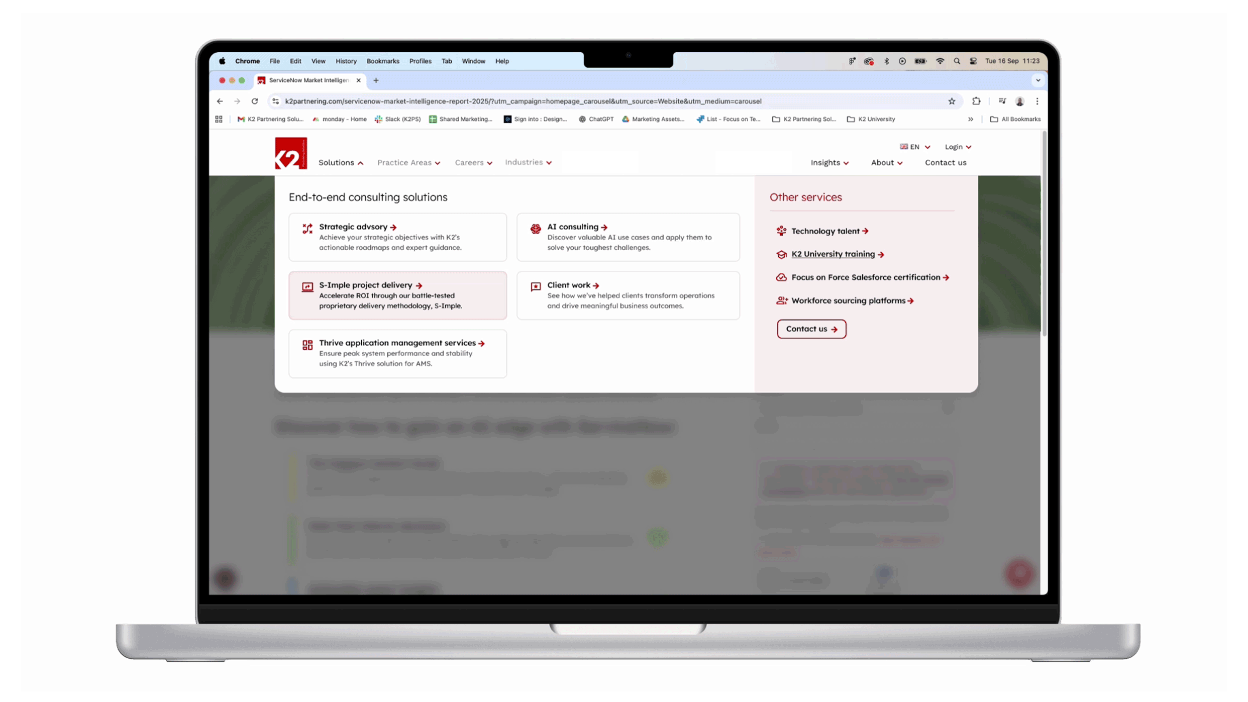
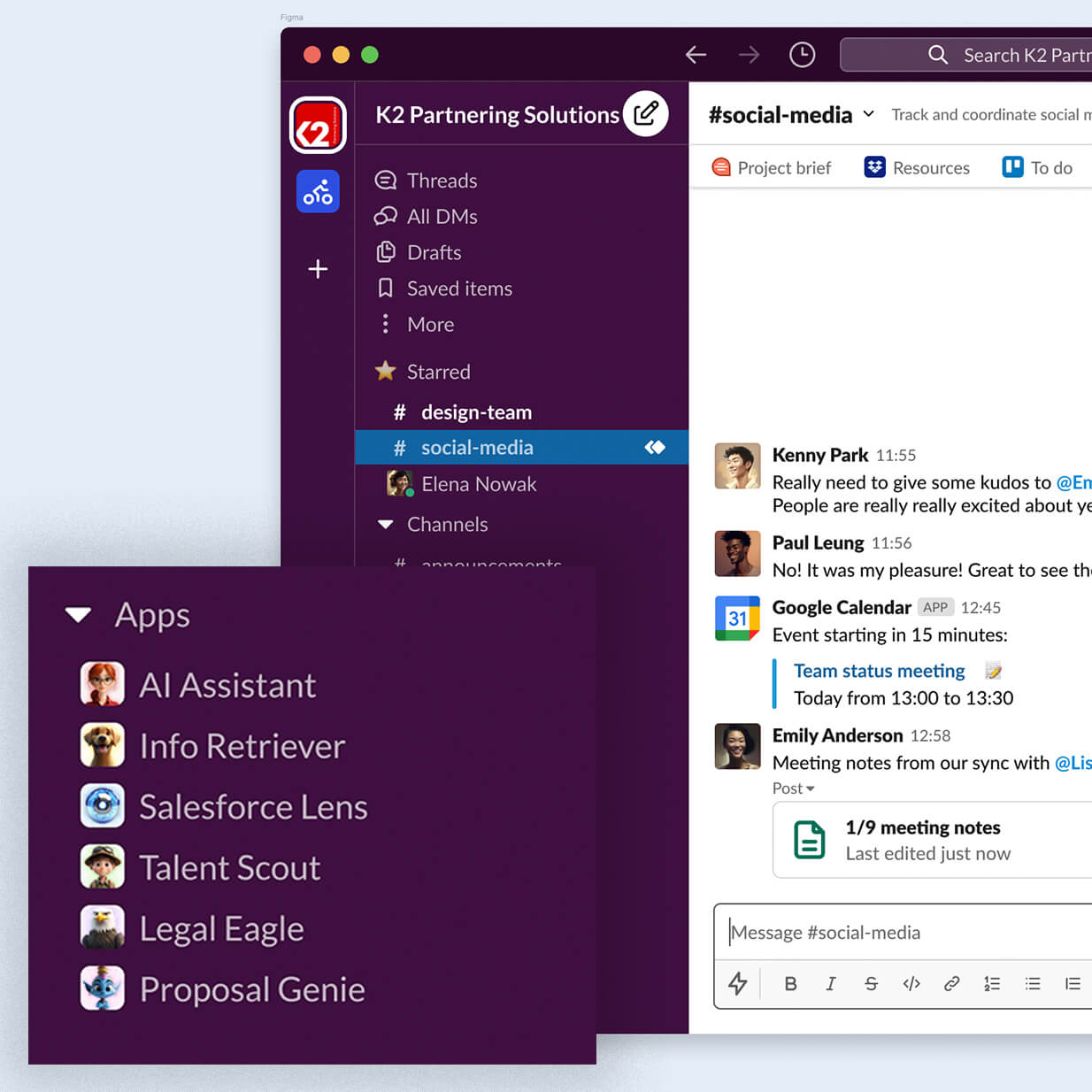
12. Making the change online
The situation:
Introducing additional consulting services to an already unintuitive recruitment-focused website could confuse users and weaken SEO.
Creating new webpages was resource intensive and didn't always follow best practices.
Increased AI use instead of traditional web searches was leading to fewer organic visitors.
K2's corporate website needed updating to improve aesthetics, usability and accessibility.
The strategy:
Analytics, reporting and heatmapping tools were implemented to understand how users engaged with the site. New top-level navigation provided clarity and positioned consultancy services as the primary offering.
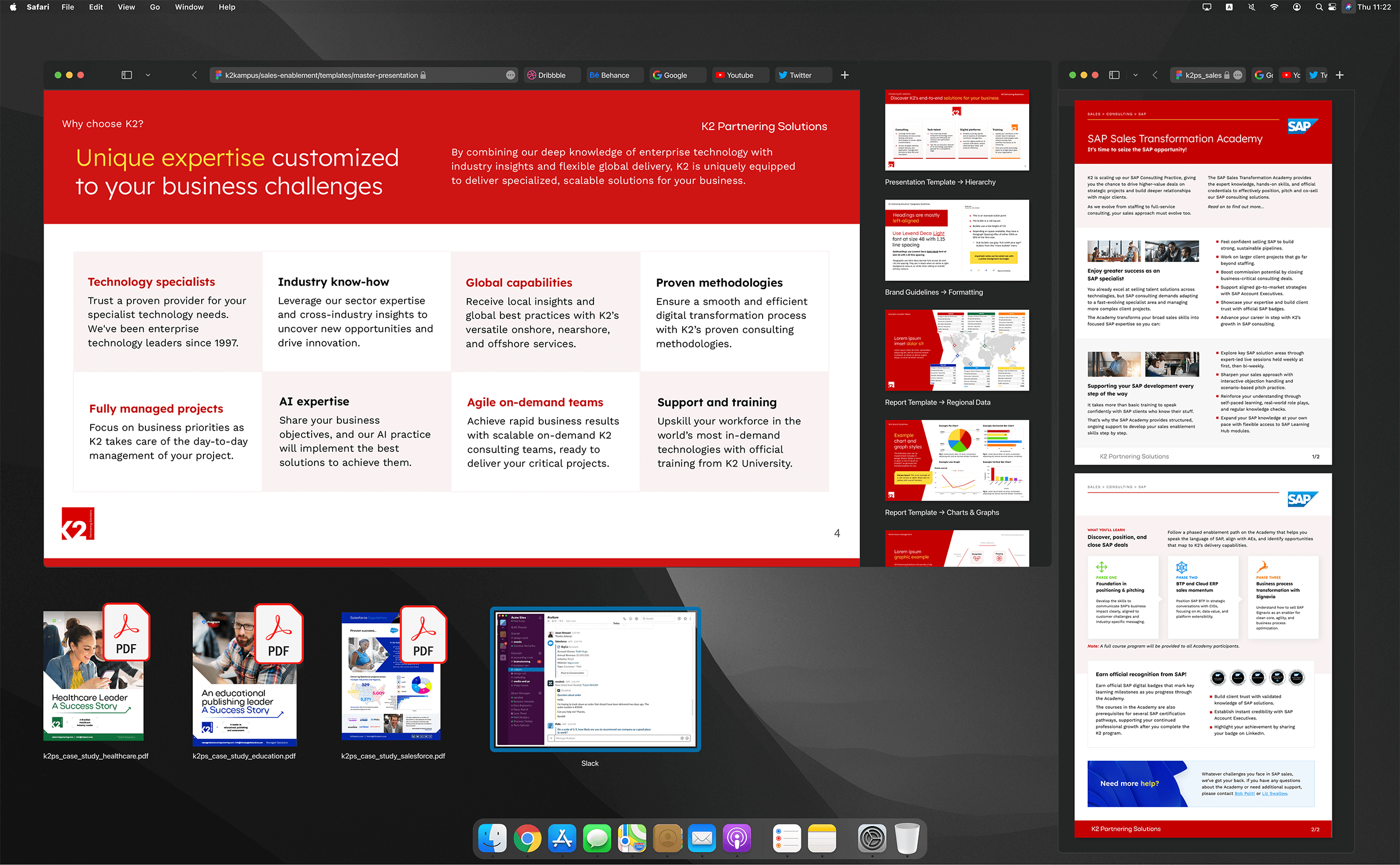
A new bespoke template library was created in the CMS, allowing efficient page creation. Training ensured best practice file handling, metadata and tagging.
Dedicated SEO and GEO projects radically improved search performance and references in ChatGPT and Google's AI Overview. These updates had a near-instant positive effect on brand visibility.
A recent acquisition brought an additional UI/UX designer into the company. I recognised his skills and quickly brought him into the marketing team to help with reskinning and UI/UX improvements to K2 Partnering Solutions' website.